February 9, 2026

Component parameters and content type fields now support multiple editor styles, letting you tailor the authoring experience to common use cases like layout alignment, size presets, and design toggles. Authors get controls that match how they think about each setting.

New editor controls
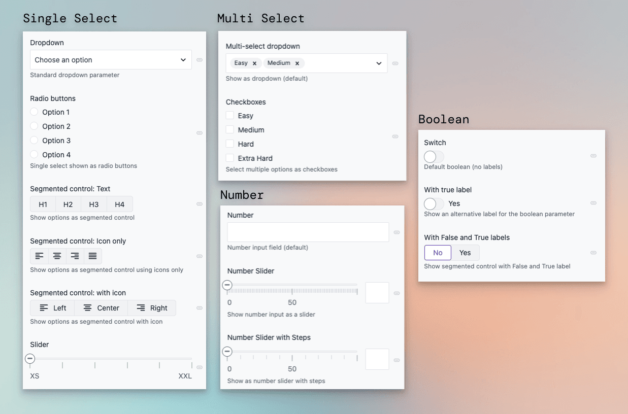
In addition to the default controls, the following options are now available for the following parameter and field types:
- Single-select — Radio buttons, segmented control (text, icon and text, or icon only), or slider.
- Multi-select — Checkboxes for full visibility of all options.
- Number — Slider with optional steps for bounded ranges.
- Boolean — Switch with a custom label, or segmented control with custom labels (e.g. No/Yes).
All new controls support common features like localization and conditional values. Choose the editor that best fits each parameter or field under Editor settings.
Clear any value with one click
Every parameter and field now also includes a Clear current value option in its dropdown menu, letting authors reset any value with a single click.
Learn more in the parameters documentation.