Parameters for components
Parameters are the elements that make up the component, such as a title, description, or image. They define the data that a component definition needs, which might be data in some external system or local parameters to influence how the external data appears when rendered.
For example, a promotion component might have two parameters:
- Content, which is a link to some content in a headless CMS
- Alignment, which could be a single select with text alignment options.
These are the basic building block of what will end up as component props when rendering a Canvas composition.
A parameter lets you set a value on a component. Each parameter has a type. The parameter type determines the kind of value you can set for the parameter.
Add a parameter#
In your project, navigate to Experience > Components and select your component.
Click the tab Parameters.
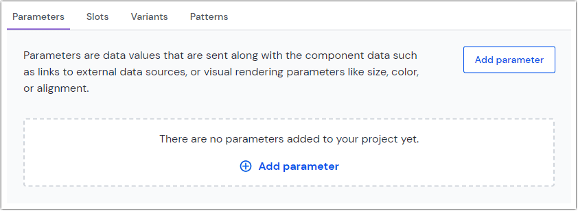 Click to add a parameter.
Click the Add parameter button.
Select a base type for your parameter:
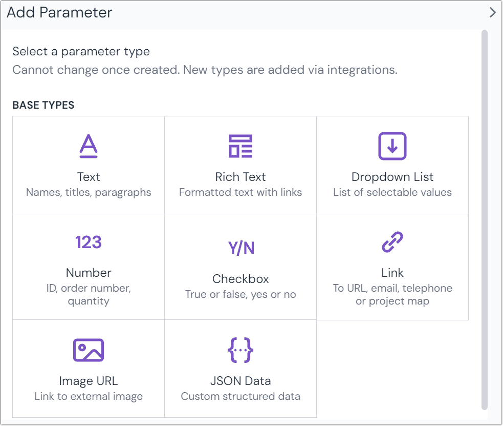 Select a type of parameter to add to your component.
Configure common properties (such as Name, Public ID, Help text, and Guidance) and parameter-type-specific settings in the Editor settings and Conditions & Localization tabs. See parameter types below for reference.
Click Accept on the bottom of the dialog to update the component configuration. To add a new parameter you can also select Accept & add another in the button dropdown.
After all component updates are complete, make sure to save the component to apply your changes.
Parameter configuration#
Parameter configuration is organized in two tabs: Editor settings and Conditions & Localization.
Editor settings tab#
Validation settings (such as required, min/max, or regex) and, options to change how the control appears in the editor. The settings in this tab are specific to the parameter type.
Conditions & Localization tab#
Define the Localization (locale-specific values and default behavior) and conditional values settings for the parameter.

Parameter types#
The configuration options for each base parameter type differ. Each parameter type's options are outlined here.
Asset#
The asset parameter connects images and other media that may be stored in Uniform's asset library, a data resource or an external digital asset management system. It also supports inline linking to URLs of external media files.
To render the data from an asset parameter in front-end applications, learn about the asset utilities provided by the Uniform SDK.
tip
View the guide on media assets for a more lengthy explanation on differences between an asset and an image URL.
When adding an asset parameter, enter the following values:
Name Description Notes Name A text field to enter a descriptive name for the parameter or its purpose.
Public ID Name that uniquely identifies the parameter. This value is available to developers, and is auto generated from the Name given. It can't be changed once it's created.
Help text A user is responsible for setting a value on the parameter. This text appears below the user-interface available for setting the parameter value.
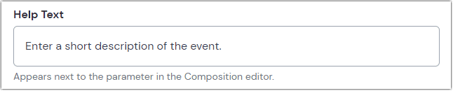 The user interface for setting the value on a text parameter with help text set to 'Enter a short description of the event.'
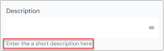 The help text in context of a composition.
Guidance Instructions that help Scout and AI quick edits understand what content to generate for this parameter. Describe the expected format, length, writing style, or specific requirements. Keep it concise (1-2 sentences). Learn more about AI guidance.
Required Indicates whether setting an asset is required when the component is used. Default: false. Number of assets Specify a minimum and maximum number of assets that can be added to the selection. Restrict asset types
Allow only specific types to be uploaded or selected:
Image, Video, Audio, Other Example: Restrict an asset parameter to video files
Localizable Allows the parameter to be localizable.
If enabled, the default localization behavior can be set:
- Localized: One value can be set per locale
- Not localized: Single value is used across all locales
Editors can change the localization behavior on a per-instance basis.
Allow conditional values Set up multiple potential values and conditions for use.
Learn more about conditional values.
Use as display name Setting this value to true will show the alt attribute of the first asset as the name of the component within the structure panel of a composition. Use as thumbnail Setting this value to true will show the first asset as the thumbnail of the entry Click Accept on the bottom of the dialog to update the component configuration. To add a new parameter you can also select Accept & add another in the button dropdown.
After all component updates are complete, make sure to save the component to apply your changes.
Blocks#
Blocks are used to model repeated data within a component. They expect an array of data that's only shared in relation to something else. For example, on a site selling coffee beans you wouldn't present roasts or grind levels independent of the context of coffee beans. Learn about block utilities provided by the Uniform SDK.
Blocks differ from slots in that they're data or content focused, where slots are for nested or repeated UI components.
To add a block parameter to a component:
Create or navigate to the component to which you want to add a block at Experience > Components.
In the parameters section click Add parameter as described above.
Select Block from the list of field types.
Enter the following values:
Name Description Notes Name A text field to enter a descriptive name for the parameter or its purpose.
Public ID Name that uniquely identifies the parameter. This value is available to developers, and is auto generated from the Name given. It can't be changed once it's created.
Help text A user is responsible for setting a value on the parameter. This text appears below the user-interface available for setting the parameter value.
The user interface for setting the value on a text parameter with help text set to 'Enter a short description of the event.'The help text in context of a composition.Required Indicates whether setting a block is required when the component is used. Default: false. Number of blocks Minimum: The minimum number of blocks to allow in the field.
Maximum: The maximum number of blocks to allow in the field.Search for a type: A field to select other content types to connect to the block field. List of content types to connect to the block field. Allowed block types A search field and available blocks are provided to find the block types you want to add. If you haven't yet created a block, you will see a message stating that there are no blocks created. You can add this field now, but it won't be useful until at least one block type is created and allowed in it.
Boolean#
The Boolean parameter stores a true or false value. You can configure how it appears in the editor (e.g. toggle vs segmented control).
When adding a Boolean parameter, enter the following values:
Name Description Name A text field to enter a descriptive name for the parameter or its purpose.
Public ID Name that uniquely identifies the parameter. This value is available to developers, and is auto generated from the Name given. It can't be changed once it's created.
Help text A user is responsible for setting a value on the parameter. This text appears below the user-interface available for setting the parameter value.
The user interface for setting the value on a text parameter with help text set to 'Enter a short description of the event.'The help text in context of a composition.Guidance Instructions that help Scout and AI quick edits understand what content to generate for this parameter. Describe the expected format, length, writing style, or specific requirements. Keep it concise (1-2 sentences). Learn more about AI guidance.
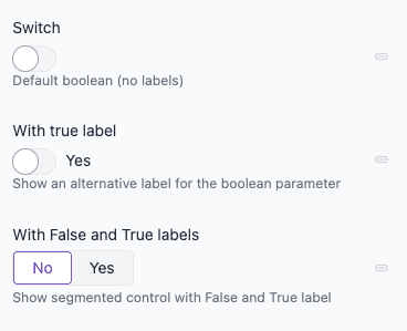
False label Optional. When both False label and True label are set, the editor shows a segmented control (e.g. "No" | "Yes") instead of a toggle. Example: "No", "False". True label Optional. When both labels are set, the editor uses a segmented control. Otherwise, the editor shows a toggle switch and uses this as the label next to it; the false label is ignored. Example: "Yes", "True". Localizable Allows the parameter to be localizable.
If enabled, the default localization behavior can be set:
- Localized: One value can be set per locale
- Not localized: Single value is used across all locales
Editors can change the localization behavior on a per-instance basis.
Allow conditional values Set up multiple potential values and conditions for use.
Learn more about conditional values.
How Uniform stores the value
{ "type": "checkbox", "value": true }Click Accept on the bottom of the dialog to update the component configuration. To add a new parameter you can also select Accept & add another in the button dropdown.
After all component updates are complete, make sure to save the component to apply your changes.
Date#
The date parameter adds an area where authors can either enter a date (in mm/dd/yyyy format) or use a calendar selector to pick a date.
When adding a date parameter, enter the following values:
Name Description Notes Name A text field to enter a descriptive name for the parameter or its purpose.
Public ID Name that uniquely identifies the parameter. This value is available to developers, and is auto generated from the Name given. It can't be changed once it's created.
Help text A user is responsible for setting a value on the parameter. This text appears below the user-interface available for setting the parameter value.
The user interface for setting the value on a text parameter with help text set to 'Enter a short description of the event.'The help text in context of a composition.Guidance Instructions that help Scout and AI quick edits understand what content to generate for this parameter. Describe the expected format, length, writing style, or specific requirements. Keep it concise (1-2 sentences). Learn more about AI guidance.
Required Indicates whether setting a date is required when the component is used. Default: false. No earlier than Specify a date before which no author can set a value. No later than Specify a date after which no author can set a value. Localizable Allows the parameter to be localizable.
If enabled, the default localization behavior can be set:
- Localized: One value can be set per locale
- Not localized: Single value is used across all locales
Editors can change the localization behavior on a per-instance basis.
Allow conditional values Set up multiple potential values and conditions for use.
Learn more about conditional values.
Use as display name Setting this value to true will show what's entered in the Date field as the name of the component within the structure panel of a composition. Click Accept on the bottom of the dialog to update the component configuration. To add a new parameter you can also select Accept & add another in the button dropdown.
After all component updates are complete, make sure to save the component to apply your changes.
Date/Time#
The date/time parameter allows you to set a date and time in a specific timezone. The date and time are stored in the ISO 8601 format in UTC. Time zone names correspond to the tz database, such as America/New_York.
When adding a date/time parameter, enter the following values:
Name Description Name A text field to enter a descriptive name for the parameter or its purpose.
Public ID Name that uniquely identifies the parameter. This value is available to developers, and is auto generated from the Name given. It can't be changed once it's created.
Help text A user is responsible for setting a value on the parameter. This text appears below the user-interface available for setting the parameter value.
The user interface for setting the value on a text parameter with help text set to 'Enter a short description of the event.'The help text in context of a composition.Guidance Instructions that help Scout and AI quick edits understand what content to generate for this parameter. Describe the expected format, length, writing style, or specific requirements. Keep it concise (1-2 sentences). Learn more about AI guidance.
Required Indicates whether setting a date is required when the component is used. Default: false. Localizable Allows the parameter to be localizable.
If enabled, the default localization behavior can be set:
- Localized: One value can be set per locale
- Not localized: Single value is used across all locales
Editors can change the localization behavior on a per-instance basis.
Allow conditional values Set up multiple potential values and conditions for use.
Learn more about conditional values.
Use as display name Setting this value to true will show what's entered in the Date/Time field as the name of the component within the structure panel of a composition. Click Accept on the bottom of the dialog to update the component configuration. To add a new parameter you can also select Accept & add another in the button dropdown.
After all component updates are complete, make sure to save the component to apply your changes.
Enrichment#
The Enrichment parameter allows you to associate an enrichment with a field on a content entry or a component parameter. This differs from the built-in Enrichment Tags on components, which automatically add enrichment values to visitor profiles when content is viewed. Instead, the Enrichment parameter is designed specifically for programmatic enrichment on components or for connecting the enrichment values of a content entry to a dynamic composition.
When adding a Enrichment parameter, enter the following values:
Name Description Name A text field to enter a descriptive name for the parameter or its purpose.
Public ID Name that uniquely identifies the parameter. This value is available to developers, and is auto generated from the Name given. It can't be changed once it's created.
Help text A user is responsible for setting a value on the parameter. This text appears below the user-interface available for setting the parameter value.
The user interface for setting the value on a text parameter with help text set to 'Enter a short description of the event.'The help text in context of a composition.Guidance Instructions that help Scout and AI quick edits understand what content to generate for this parameter. Describe the expected format, length, writing style, or specific requirements. Keep it concise (1-2 sentences). Learn more about AI guidance.
Click Accept on the bottom of the dialog to update the component configuration. To add a new parameter you can also select Accept & add another in the button dropdown.
After all component updates are complete, make sure to save the component to apply your changes.
Single Select#
Lets a user select a single value from a list of options that are assigned to the parameter. It's used when you want to limit the options that are available to the user.
When adding a single select parameter, enter the following values:
Name Description Name A text field to enter a descriptive name for the parameter or its purpose.
Public ID Name that uniquely identifies the parameter. This value is available to developers, and is auto generated from the Name given. It can't be changed once it's created.
Help text A user is responsible for setting a value on the parameter. This text appears below the user-interface available for setting the parameter value.
The user interface for setting the value on a text parameter with help text set to 'Enter a short description of the event.'The help text in context of a composition.Guidance Instructions that help Scout and AI quick edits understand what content to generate for this parameter. Describe the expected format, length, writing style, or specific requirements. Keep it concise (1-2 sentences). Learn more about AI guidance.
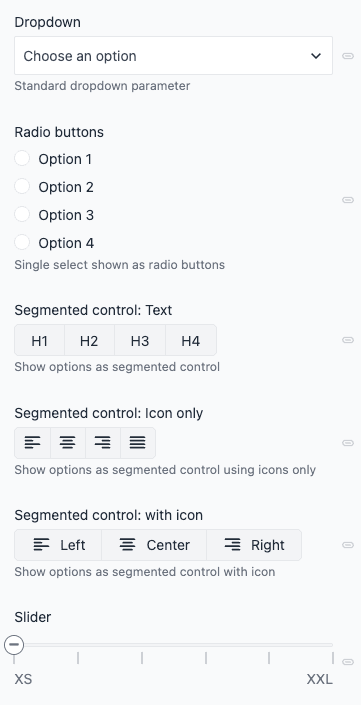
Editor In Editor settings, choose how the value is selected: Select (default dropdown), Radio buttons, Segmented control (horizontal buttons; each option can have an optional icon plus Text and Value), or Slider (horizontal slider over the same options, e.g. XS–XXL). Options The values that populate the control. Click Add Option (or Add Item) and specify Text (label) and Value for each option. For Segmented control, options can also include an optional Icon (use "Select an icon"); leave Text empty for icon-only display. Required Indicates whether setting a link is required when the component is used. Default: false. Localizable Allows the parameter to be localizable.
If enabled, the default localization behavior can be set:
- Localized: One value can be set per locale
- Not localized: Single value is used across all locales
Editors can change the localization behavior on a per-instance basis.
Allow conditional values Set up multiple potential values and conditions for use.
Learn more about conditional values.
Use as display name Setting this value to true will show what's selected in the Single select field as the name of the component within the structure panel of a composition. How Uniform stores the value
{ "type": "select", "value": "######################" }Click Accept on the bottom of the dialog to update the component configuration. To add a new parameter you can also select Accept & add another in the button dropdown.
After all component updates are complete, make sure to save the component to apply your changes.
Multi Select#
Lets a user select multiple values from a list of options that are assigned to the parameter. It's used when you want to limit the options that are available to the user.
When adding a multi select parameter, enter the following values:
Name Description Name A text field to enter a descriptive name for the parameter or its purpose.
Public ID Name that uniquely identifies the parameter. This value is available to developers, and is auto generated from the Name given. It can't be changed once it's created.
Help text A user is responsible for setting a value on the parameter. This text appears below the user-interface available for setting the parameter value.
The user interface for setting the value on a text parameter with help text set to 'Enter a short description of the event.'The help text in context of a composition.Guidance Instructions that help Scout and AI quick edits understand what content to generate for this parameter. Describe the expected format, length, writing style, or specific requirements. Keep it concise (1-2 sentences). Learn more about AI guidance.
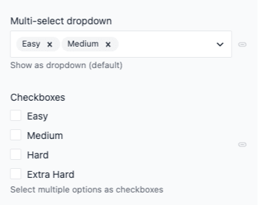
Editor In Editor settings, choose Multi Select (default dropdown) or Checkboxes (each option shown as a checkbox). Options The values that populate the select field. Click on the Add Option button to add a new option and specify the label text and value for it. Number of selections Minimum: The minimum number of selections to allow in the parameter.
Maximum: The maximum number of selections to allow in the parameter.Localizable Allows the parameter to be localizable.
If enabled, the default localization behavior can be set:
- Localized: One value can be set per locale
- Not localized: Single value is used across all locales
Editors can change the localization behavior on a per-instance basis.
Allow conditional values Set up multiple potential values and conditions for use.
Learn more about conditional values.
Use as display name Setting this value to true will show what's selected in the Multi select field as the name of the component within the structure panel of a composition. How Uniform stores the value
{ "type": "multi-select", "value": [ "optionValue1", "optionValue2" ] }Click Accept on the bottom of the dialog to update the component configuration. To add a new parameter you can also select Accept & add another in the button dropdown.
After all component updates are complete, make sure to save the component to apply your changes.
Image URL#
The image URL parameter provides a visual preview for an external image URL.
Legacy parameter type
This parameter type is recommended only for legacy projects or basic scenarios where you need to reference an external image via URL.
For new projects, we highly recommend using the asset parameter instead which is more versatile and is integrated with the Uniform Asset Library.
When adding an image URL parameter, enter the following values:
Name Description Notes Name A text field to enter a descriptive name for the parameter or its purpose.
Public ID Name that uniquely identifies the parameter. This value is available to developers, and is auto generated from the Name given. It can't be changed once it's created.
Help text A user is responsible for setting a value on the parameter. This text appears below the user-interface available for setting the parameter value.
The user interface for setting the value on a text parameter with help text set to 'Enter a short description of the event.'The help text in context of a composition.Required Indicates whether setting an image URL is required when the component is used. Default: false. Validation Regex (optional) Validation logic that limits the text the user can enter. This uses the regular expression features in the user's browser. Validation Regex Message Message displayed to the user when the input doesn't match the validation regex. Only used if the validation regex is specified. Localizable Allows the parameter to be localizable.
If enabled, the default localization behavior can be set:
- Localized: One value can be set per locale
- Not localized: Single value is used across all locales
Editors can change the localization behavior on a per-instance basis.
Allow conditional values Set up multiple potential values and conditions for use.
Learn more about conditional values.
Use as display name Setting this value to true will show what's entered in the Image URL field as the name of the component within the structure panel of a composition. How Uniform stores the value
{ "type": "image", "value": "https://my-website.dev/welcome.png" }note
Uniform doesn't optimize the image when rendered in your frontend application. Try to keep the image file size as small as possible.
The Uniform image URL parameter always requires an image URL to function correctly. You can provide this directly from an image hosted in a remote source (such as a DAM, CMS or brand gallery).
Image URL parameter no longer supports uploads
As of March 11, 2025, image uploads via the Image URL parameter are no longer supported.
Any previously uploaded images used in Image URL parameters will continue to function normally, but you cannot upload new images through this method.
For all image upload needs, please use the Asset parameter, which provides improved asset management capabilities.
Click Accept on the bottom of the dialog to update the component configuration. To add a new parameter you can also select Accept & add another in the button dropdown.
After all component updates are complete, make sure to save the component to apply your changes.
JSON Data#
The JSON data parameter lets you store any data that's serialized in valid JSON.
When adding a JSON data parameter, enter the following values:
Name Description Notes Name A text field to enter a descriptive name for the parameter or its purpose.
Public ID Name that uniquely identifies the parameter. This value is available to developers, and is auto generated from the Name given. It can't be changed once it's created.
Help text A user is responsible for setting a value on the parameter. This text appears below the user-interface available for setting the parameter value.
The user interface for setting the value on a text parameter with help text set to 'Enter a short description of the event.'The help text in context of a composition.Guidance Instructions that help Scout and AI quick edits understand what content to generate for this parameter. Describe the expected format, length, writing style, or specific requirements. Keep it concise (1-2 sentences). Learn more about AI guidance.
Required Indicates whether setting a link is required when the component is used. Default: false. Expected JSON schema By providing a JSON schema you can provide validation rules to specify the expected shape and value types of the parameters JSON data. The JSON schema needs to follow the Draft 7 specification. Localizable Allows the parameter to be localizable.
If enabled, the default localization behavior can be set:
- Localized: One value can be set per locale
- Not localized: Single value is used across all locales
Editors can change the localization behavior on a per-instance basis.
Allow conditional values Set up multiple potential values and conditions for use.
Learn more about conditional values.
Use as display name Setting this value to true will extrapolate a value from the JSON data entered as the name of the component within the structure panel of a composition. { "type": "object", "required": ["name", "sku"], "properties": { "name": { "type": "string" }, "sku": { "type": "string" }, "description": { "type": "string" }, "price": { "type": "number" }, "currency": { "type": "string" } }, "description": "A simple product schema" }How Uniform stores the value
{ "type": "json", "value": { /* any JSON data */ } }Click Accept on the bottom of the dialog to update the component configuration. To add a new parameter you can also select Accept & add another in the button dropdown.
After all component updates are complete, make sure to save the component to apply your changes.
Link#
The link parameter lets a user create a link to a:
- Node in a project map
- Static URL
- Email address
- Telephone number
If the link is to a project map node, the value will automatically update when the path of the node changes (e.g., if it's moved).
When adding a link parameter, enter the following values:
Name Description Name A text field to enter a descriptive name for the parameter or its purpose.
Public ID Name that uniquely identifies the parameter. This value is available to developers, and is auto generated from the Name given. It can't be changed once it's created.
Help text A user is responsible for setting a value on the parameter. This text appears below the user-interface available for setting the parameter value.
The user interface for setting the value on a text parameter with help text set to 'Enter a short description of the event.'The help text in context of a composition.Guidance Instructions that help Scout and AI quick edits understand what content to generate for this parameter. Describe the expected format, length, writing style, or specific requirements. Keep it concise (1-2 sentences). Learn more about AI guidance.
Types of links The types of links this parameter supports: Project map, URL, Email address, and Telephone number. All are enabled by default. Localizable Allows the parameter to be localizable.
If enabled, the default localization behavior can be set:
- Localized: One value can be set per locale
- Not localized: Single value is used across all locales
Editors can change the localization behavior on a per-instance basis.
Allow conditional values Set up multiple potential values and conditions for use.
Learn more about conditional values.
Use as display name Setting this to true displays the link value as the component's name in the structure panel. For project map links, the node ID is shown. How Uniform stores the value: Project map
{ "type": "link", "value": { "type": "projectMapNode", "path": "/path/of/node", "nodeId": "<some-id-value>", "projectMapId": "<some-id-value>" } }How Uniform stores the value: Url, email address, or telephone number
{ "type": "link", "value": { "type": "url", // or "email" or "tel" "path": "https://example.com" // or "someone@email.com" or "+1 555 555 5555" } }How to render links using Next.js and LinkParamValue
import Link from "next/link"; import { LinkParamValue, ProjectMapLinkParamValue } from "@uniformdev/canvas"; export function Button({ label, link, openInNewTab = false, }: { label: string; link: LinkParamValue | ProjectMapLinkParamValue; openInNewTab?: boolean; }) { if (!link || !link.path) return null; const target = openInNewTab ? "_blank" : "_self"; const rel = openInNewTab ? "noopener noreferrer" : undefined; if (link.type === "projectMapNode" || link.type === "url") { return ( <Link href={link.path} target={target} rel={rel}> {label} </Link> ); } if (link.type === "email") { return ( <a href={`mailto:${link.path}`} target={target} rel={rel}> {label} </a> ); } if (link.type === "tel") { return ( <a href={`tel:${link.path}`} target={target} rel={rel}> {label} </a> ); } console.warn(`Unsupported link type: ${link?.type}`); return null; }note
This example uses Next.js. If you're using plain React or another framework, replace next/link with your own router or use standard <a> tags for navigation.
Learn more about the HREF attribute.
Click Accept on the bottom of the dialog to update the component configuration. To add a new parameter you can also select Accept & add another in the button dropdown.
After all component updates are complete, make sure to save the component to apply your changes.
Number#
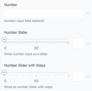
The number parameter lets a user enter a numeric value. You can configure how it appears in the editor (number field vs slider & number field).
When adding a number parameter, enter the following values:
Name Description Notes Name A text field to enter a descriptive name for the parameter or its purpose.
Public ID Name that uniquely identifies the parameter. This value is available to developers, and is auto generated from the Name given. It can't be changed once it's created.
Help text A user is responsible for setting a value on the parameter. This text appears below the user-interface available for setting the parameter value.
The user interface for setting the value on a text parameter with help text set to 'Enter a short description of the event.'The help text in context of a composition.Guidance Instructions that help Scout and AI quick edits understand what content to generate for this parameter. Describe the expected format, length, writing style, or specific requirements. Keep it concise (1-2 sentences). Learn more about AI guidance.
Required Indicates whether setting a number is required when the component is used. Default: false. Editor In Editor settings, choose Number field (default) or Slider & number field (slider plus numeric input). Integer Use this when the number is a whole number (such as 3, 17, 101, 5000). Radio button Decimal Use this when the number is a fractional number (such as 12.44, 400.00, 1044.80). Radio button Number of decimal places This controls how precise a number can the user enter. This option is only available for decimal numbers. Minimum The user can't enter a value less than this. When Slider & number field is chosen, this defines the left end of the slider range. Optional Maximum The user can't enter a value greater than this. When Slider & number field is chosen, this defines the right end of the slider range. Optional Use steps When Slider & number field is chosen, enable this to make the slider move in fixed increments (e.g. 10). Optional. Localizable Allows the parameter to be localizable.
If enabled, the default localization behavior can be set:
- Localized: One value can be set per locale
- Not localized: Single value is used across all locales
Editors can change the localization behavior on a per-instance basis.
Allow conditional values Set up multiple potential values and conditions for use.
Learn more about conditional values.
Use as display name Setting this value to true will show what's entered in the Number field as the name of the component within the structure panel of a composition. How Uniform stores the value
{ "type": "number", "value": "####.##" }tip
Notice that the value is stored as a string, not as a number.
Click Accept on the bottom of the dialog to update the component configuration. To add a new parameter you can also select Accept & add another in the button dropdown.
After all component updates are complete, make sure to save the component to apply your changes.
Rich Text#
With the rich text parameter, users can apply various formatting options such as heading levels, bold, italics, underline, strike through, and more to emphasize specific words or phrases. Additionally, it supports the inclusion of hyperlinks (both static and project map), bullet points, numbered lists, tables, and dynamic tokens.
When adding a rich text parameter, enter the following values:
Name Description Required Name A text field to enter a descriptive name for the parameter or its purpose.
Public ID Name that uniquely identifies the parameter. This value is available to developers, and is auto generated from the Name given. It can't be changed once it's created.
Help text A user is responsible for setting a value on the parameter. This text appears below the user-interface available for setting the parameter value.
The user interface for setting the value on a text parameter with help text set to 'Enter a short description of the event.'The help text in context of a composition.Guidance Instructions that help Scout and AI quick edits understand what content to generate for this parameter. Describe the expected format, length, writing style, or specific requirements. Keep it concise (1-2 sentences). Learn more about AI guidance.
Required Indicates whether setting a link is required when the component is used. Default: false. Allowed controls Controls which formatting and element options are available to users. By default all options are enabled. 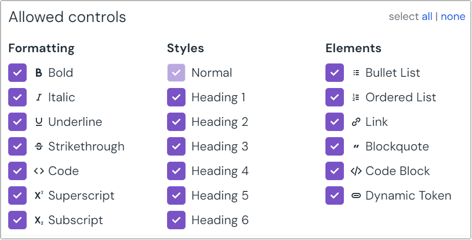 The allowed controls available in rich text.
Localizable Allows the parameter to be localizable.
If enabled, the default localization behavior can be set:
- Localized: One value can be set per locale
- Not localized: Single value is used across all locales
Editors can change the localization behavior on a per-instance basis.
Allow conditional values Set up multiple potential values and conditions for use.
Learn more about conditional values.
Use as display name Setting this value to true will show what's entered in the Rich text field as the name of the component within the structure panel of a composition. How Uniform stores the value
{ "type": "richText", "value": { "root": { "type": "root", "children": [] } } }Click Accept on the bottom of the dialog to update the component configuration. To add a new parameter you can also select Accept & add another in the button dropdown.
After all component updates are complete, make sure to save the component to apply your changes.
Text#
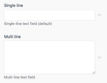
The text parameter lets a user enter a text value. You can configure validation and multi-line behavior in the editor.
When adding a text parameter, enter the following values:
Name Description Notes Name A text field to enter a descriptive name for the parameter or its purpose.
Public ID Name that uniquely identifies the parameter. This value is available to developers, and is auto generated from the Name given. It can't be changed once it's created.
Help text A user is responsible for setting a value on the parameter. This text appears below the user-interface available for setting the parameter value.
The user interface for setting the value on a text parameter with help text set to 'Enter a short description of the event.'The help text in context of a composition.Guidance Instructions that help Scout and AI quick edits understand what content to generate for this parameter. Describe the expected format, length, writing style, or specific requirements. Keep it concise (1-2 sentences). Learn more about AI guidance.
Required Indicates whether the value is required when the component is used. Allow multi-line text If selected, the user enters the text into a multi-line text box. Multi-line text is saved in a string with the line-break character \nused to separate lines.Lines count Maximum number of lines of text the user can enter. Only available when the allow multi-line text option is enabled. Validation Regex (optional) Validation logic that limits the text the user can enter. This uses the regular expression features in the user's browser. Test If a value is entered it's checked against the validation regex. Validation Regex Message Message displayed to the user when the input doesn't match the validation regex. Only used if the validation regex is specified. Localizable Allows the parameter to be localizable.
If enabled, the default localization behavior can be set:
- Localized: One value can be set per locale
- Not localized: Single value is used across all locales
Editors can change the localization behavior on a per-instance basis.
Allow conditional values Set up multiple potential values and conditions for use.
Learn more about conditional values.
Use as display name Setting this value to true will show what's entered in the Text field as the name of the component within the structure panel of a composition. How Uniform stores the value
{ "type": "text", "value": "######################" }
Custom parameters#
It is possible to implement your own custom parameter types with custom visuals, validation, and data formats using custom integrations.
tip
When you add an integration to your project, new parameter types can be enabled on your project.
Consult each integration's documentation for information about the parameter types it includes.
Group parameters#
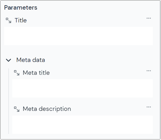
Component parameters may be grouped to help cluster related ideas together in the Canvas editor. For example, you may collect fields for meta title and meta description in a group called "Meta data."
To create a parameter group, navigate to Experience > Components and select the appropriate component in your project.
Click the tab Parameters.
Click the chevron on the Add parameter button to open the menu
Select “Add parameter group”
Enter the following values:
Field Description Name The group name will be displayed in the canvas editor. it's the only label visible when the group is collapsed. Is collapsed by default? If checked, the group will be collapsed by default. If unchecked, it will be expanded by default. Editors can always expand or collapse the group in the canvas editor. Default: checked Click OK to save your changes.
Click Save to save the changes to the component.
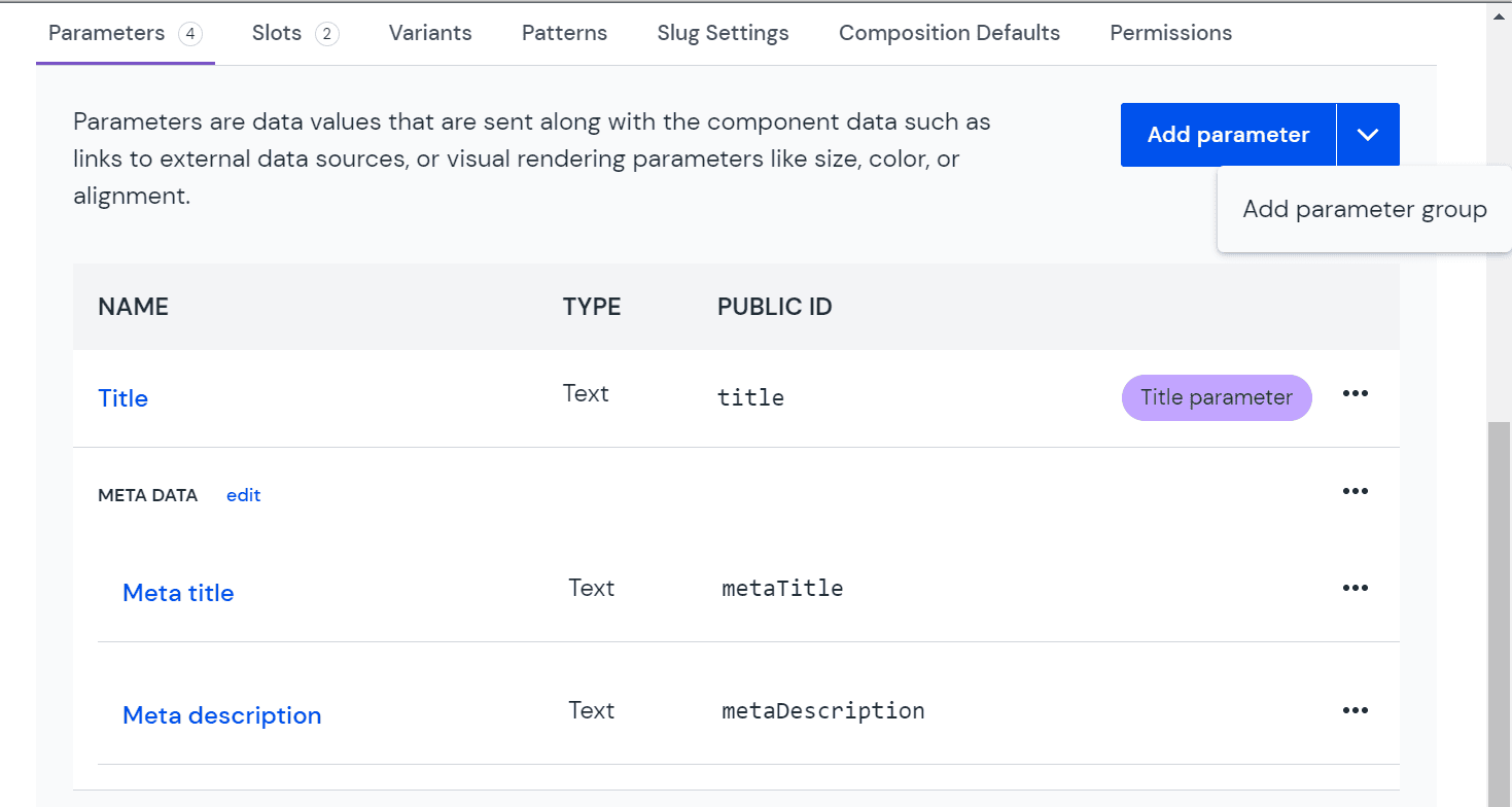 A group of parameters in the parameter view of a component.
Parameters can be added to the group by dragging and dropping them into the group. Groups can also be rearranged in the same way. The order shown in the table is the order they will be displayed in the Canvas editor.
note
Placing a parameter in a group doesn't modify the API response from Uniform.
Delete a parameter#
In your project, navigate to Experience > Components and select your component.
Click the tab Parameters.
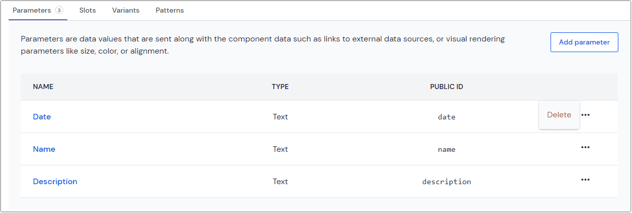 The parameters tab on the component page.
Click > Delete.
Click Save to save the changes to the component.
About this step
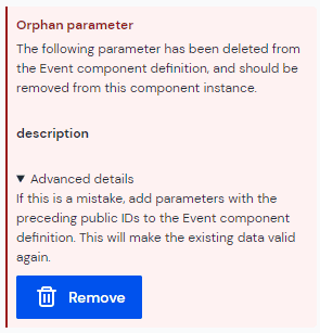
If the deleted parameter is used in any composition, when you
select the component in a composition you will see a warning
about "orphan parameter data." This tells you that Uniform is storing a value for a parameter that's not defined in the component. You must remove this value before you are able to save any changes to the composition.
Click Remove to remove this value from the composition.