How to optimize the UX for your editors
With Uniform, optimizing the user experience is easy, making it easier for your users to get their jobs done.
Below are our favorite tips on how to make the Uniform experience even better.
Organize your components#
When connecting your design system to Uniform, you will most likely have a good mix of different types of components, e.g., a Hero, Call to action, Product list, Banner, Modal, Header, etc.
One of the hidden gems in Uniform’s component library is that you can manage categories of components, it could be to organize the above components like this:
Marketing(with Hero, Call to action, Banner and Modal)Lists(with Product list)Structure(with Header)
When inserting a new component, the user can click on the category to view the components within the category.
To manage component categories, follow these steps:
- Go to a component under
Experience>Modeling>Components> Select any component. - In the
Generaltab, clickManageto the right of the Category field. - Add your categories and save.
- Associate your components to the categories.
The video below highlights how to manage your component categories.
Organize by compositions#
It’s tempting to have a few compositions as templates, e.g. Page, Article and so forth, the issue is that if you have few compositions, you properly have many components allowed in the different areas of a page. By splitting jobs to be done to separate compositions, make it easier for your users to create new experiences, without having to choose between hundreds of components.
To manage templates, follow these steps:
- Go to
Experience>Modeling>Components - For the type drop-down, select
Composition(which is your templates for e.g. pages) - Duplicate an existing composition, e.g. a Page can be duplicated to a landing page
- Open the new composition and go to the slots tab.
- Click on a slot section, e.g. body, content area, or what you have as the main area for components. This will open the allowed components, where you can optimize what is allowed according to the type of composition.
- Click save and close and your composition is ready for use.
The video below highlights how to manage compositions and allowed components:
Add screenshots#
This is the trick that will make your users love you. Create screenshots of your components, patterns and compositions, and get them uploaded to your image CDN (or use Uniform Asset Library).
For each component, composition, or pattern, use these steps to add the relevant screenshot:
- Go to
Experience>Modeling>Components> Select any component or composition. - In the
Generaltab, add the screenshot URL in the Preview Image Url box. - Save and close.
Pattern will use the preview image from its component, unless you override it on the pattern level.
- Go to
Experience>Component Patterns> Select any pattern. - Click on the Gears icon in the left sidebar to open the
Propertiespanel. - At the bottom of the drawer, see the add the
Preview Image URLyou can populate with a link to the pattern screenshot. - Save and close.
The video below highlights how to enable screenshots on components or compositions:
Add help texts#
For any fields used in a component, composition, or content entry, you can easily add help texts that provide your users with more context. Follow the steps below to create help texts.
- Go to
Experience>Modeling>Content Types> Select any content type. - In the
Fieldstab, click on a field, e.g. Title. - Add help text in the Help Text field and click Save.
- Save and close.
- Go to
Experience>Modeling>Components> Select any component or composition. - In the
Parametertab, click on a parameter, e.g. Title. - Add help text in the Help Text field and click Save.
- Save and close.
The video below highlights how to enable help texts on entries:
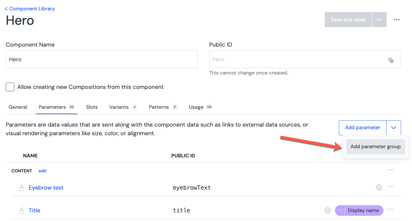
Use groups for parameters and fields#
Logical grouping of parameters and fields can be done with a couple of clicks. You can add as many groups as you need. Afterwards, you can use drag-n-drop to re-organize your fields into different groups and move groups up and down.
As for the group naming, it's common to use the following names: "Content", "Presentation", "Styling", "Call to actions" but the naming is completely up to you, as it needs to make sense to your authors.
When setting up a group, you can choose to have it be collapsed by default:
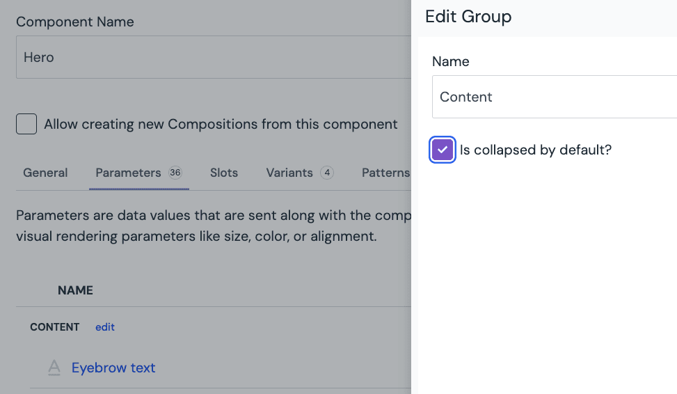
This allows to focus the editors on the most important parameters, improve the discoverability of parameters on complex components and general ease of use:
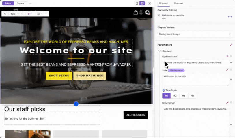
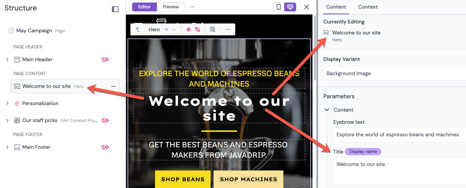
Set the "Display name" option#
This option is available on both component parameter and entry fields when you edit either a Component or a Content Type:
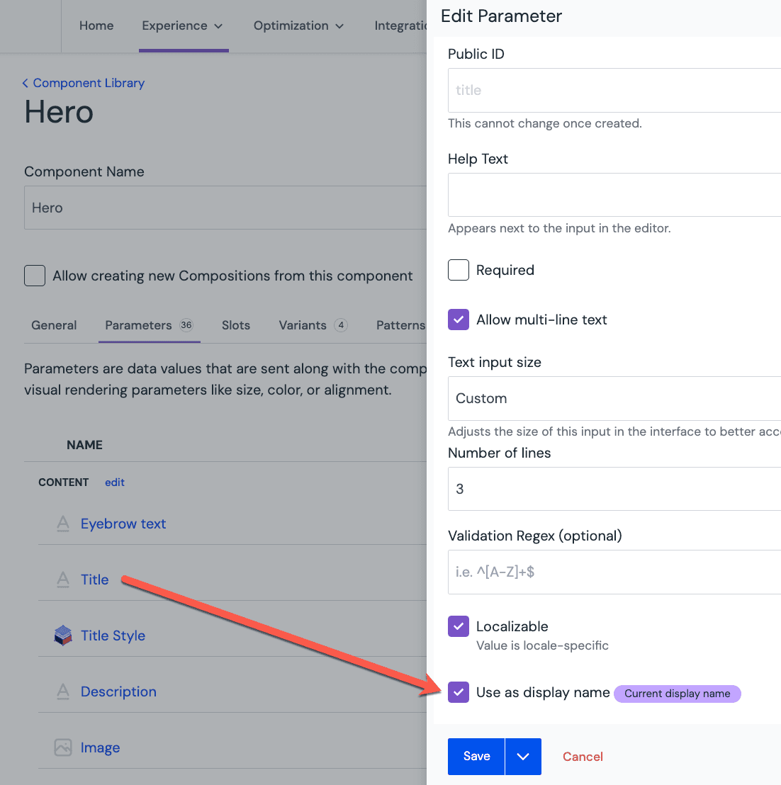
Setting this option will make the value appear as a display name for either a component or an entry. Typically, the best candidate for that is a title or name field/parameter:
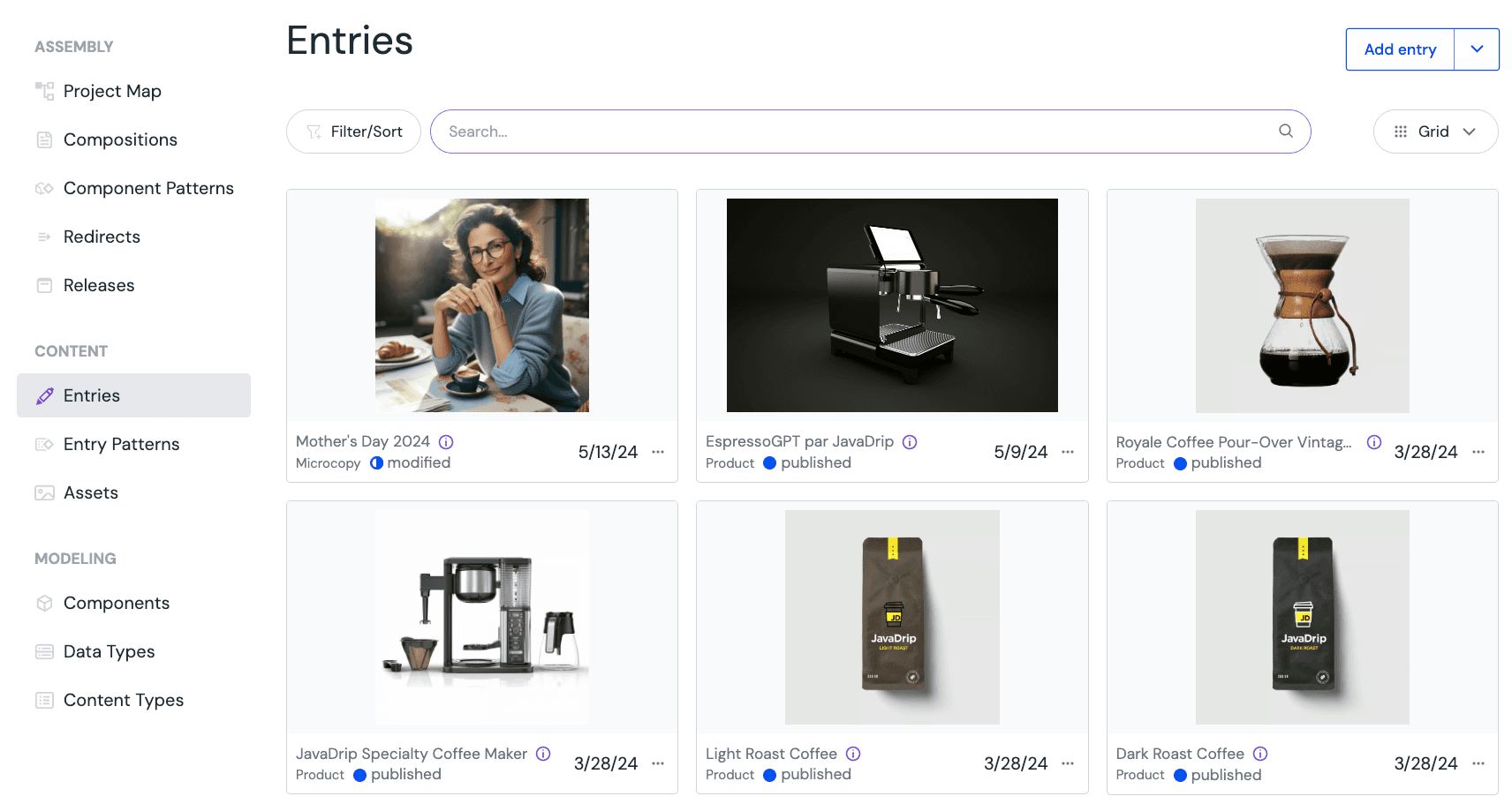
Set the "Use as thumbnail" option#
This setting is available on asset fields for content types:
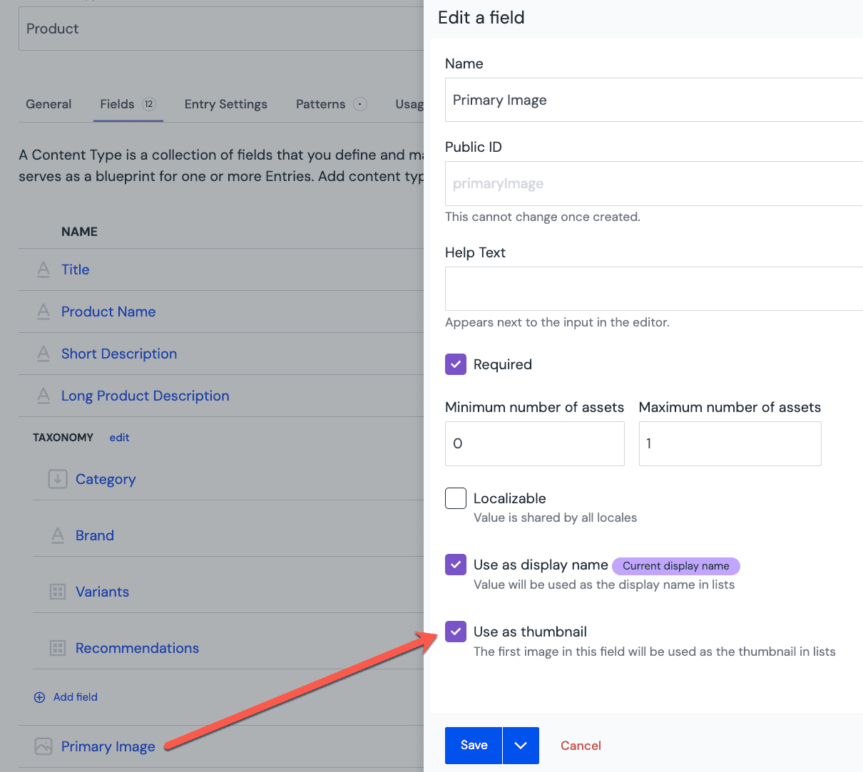
This will make your lists more appealing with visual cues for your users:
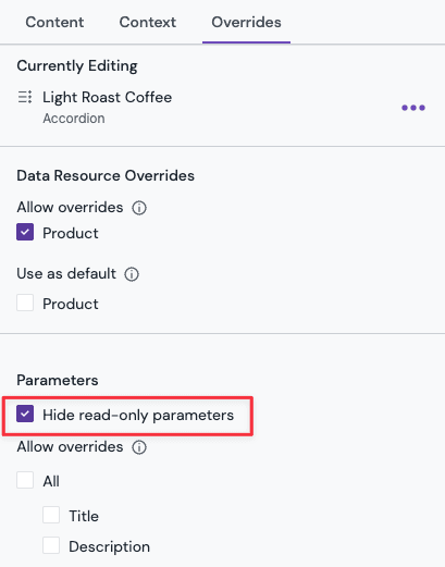
Hide read-only parameters on Patterns#
To further simplify the authoring experience, you can hide read-only parameters from the property panel of the pattern instance by enabling the "Hide read-only parameters" setting. Doing so will hide the parameter from the property panel of the pattern instance and lets authors focus on the parameters that can be changed.
Learn more about this technique here.