Patterns
Patterns are a powerful way to manage pre-assembled, reusable building blocks for content in Uniform visual workspace.
There are three kinds of patterns:
- Component patterns: Reuse pre-assembled components in multiple compositions.
- Composition patterns: Create compositions from composition patterns that have pre-assembled component structures and pre-connected data and can be centrally managed.
- Entry patterns: Create entries from entry patterns that are pre-connected to data from multiple sources and optionally enrich them with additional content.
Pattern use cases#
On a high level, patterns are useful when you want to
- avoid duplication of content and encourage reuse of content across multiple compositions
- reuse configuration: like design settings, pre-assembled component or composition structures or mapping of external data to component parameters or entry fields
- provide use case specific templates of a component, composition or entry by combining different kinds of data with a generic component or content type. For example, a "Event card" or "Product Card" would be specialized component patterns of a generic "Card" component.
- provide a simple and streamlined authoring experience for content editors
- grant flexibility and autonomy to content editors while having some guardrails in place to ensure consistency
All of these use cases are not exclusive and can be combined in a single pattern.
Use patterns to save on development costs
Patterns are proven to save a lot of development time and costs by allowing content architects and content editors to create complex reusable building blocks without needing to involve developers.
This is especially true if your design system follows a atomic design methodology which allows simple components (Atoms) to be combined into more complex component structures (Molecules or Organisms) by using patterns.
Patterns as reusable components#
One common use case for patterns is to create reusable components that can be shared across multiple compositions. These reusable component patterns can be as simple as a site-wide banner or they can contain complex nested layouts and content by placing child components in the slots of a component pattern or any of its children.
Common examples are:
- global navigation or site footers
- site-wide promotions, banners or heros
- event announcements
- legal disclaimers
Depending on the override settings of a pattern, each of its instances can either be fully static or partially overridden or augmented with custom components using slot sections.
info
This use case only applies to component patterns as they are considered standalone and reusable content items that can be referenced on one or more compositions.
Patterns as reusable configuration and content templates#
One other main use case is to use patterns to reuse configuration and structure.
This shared configuration usually includes:
- what kind of data should be used with the pattern, so called pattern data resources
- how data is mapped to component parameters or entry fields using dynamic tokens
- design settings and variants of the component and child components (only applies to component patterns)
- default values for parameters or fields
- pre-assembled component structures placed in slots of a component pattern
Often when these kinds of patterns are used, most of its content is either connected to external data or is overridden by the author while still reusing some of the shared configuration.
While components usually define how a component should look and behave, component patterns can define what content should be displayed and how the content should be mapped to the component parameters.
For example, a generic "Card" component could be re-used for multiple types of content by defining more specialized component patterns for it such as a "Product card", a "Blog post card", or a "Author card". Each component pattern would define the data source for each of these more specialized types of cards and the mappings of the data elements to the corresponding parameters.
info
These kinds of patterns are usually managed by content architects or developers who define the pattern data resources, the dynamic tokens in parameters and override settings.
Their main task is to optimize and simplify the authoring experience for content editors.
Using data resources with patterns#
Patterns can connect to external data by adding one or more data resources – so called "Pattern data resources" - to them.
There are two basic strategies for handling pattern data resources when building a pattern:
- You can permit (or even enforce) that authors replace the pattern data resource each time the pattern is instantiated using pattern overrides.
- You can prevent authors from changing the pattern data resources, making the pattern data resources static across all instances of the pattern.
Architects can blend these strategies as patterns can have any number of pattern data resources.
Best practice: Use patterns when using external data
When you're consuming external data through data resources, it's best to leverage patterns to keep the authoring experience smooth.
This way, authors can visually pick the right content for the pattern by overriding the pattern data resources, without having to worry about how to navigate JSON data to map values to the parameters of the component or the fields of an entry.
Using dynamic inputs in patterns#
Component patterns and composition patterns can use global query strings as dynamic inputs for data resources and conditional logic. This enables patterns to fetch different data or adapt behavior based on URL query parameters.
Requirements:
- Query strings must be configured as global query strings at the project map level. Node-specific query strings and dynamic path segments are not accessible to patterns.
- The composition using the pattern must be attached to a project map node and resolved through the Route API
To use dynamic path segments with a pattern, assign the dynamic input to the pattern data resource at the instance level when adding the pattern to a composition. This way, the specific value from the URL can be mapped to the pattern’s data resource as needed.
Pattern overrides#
Patterns have a powerful way to improve reuse and editorial flexibility by allowing authors to override various aspects of patterns for each instance where the pattern is used. You can override patterns in a few different ways.
- Pattern data resources
- Parameters of component patterns
- Fields of entry patterns
- Component variant setting
- Slots
Managing pattern overrides#
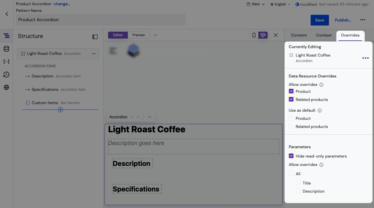
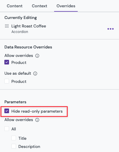
Pattern overrides are managed for the component pattern and each of its child components in the pattern editor in the "Overrides" tab of the property panel.
Same applies to entry patterns with the exception that these don't have child components.
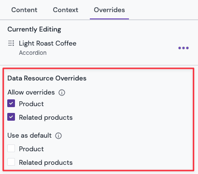
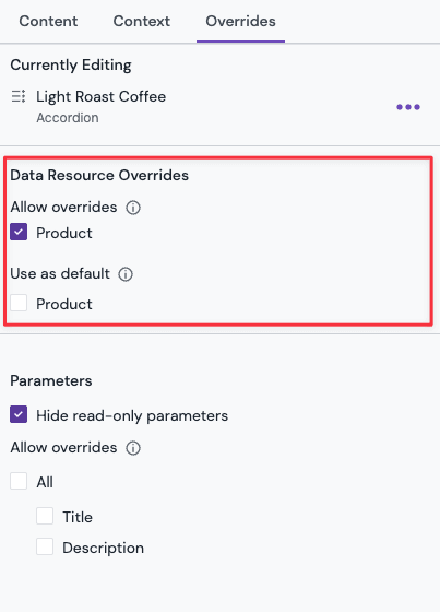
Overridable pattern data resources#
Patterns default to allowing pattern data resources to be overridden.
To change the override settings of the pattern data resources, select the checkbox for each overridable pattern data resource in the "Overrides" tab of the property panel of the pattern.
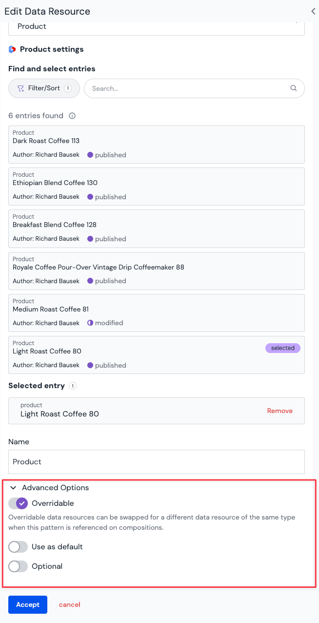
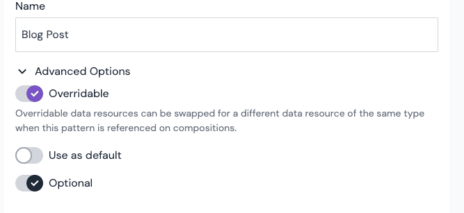
An alternative way to change the override settings for a single pattern data resource is to open the "Advanced Options" accordion on the "Edit Data Resource" dialog and toggle the "Overridable" setting.
A pattern can have some data resources that are overridable and others that aren't.
Default selection for overridable pattern data resources#
If you deselect the "Use as default" toggle you must select a data resource each time the pattern is used. Otherwise, the resource chosen during pattern creation will be the default.
- Advantages: Visual preview will show a fully functional component, making it clear how it looks and works in the context of a given digital experience.
- Disadvantages: Defaults can be powerful; and it may be important to force an explicit choice about what data resource to use in a pattern.
Static pattern data resources#
For patterns using a pattern data resource that can not be overridden, the author only needs to add the component pattern to the composition or create an entry based on an entry pattern. All other configuration is stored in the pattern. This is a great strategy for legal copy that is sourced from a CMS. Each time an author uses the legal disclaimer pattern, it will reference the same piece of legal copy from the source system.
Optional pattern data resources#
In the "Edit Data Resource" dialog in the "Advanced Options" section, you can mark a pattern data resource as optional, so that authors can choose on each instance of the pattern if they want to add the data resource or not. This can only be set if the pattern data resource is overridable and is not set as default.
Overridable parameters#
Parameters (for component patterns) can be marked as overridable. Doing so allows their value to be changed on parameter instances. This includes replacing the value with a different data resource or from a different data type.
Any overridable parameter that has a value defined on the pattern will use this value as the default value for each instance of the pattern. This also includes any dynamic token that point to values inside of a data resource.
Blocks are not overridable
Block parameter and block fields are not overridable in patterns. This means the instances of a pattern will always share the same number of blocks and the same values in each block.
Hide read-only parameters#
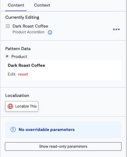
To further simplify the authoring experience, you can hide read-only parameters from the property panel of the pattern instance by enabling the "Hide read-only parameters" setting. Doing so will hide the parameter from the property panel of the pattern instance and lets authors focus on the parameters that can be changed.
When the pattern is used, the read-only parameters are hidden by default. To show them, click the "Show read-only parameters" button in the property panel of the pattern instance.
Overridable fields#
Same as with overridable parameters, fields of entry patterns can be marked as overridable. This allows authors to replace the value of a field that was marked as overridable for each entry that is based on the entry pattern.
Overridable component variant setting#
If the component that a component patterns is based on has variants, the variant setting can be marked as overridable just like any other parameter. This allows authors to change the variant setting for each instance of the component pattern. This override setting also can be set on any child component inside a slot of the component pattern if it supports variants.
Overriding slots and child components#
Slots and any nested slot of child components that is placed in a slot of a pattern aren't overridable. All components in all slots will be present for each component pattern instance. This means the placed child components inside of a slot of a component pattern can not be removed or change its position within the slot. But you can alter the parameters of any placed component in a component pattern by defining the override settings for each child component like for the root component of the pattern itself.
If you want to allow additional components to be added to a slot for an instance of a component pattern then a slot section can be placed in the slot of the component pattern.
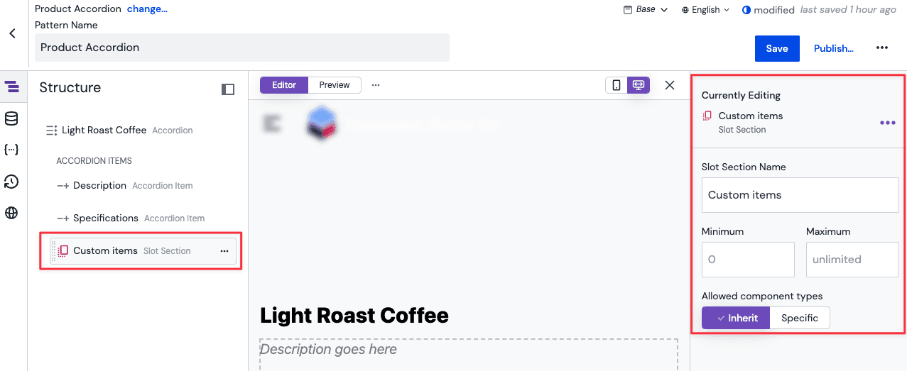
Slot Sections#
Before Slot Sections, you were not able to add additional child components in a slot of a component pattern when it is used on a composition. Components added within a slot of a component pattern came with it "fixed". Slot Sections solve for this. By placing a Slot Section inside of a slot of a component pattern (or any of its child components), you specify the location where additional components can be inserted when the component pattern is used on a composition.
For each Slot Section you can further limit which and how many components (or component patterns) can be placed inside of it. This allows you to optimize the authoring experience for specific use cases and content requirements for each component pattern.
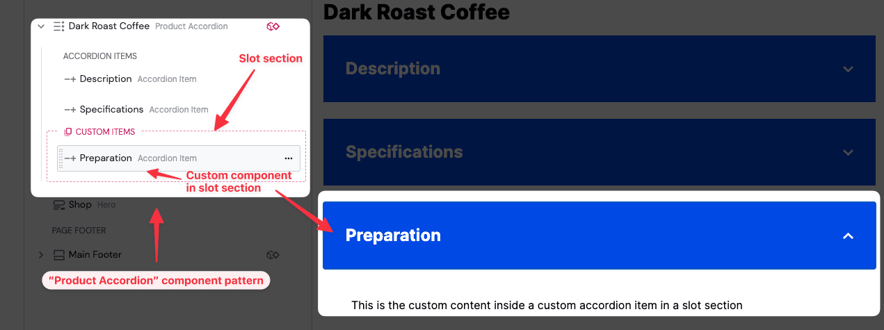
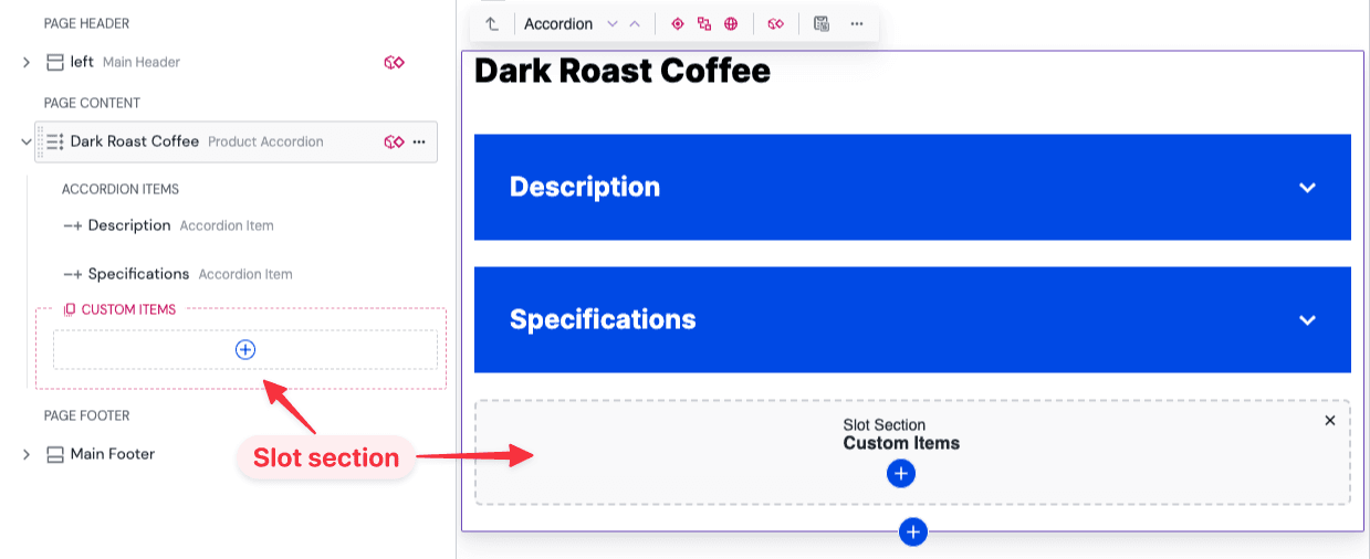
For example you could define a Slot Section called Custom items for a Product accordion component pattern that allows additional Accordion item components to be added to instances of the "Product accordion" component pattern. These additional components in the slot section are placed as siblings to any pre-defined components in the same slot.
This powerful addition to component patterns allows building generic container patterns and reserve the areas where other components can be placed. Think of a generic two-column section, for example, where you don't want to pre-define child components at design time, and allow authors to place desired component at authoring time.
Creating slot sections#
To create a slot section, edit a component pattern and open the component inserter dialog in a slot at the desired location where the slot section should be added. This can be on the top-level component of the pattern or in a slot of any of its child components.
Slot sections can be the only child component in a slot or can be placed alongside other child components in the same slot.
For example you could configure a component pattern where the first items of a slot are always present but allowing additional items to be added to the slot for each instance using the slot section.
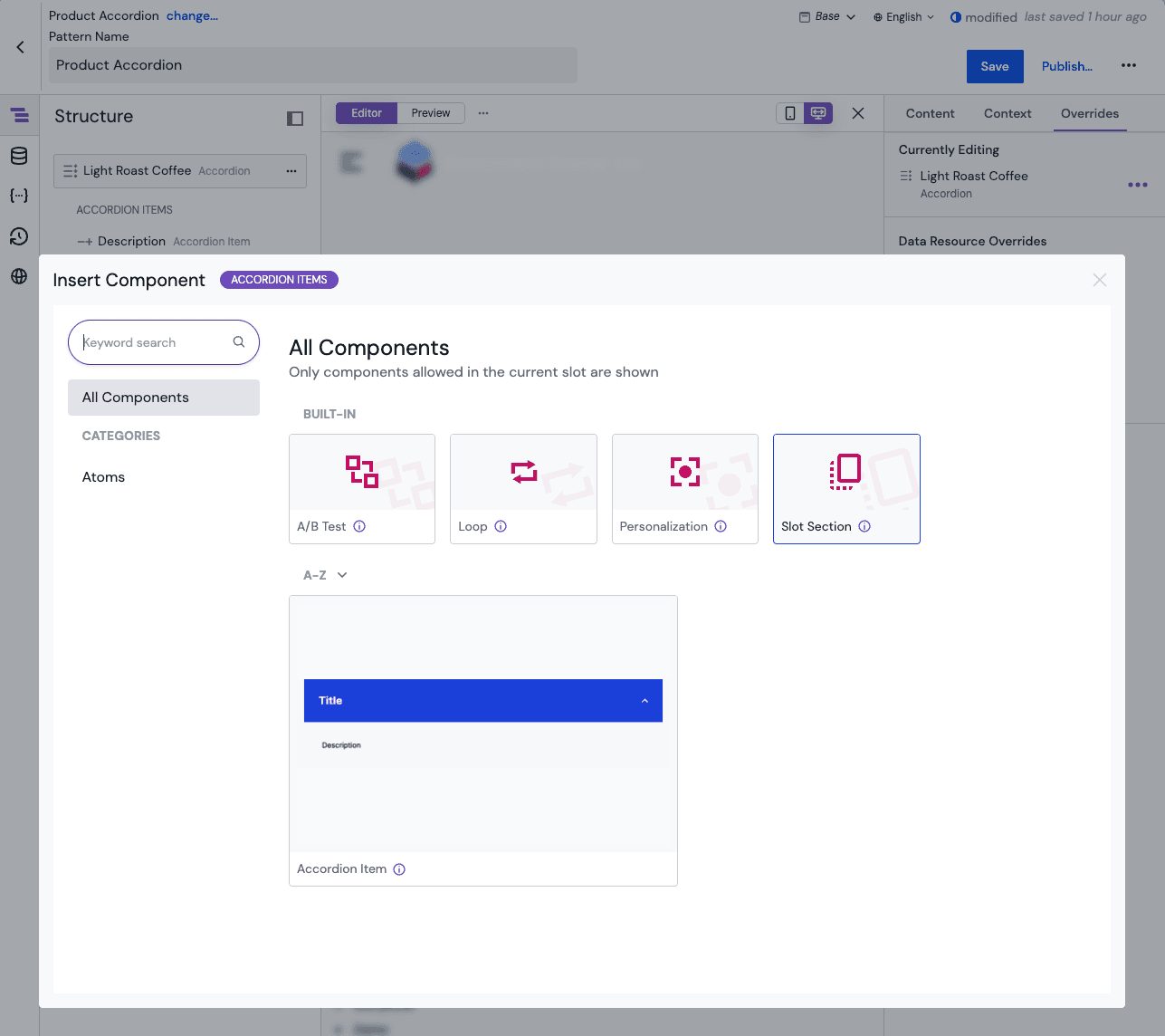
Once the slot section has been placed inside of a slot, you can configure its name and validation settings (allowed components types, minimum and maximum) in the property panel.
Allowed components configuration#
When configuring which components are allowed in a slot section, you have two options:
- Allow some: Explicitly select which components and patterns are allowed in the slot section.
- Exclude some: Inherit all components allowed in the parent slot, then exclude specific ones. This is useful when you want to allow most components but restrict a few.
Quick selection for patterns
When configuring allowed or excluded components, hold Alt (Windows/Linux) or Option (Mac) while clicking on a component to apply the selection to both the component and all patterns based on it.
Using slot sections#
When using a component or composition pattern with a slot section, the slot section will appear in the structure panel where it was placed. In the preview panel, a placeholder will be shown for empty slot sections. To insert a component into the slot section, click on the "+" icon in the slot section or on the placeholder.
If a composition is fetched via the API, any slot sections will be flattened out and the components that are placed inside of the slot section will be siblings to the components that are placed directly in the slot of the component or composition pattern. Therefore no code changes are needed to support slot sections in your application.
Known limitations of slot sections#
Slot sections that are placed inside a A/B test, Personalization or Localization container are not supported. Components that are added to such slot sections won't be recognized as variants of the parent container and can not be configured as such. However it is possible to place A/B test, Personalization or Localization containers inside of a slot section of a component pattern if these are allowed in the validation settings of the slot section.