Uniform components
A component is the basic building block of Uniform's composition capabilities. In Uniform components are used to allow the authoring of the elements dictated by your design system. You create and manage components using Uniform Canvas.
Components consist of:
- Parameters: The elements that make up the component, such as a title, description, or image.
- Slots: These allow additional components to be added within a component. For example an accordion component could have a slot for accordion items.
- Variants: Use variants for testing elements, copy, or to give authors flexibility in choosing treatments.
Create a component#
In Uniform, open your project.
Navigate to the Experience > Components tab menu.
Click the Add Component button.
Enter the following values:
Field Description Is required? Component name Name that describes the component or its purpose. Required Public ID Name that uniquely identifies the component. This value is available to developers. Required Component icon Icon that's displayed next to the component within Uniform. This helps users immediately identify components. Category
Add components to categories by which they can be found for insertion into a composition. Uncategorized is the default.
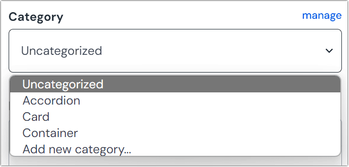 Setting a category on a component.
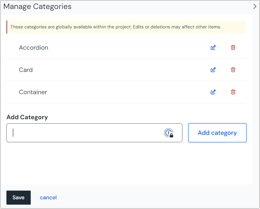 Managing the available component categories.
Preview image URL This image will be shown when someone is browsing components to insert into a composition. Description A brief description of what the component is for to help authors understand how to use it in compositions. Composition component If this is ticked, the component can be used to create a composition. Click Save and close.
About this step
The Save and close button is a dropdown. In the dropdown options you will find the Save button.
Slots#
A slot is a named area of the component that can have child components added to it.
Add a slot#
In your project, navigate to Experience > Components and select your component.
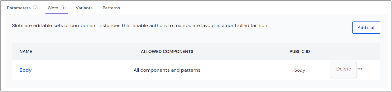
Click the tab Slots.
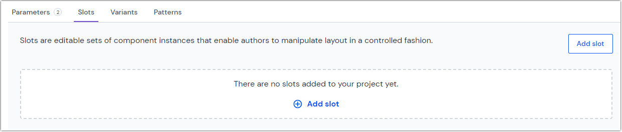 Add a slot to your component.
Click the Add slot button.
Enter the following values:
Field Description Slot name Name that describes the slot or its purpose. Public ID Name that uniquely identifies the slot. This value is available to developers. Minimum The minimum number of components that users must add to the slot before a composition with the slot can be saved. If no number is specified, the slot can be empty. Maximum The maximum number of components that users must add to the slot in order for a composition with the slot can be saved. If no number is specified, an unlimited number of components can be added to the slot. Allowed Components - All components and patterns: All components (and patterns derived from those components) can be added to the slot.
- Same as parent slot: The components that can be added to the slot depend on the components allowed in the slot the component with the slot is in.
- Specify allowed components: Choose specific components and, optionally, which patterns to allow in the slot. You must select at least one component or pattern.
Click OK to save the new slot.
Click Save to save the changes to the component.
Remove a slot#
In your project, navigate to Experience > Components and select your component.
Click the tab Slots.
 Select the slot you wish you remove.
Click > Delete.
Click Save to save the changes to the component.
About this step
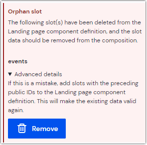
If the deleted slot was used in any composition, when you select the component in a composition you will see a warning about "orphan slot data." This tells you that Uniform is storing a value for a slot that's not defined in the component. You must remove this value before you are able to save any changes to the composition.
Click Remove orphan slot data to remove this value from the composition.
Empty slots in Canvas#
The purpose of a slot is to allow an editor to specify which components should be rendered at runtime. There are times where the page layout expects the slot to be populated, and if the slot is empty, the layout breaks.
For example, consider slots that represent a 2 column layout. If either column is empty, the layout doesn't render properly. This is only an issue when the page is first created because the editor knows that both columns must be populated with components. However, to provide the best possible editing experience, you want to avoid displaying a broken layout.
The solution is to specify a placeholder that's rendered when the slot is empty. This is done using the emptyPlaceholder prop on the slot component. The following is an example for a React-based application:
Editing mode only
This functionality is only used within Canvas when a slot is empty. Outside of Canvas, an empty slot is never rendered.
Placeholder, not sample content
The purpose of this feature is to ensure page layout doesn't break. It's not designed for you to specify sample content or default content. If you try using code like the following, you won't see the component's content in Canvas.
Hiding and restoring empty placeholders#
When an empty placeholder is rendered, a small X is added in the upper right-hand corner of the component. Clicking this will hide the empty placeholder.
In order to restore a hidden empty placeholder, you must edit local storage on your browser:
- Open your browser's developer tools.
- Click the tab Application.
- Under Local storage, select https://uniform.app.
- Find the key dismissedCanvasPlaceholders.
- The value is a JSON object where each key is a combination of the composition ID and the placeholder name. Find the placeholder you want to restore and change the value to
false.
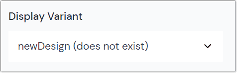
Variants (aka Display Variants)#
(Display) Variants are optional and can provide multuple additional descriptors for your components. Developers can interpret variants differently, so the implementation is solution-specific.
Learn more about (Display) Variants here.
Add a variant#
In your project, navigate to Experience > Components and select your component.
Click the tab Variants.
 Add a variant to your composition.
Click the Add variant button.
Enter the following values:
Field Description Variant name Name that describes the variant or its purpose. Public ID Name that uniquely identifies variant slot. This value is available to developers. Click Save to save the new variant.
Click Save to save the changes to the component.
Remove a variant#
In your project, navigate to Experience > Components and select your component.
Click the tab Variants.
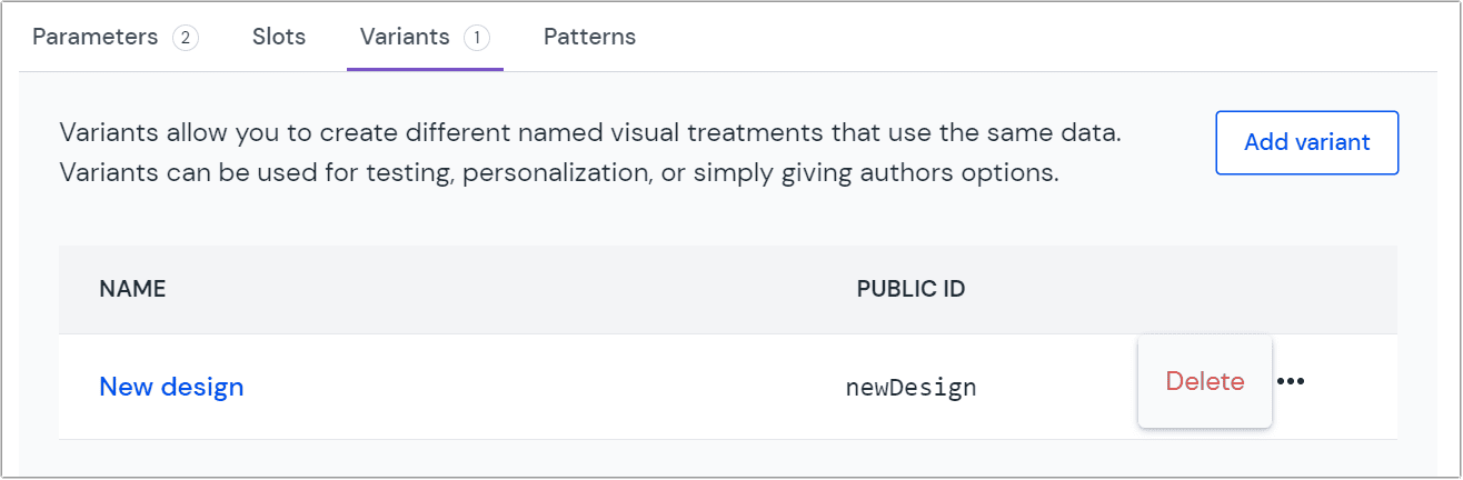 Select the variant you wish you remove.
Click > Delete.
Click Save to save the changes to the component.
About this step
If the deleted variant was used in any composition, when you open
the component you will see an error message next to component
that uses the variant. This tells you that Uniform is storing a value for a variant that's not defined in the component. You must remove this value before you are able to save any changes to the composition.
You must select the component and change the variant to Default.