Productivity report in Uniform Pulse
The Productivity tab shows a report about the work of your team. The report uses the time range and the search at the top of Pulse. For example, to see only the work on a campaign, search for the name of the campaign.
Publishing velocity#
This section shows how efficiently changes become published content:
- Edits / publish: the number of events in the range, divided by the number of publishes. A lower number means fewer events before content goes live.
- Publish rate: publishes as a percentage of all events.
- A bar chart of all events and publishes for each day. The chart shows a minimum of 7 days.
In this section, publishes are items that were published. Release launches are not counted.
Where the work goes#
This section shows the six types of content with the most events, such as compositions, entries, or assets. For each type, it shows the number of events and the percentage of all events.
Contributors#
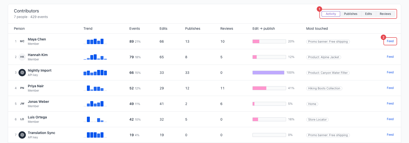
The Contributors table shows each person, API key, and system actor with events in the range. Each row has these columns:
| Column | What it shows |
|---|---|
| Person | The rank, the name, and the role: Member, API key, or System. |
| Trend | The number of events for each day. The trend shows a minimum of 7 days. |
| Events | The number of events, and the percentage of all events in the range. |
| Edits | Items that were changed or added. This includes content, project maps, project map nodes, and redirects. |
| Publishes | Items that were published, and releases that were launched. |
| Reviews | Workflow moves. |
| Edit → publish | Publishes as a percentage of edits. The maximum is 100%. |
| Most touched | The item with the most events from this contributor. |
To sort the table, select Activity, Publishes, Edits, or Reviews at the top right of the table. The default is Activity, which sorts by the number of events.
To see all events of one contributor, select Feed on their row. The Activity tab opens and shows only their events.
People and automation#
This section compares three groups: people, API keys, and the system. For each group, it shows the number of actors, events, and publishes.
A large share of events from API keys is normal when you import or sync content. Use this section to make sure that your automations do what you expect.
When people work#
This chart shows the number of events for each hour of the day, in the time zone of your browser. It counts all events, also the events from API keys and the system.
Use this chart to see when your team is most active, and to find activity at unusual hours.