The Algolia integration now installs components that map to Algolia React components from react-instantsearch-hooks-web SDK , allowing business users to compose custom search experiences in Canvas.
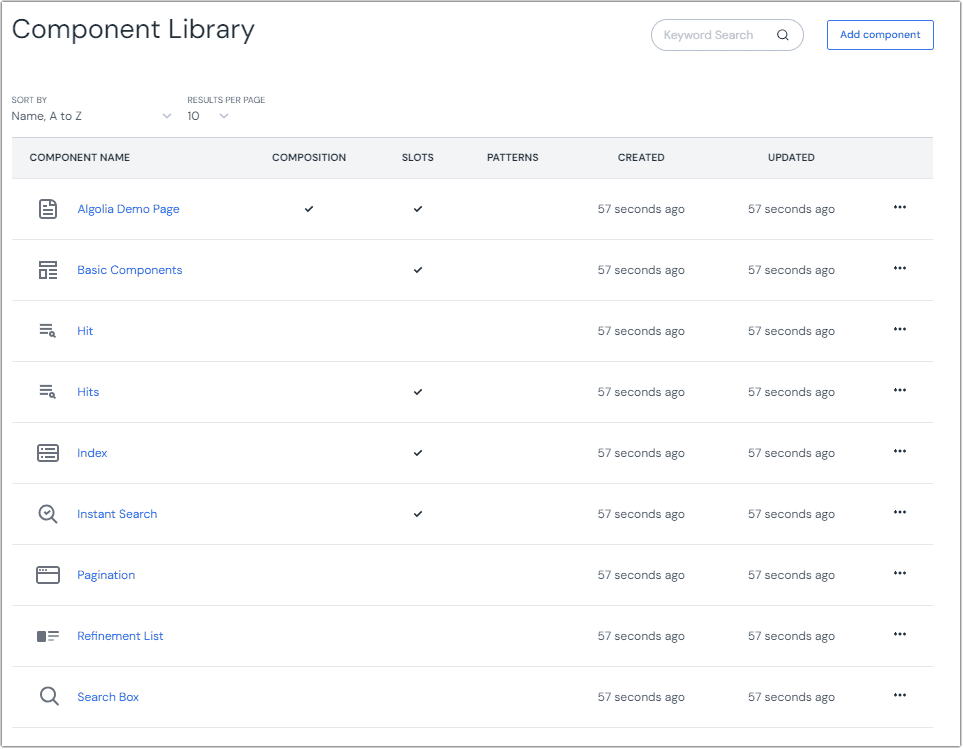
After you install the Algolia integration, the following components will be added to your Uniform project.
These components represent the Algolia React components within your Uniform project. You must still add the React components to your app.
Type Description Algolia Demo Page This is a composition component that contains all the components available through the Algolia integration. It represents a web page experience. Basic Components Configures parameters for search box, refinement list, hits, and pagination. Hit and Hits Shows search results returned. Index Allows searching multiple indices. InstantSearch Connects your InstantSearch app to your Algolia application. Pagination Allows users to navigate through all the returned hits. Refinement List Filters search results by specific criteria (size, color, etc.). Search Box Represents the main UI component of the search experience.
Update your Next.js app# When you add the Algolia integration, Uniform components that represent the Algolia React components are automatically added to your Uniform project. You must add the React components to your front-end application.
Install npm packages# Open a terminal in the root of your project.
Enter the following command:
npm i @uniformdev/canvas-algolia algoliasearch instantsearch.css react-instantsearch-hooks-web
Copied! Add environment variables# Add the following environment variables to your .env file. Be sure to use the values that match your Algolia application:ALGOLIA_APPLICATION_ID=
ALGOLIA_API_KEY=
Copied! Add the following to your next.config.js file: publicRuntimeConfig: {
applicationId: process.env.ALGOLIA_APPLICATION_ID,
algoliaApiKey: process.env.ALGOLIA_API_KEY,
},
Copied! Add component CSS# Add the following code to ensure search results are formatted properly:
pages/_app.tsx
import "instantsearch.css/themes/algolia.css";
Copied! Add React components# The following React components are required to display search controls and results.
These components are examples
These components are just examples to demonstrate how to render search results. You can modify them as you like.
Error Property Callout# This component is used to display error messages when one of the Algolia component in Uniform is not configured properly.
canvas/Algolia/ErrorPropertyCallout.tsx
import React from 'react';
const ErrorPropertyCallout = ({ title }: { title?: string }) => (
<div className="callout">
<span className="callout-title">{title}</span>
<span>
One or more parameters on the Algolia component is not configured properly.
</span>
</div>
);
export default ErrorPropertyCallout;
Copied! Hit# This component is responsible for rendering an individual hit from the search results.
Replace this rendering logic
This code renders a hit by stringify-ing the JSON representation of the hit. This can be helpful for identifying the data that is returned, but you will almost certainly want to replace this rendering logic with something more appropriate for your site.
canvas/Algolia/Hit.tsx
import React from 'react';
import { Hits } from 'react-instantsearch-hooks-web';
import { ComponentInstance } from '@uniformdev/canvas';
enum HitTypes {
Hit = 'algolia-hit',
}
export const renderHits = (component: ComponentInstance) => {
const hitType = component?.slots?.hitComponent?.[0]?.type;
switch (hitType) {
case HitTypes.Hit:
return <Hits hitComponent={Hit} />;
default:
return <Hits />;
}
};
type HitComponent = {
objectID: string;
[name: string]: any;
};
const Hit = ({ hit }: { hit: HitComponent }) => {
const { objectID = 'unknown', ...properties } = hit || {};
return (
<div>
<h3>{`objectID: ${objectID}`}</h3>
<p style={{ wordBreak: 'break-all' }}>{JSON.stringify(properties)}</p>
</div>
);
};
export default Hit;
Copied! Instant Search# This component acts as a container for other components that allow the search to be configured. The purpose of this component is to allow you to configure basic search parameters, such as the index used.
canvas/Algolia/CanvasInstantSearch.tsx
import React from 'react';
import { ComponentProps, UniformSlot } from '@uniformdev/canvas-react';
import algoliasearch from 'algoliasearch/lite';
import { InstantSearch } from 'react-instantsearch-hooks-web';
import getConfig from 'next/config';
import CanvasAlgoliaProvider from '../../context/CanvasAlgoliaProvider';
import ErrorPropertyCallout from '@/canvas/Algolia/ErrorPropertyCallout';
const {
publicRuntimeConfig: { applicationId, algoliaApiKey },
} = getConfig();
const searchClient = algoliasearch(applicationId, algoliaApiKey);
type CanvasInstantSearchProps = {
title?: string;
instantSearchParams?: {
instantSearchProps?: {
indexName?: string;
stalledSearchDelay?: number;
};
};
};
const CanvasInstantSearch = ({ instantSearchParams, title }: ComponentProps<CanvasInstantSearchProps>) => {
const { instantSearchProps } = instantSearchParams || {};
if (!instantSearchProps?.indexName) {
return <ErrorPropertyCallout title="Property 'indexName' was not defined for InstantSearch component." />;
}
return (
<CanvasAlgoliaProvider defaultIndexName={instantSearchProps.indexName}>
{Boolean(title) && <h2>{title}</h2>}
<InstantSearch {...instantSearchProps} indexName={instantSearchProps.indexName} searchClient={searchClient}>
<UniformSlot name="widgets" />
</InstantSearch>
</CanvasAlgoliaProvider>
);
};
export default CanvasInstantSearch;
Copied! Basic Components# This component provides a full set of search capabilities. It can be used without having to add individual components to the Instant Search component.
canvas/Algolia/BasicComponents.tsx
import React from 'react';
import { ComponentProps } from '@uniformdev/canvas-react';
import { Configure, Pagination, RefinementList, SearchBox } from 'react-instantsearch-hooks-web';
import ErrorPropertyCallout from '@/canvas/Algolia/ErrorPropertyCallout';
import { renderHits } from '@/canvas/Algolia/Hit';
type CanvasBasicComponentsProps = {
searchBoxParams?: {
searchBoxProps?: {
placeholder?: string;
searchAsYouType?: boolean;
};
};
refinementListParams?: {
refinementListProps?: {
allowedIndex?: string;
attribute: string;
operator: 'and' | 'or';
limit?: number;
showMore?: boolean;
showMoreLimit?: number;
searchable?: boolean;
searchablePlaceholder?: string;
escapeFacetValues?: boolean;
};
};
paginationParams?: {
paginationProps?: {
totalPages?: number;
padding?: number;
showFirst?: boolean;
showPrevious?: boolean;
showNext?: boolean;
showLast?: boolean;
};
};
pageSize?: number;
};
const CanvasBasicComponents = (componentProps: ComponentProps<CanvasBasicComponentsProps>) => {
const { component, searchBoxParams, refinementListParams, paginationParams, pageSize } = componentProps || {};
const refinementListProps = refinementListParams?.refinementListProps;
if (!refinementListProps?.attribute) {
return (
<ErrorPropertyCallout title="Property 'attribute' was not defined for RefinementList parameter in BasicComponents component." />
);
}
const { allowedIndex, ...pureRefinementListProps } = refinementListProps;
return (
<>
<Configure hitsPerPage={pageSize} />
<div className="searchBox">
<SearchBox {...searchBoxParams?.searchBoxProps} />
</div>
<div className="refinementList">
<span>{refinementListProps.attribute}</span>
<RefinementList {...pureRefinementListProps} />
</div>
<div className="hits">{renderHits(component)}</div>
<div className="pagination">
<Pagination {...paginationParams?.paginationProps} />
</div>
</>
);
};
export default CanvasBasicComponents;
Copied! Canvas Hits# This component renders the hits that make up a search result.
canvas/Algolia/CanvasHits.tsx
import React from 'react';
import { ComponentProps } from '@uniformdev/canvas-react';
import { renderHits } from '@/canvas/Algolia/Hit';
const CanvasHits = (componentProps: ComponentProps) => {
return <div className="hits">{renderHits(componentProps.component)}</div>;
};
export default CanvasHits;
Copied! Index# This component allows you to specify the Algolia index an Instant Search component uses.
canvas/Algolia/CanvasIndex.tsx
import React from 'react';
import { Index } from 'react-instantsearch-hooks-web';
import { ComponentProps, UniformSlot } from '@uniformdev/canvas-react';
import { getDefaultIndexName } from '../../context/CanvasAlgoliaProvider';
import ErrorPropertyCallout from '@/canvas/Algolia/ErrorPropertyCallout';
type CanvasIndexProps = {
indexParams?: {
indexProps?: {
indexName?: string;
indexId?: string;
};
};
};
const CanvasIndex = (componentProps: ComponentProps<CanvasIndexProps>) => {
const { indexProps } = componentProps?.indexParams || {};
const indexName = indexProps?.indexName || getDefaultIndexName();
if (!indexName) {
return <ErrorPropertyCallout title="Property 'indexName' was not defined for Index component." />;
}
return (
<div className="index">
<Index {...indexProps} indexName={indexName}>
<UniformSlot name="widgets" />
</Index>
</div>
);
};
export default CanvasIndex;
Copied! This component allows you to configure pagination for search hits.
canvas/Algolia/CanvasPagination.tsx
import React from 'react';
import { Configure, Pagination } from 'react-instantsearch-hooks-web';
import { ComponentProps } from '@uniformdev/canvas-react';
type CanvasPaginationProps = {
paginationParams?: {
paginationProps?: {
totalPages?: number;
padding?: number;
showFirst?: boolean;
showPrevious?: boolean;
showNext?: boolean;
showLast?: boolean;
};
};
pageSize?: number;
};
const CanvasPagination = ({ paginationParams, pageSize }: ComponentProps<CanvasPaginationProps>) => {
const { paginationProps } = paginationParams || {};
return (
<>
<Configure hitsPerPage={pageSize} />
<div className="pagination">
<Pagination {...paginationProps} />
</div>
</>
);
};
export default CanvasPagination;
Copied! Refinement List# This component allows you to specify the attribute whose value is used to filter search hits.
canvas/Algolia/CanvasRefinementList.tsx
import React from 'react';
import { RefinementList } from 'react-instantsearch-hooks-web';
import { ComponentProps } from '@uniformdev/canvas-react';
import ErrorPropertyCallout from '@/canvas/Algolia/ErrorPropertyCallout';
type CanvasRefinementListProps = {
refinementListParams?: {
refinementListProps?: {
allowedIndex?: string;
attribute: string;
operator: 'and' | 'or';
limit?: number;
showMore?: boolean;
showMoreLimit?: number;
searchable?: boolean;
searchablePlaceholder?: string;
escapeFacetValues?: boolean;
};
};
};
const CanvasRefinementList = ({ refinementListParams }: ComponentProps<CanvasRefinementListProps>) => {
const { refinementListProps } = refinementListParams || {};
if (!refinementListProps?.attribute) {
return <ErrorPropertyCallout title="Property 'attribute' was not defined for RefinementList component." />;
}
const { allowedIndex, ...props } = refinementListProps;
return (
<div className="refinementList">
<span>
Search results are filtered by the following attribute: <code>{refinementListProps?.attribute}</code>
</span>
<RefinementList {...props} />
</div>
);
};
export default CanvasRefinementList;
Copied! Search Box# This component allows you to add a search box that a user can enter text that is used to filter the search hits.
canvas/Algolia/CanvasSearchBox.tsx
import React from 'react';
import { SearchBox } from 'react-instantsearch-hooks-web';
import { ComponentProps } from '@uniformdev/canvas-react';
type CanvasSearchBoxProps = {
searchBoxParams?: {
searchBoxProps?: {
placeholder?: string;
searchAsYouType?: boolean;
};
};
};
const CanvasSearchBox = ({ searchBoxParams }: ComponentProps<CanvasSearchBoxProps>) => {
const { searchBoxProps } = searchBoxParams || {};
return (
<div className="searchBox">
<SearchBox {...searchBoxProps} />
</div>
);
};
export default CanvasSearchBox;
Copied! Register React components# You must register the React components so the components in the Uniform composition can be mapped to the appropriate React components.
Add the following file to register the components:
canvas/Algolia/index.tsx
import { registerUniformComponent } from '@uniformdev/canvas-react';
import BasicComponents from './BasicComponents';
import CanvasHits from './CanvasHits';
import CanvasIndex from './CanvasIndex';
import CanvasInstantSearch from './CanvasInstantSearch';
import CanvasPagination from './CanvasPagination';
import CanvasRefinementList from './CanvasRefinementList';
import CanvasSearchBox from './CanvasSearchBox';
registerUniformComponent({
type: 'algolia-basicComponents',
component: BasicComponents,
});
registerUniformComponent({
type: 'algolia-hits',
component: CanvasHits,
});
registerUniformComponent({
type: 'algolia-index',
component: CanvasIndex,
});
registerUniformComponent({
type: 'algolia-instantSearch',
component: CanvasInstantSearch,
});
registerUniformComponent({
type: 'algolia-pagination',
component: CanvasPagination,
});
registerUniformComponent({
type: 'algolia-refinementList',
component: CanvasRefinementList,
});
registerUniformComponent({
type: 'algolia-searchBox',
component: CanvasSearchBox,
});
Copied! Add the following code to the top of the following file:
pages/_app.tsx
import '@/canvas/Algolia';
Copied! Add search to a composition# Now you can add search components to your compositions. The following steps guide you through the process of adding a search box, hits, and pagination.
In Uniform, open a composition. Add the component Instant Search to a slot. On the component there is a parameter Instant Search Parameters . Click the button Set Value . Select the index from your Algolia search application. In the slot Widgets , add the component Search Box . In the slot Widgets , add the component Hits . In the slot Widgets , add the component Pagination .