Build custom product detail page
This tutorial requires a Uniform sandbox with the JavaDrip project. If you need access to one, contact us.
In addition, a video tutorial is available on our Connect portal.
During the first exercise, you went through the process of designing and launching a new Landing Page for the JavaDrip Specialty product launch. Next you will take that a step further.
Like a lot of large sites, JavaDrip is setup to automatically display products, articles, etc., that are managed in the CMS, without a business user designing specific layouts for each one.
But what do you do when you need a very specific layout as a one-off for a particular product, article, or other content? This new coffee maker is an example where the marketing team wants a unique and more compelling layout for the Specialty, rather than the default.
About the Product Detail Page layout#
Default components#
By default, every product detail page has the same layout, which consists of the following components:
Components that appear on every page, such as the header and footer, are excluded.
Product Info#
This component displays product information.
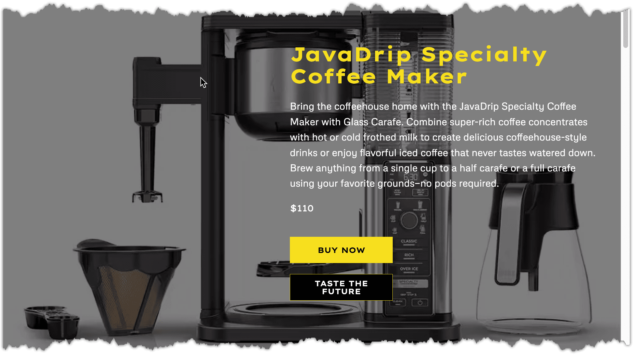
Image Gallery#
This component displays a set of images related to the product.
Recommendations#
This component shows recommended products that JavaDrip wants to sell. All product detail pages (PDPs) show the same recommended products. In this tutorial you will select recommended products for the JavaDrip Speciality Coffee Maker page.
What changes will you make?#
In this tutorial you will create a specialized PDP for the JavaDrip Speciality product launch. It will be different from the default PDP in the following ways:
- A Hero component will appear before the Product Info component.
- A Product Feature Cards component will appear after the Product Info component. It will display features of the coffee machine.
- The title on the Image Gallery component will be customized for this product.
- A Reviews component will display customer reviews for this product.
- A Recommendations component will show products that are recommended for people interested in this product.
Create a new composition#
Change the Project Map node#
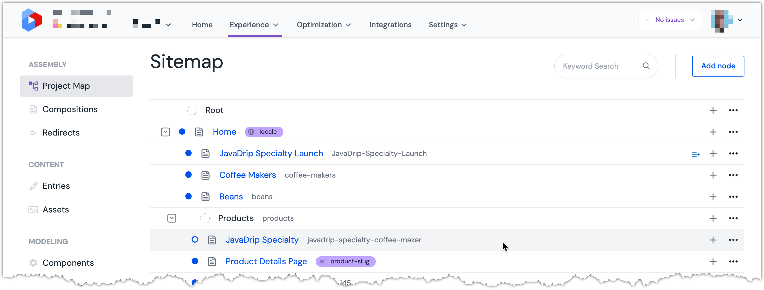
In Uniform, open the Project Map.
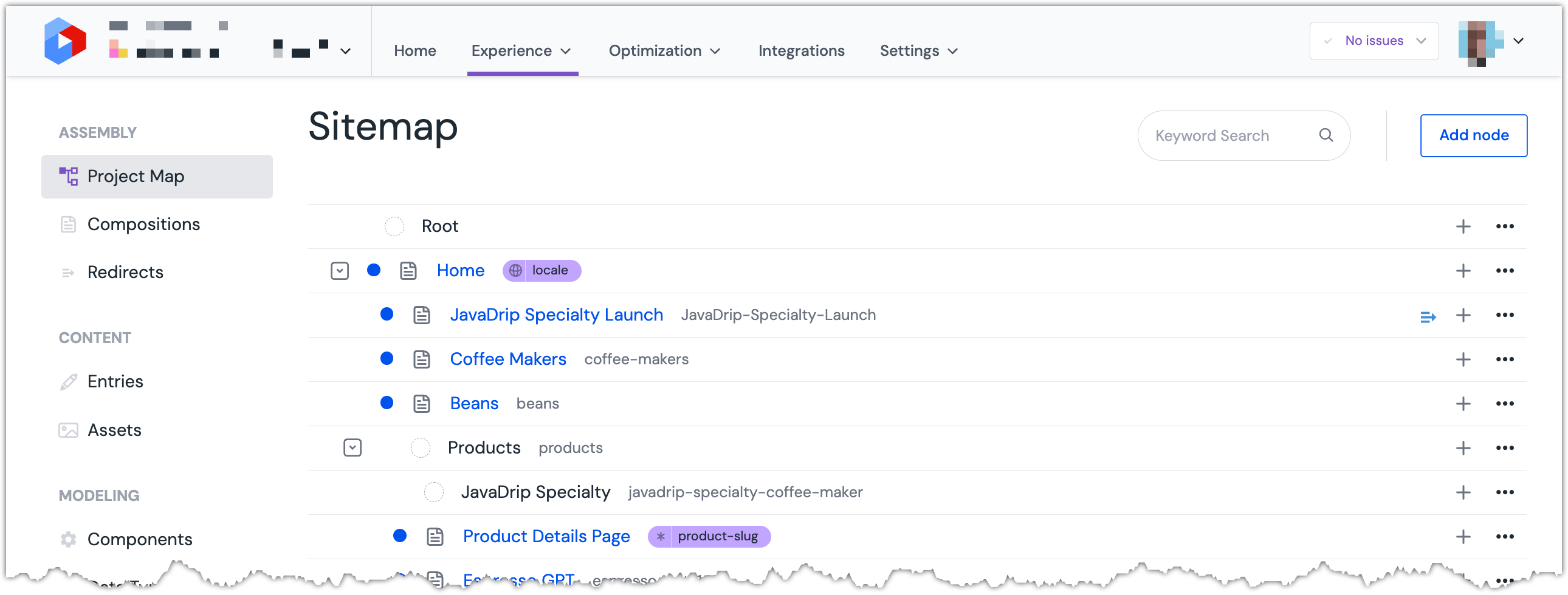 The Project Map for the Uniform project.
In the Project Map node
JavaDrip Speciality, click and select Edit.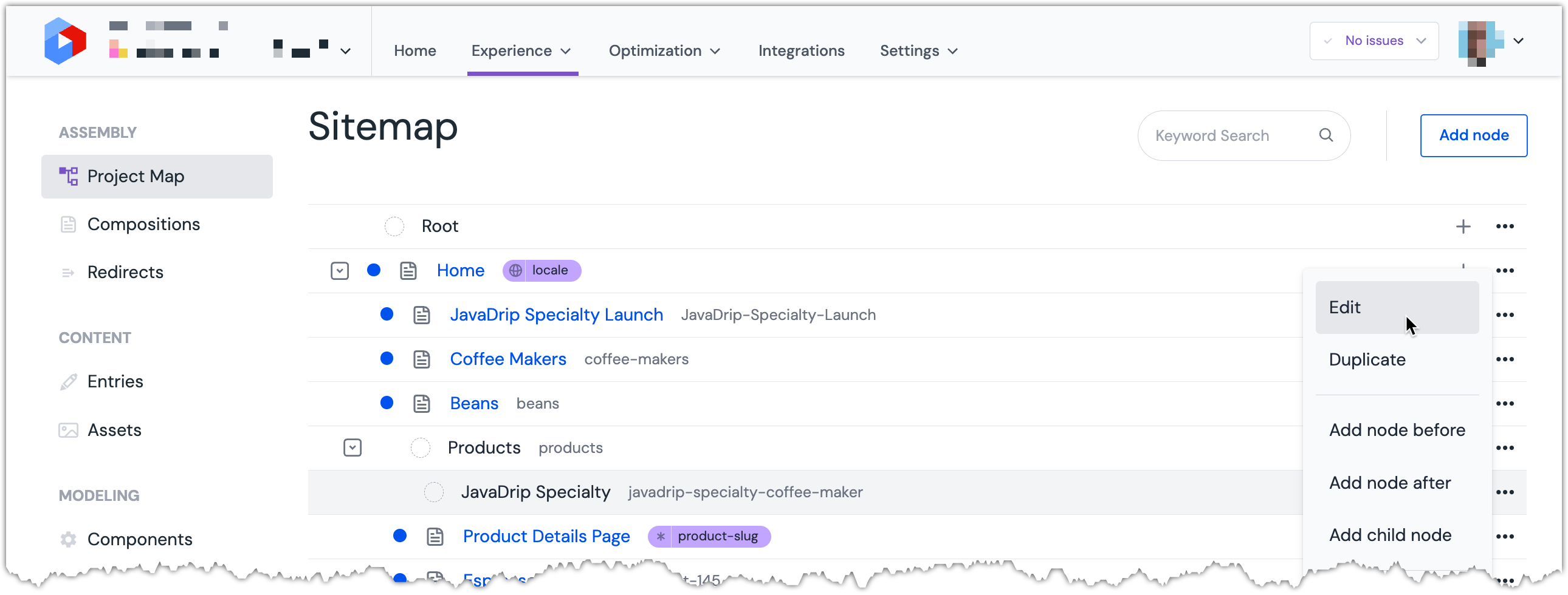 The menu for a Project Map node.
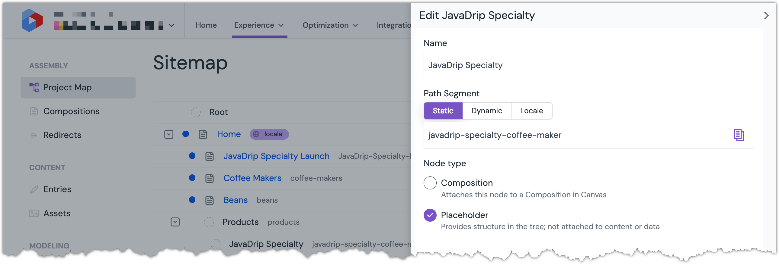 The Project Map Node Edit Drawer is opened.
Under Node type, click Composition.
 The Project Map node type is changed to Composition.
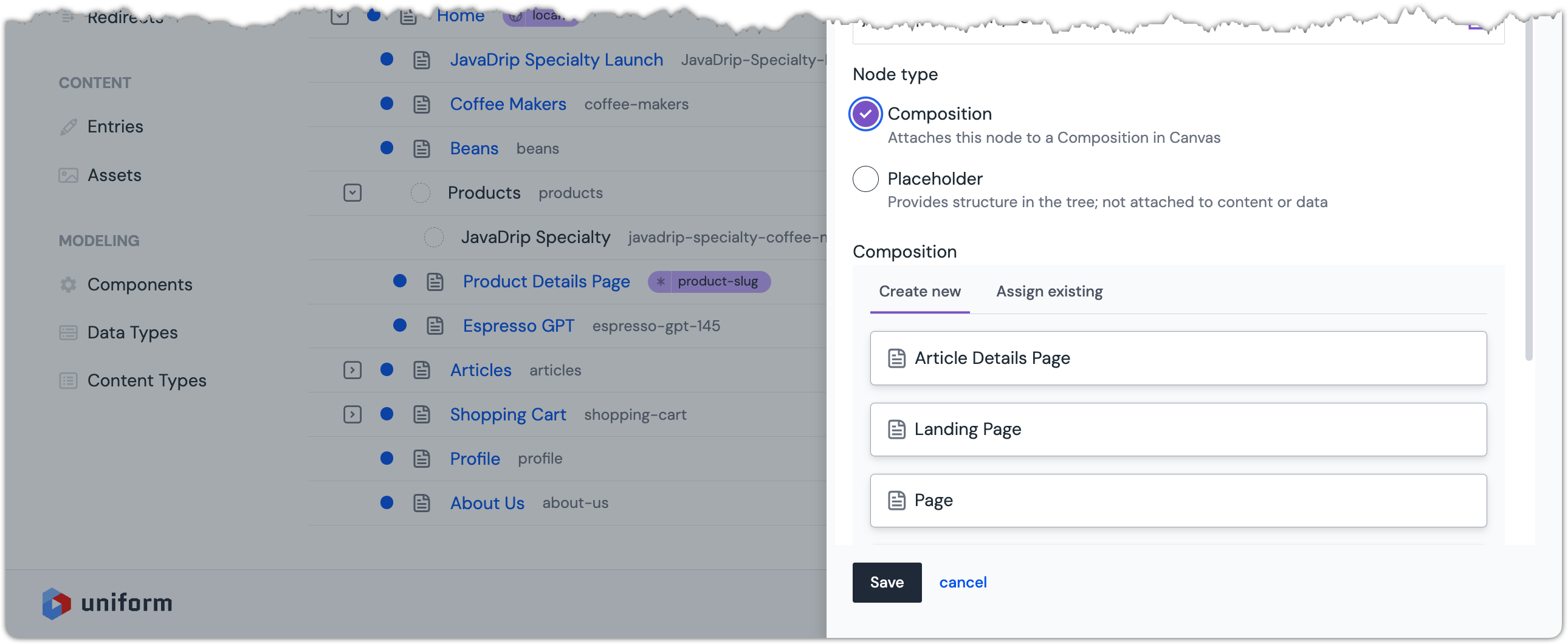
Under the Composition section, select
Product Details Page.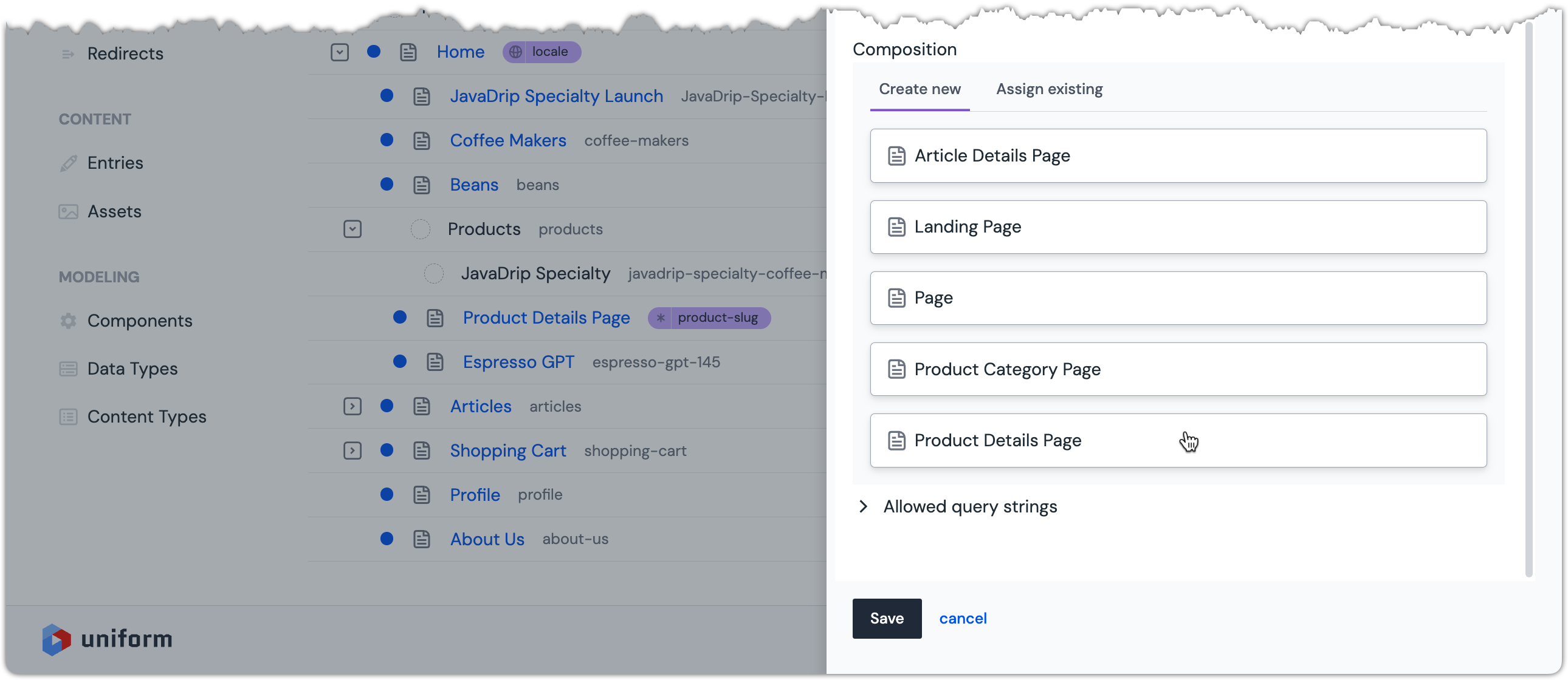 You might need to scroll down in order to find the Product Details Page option.
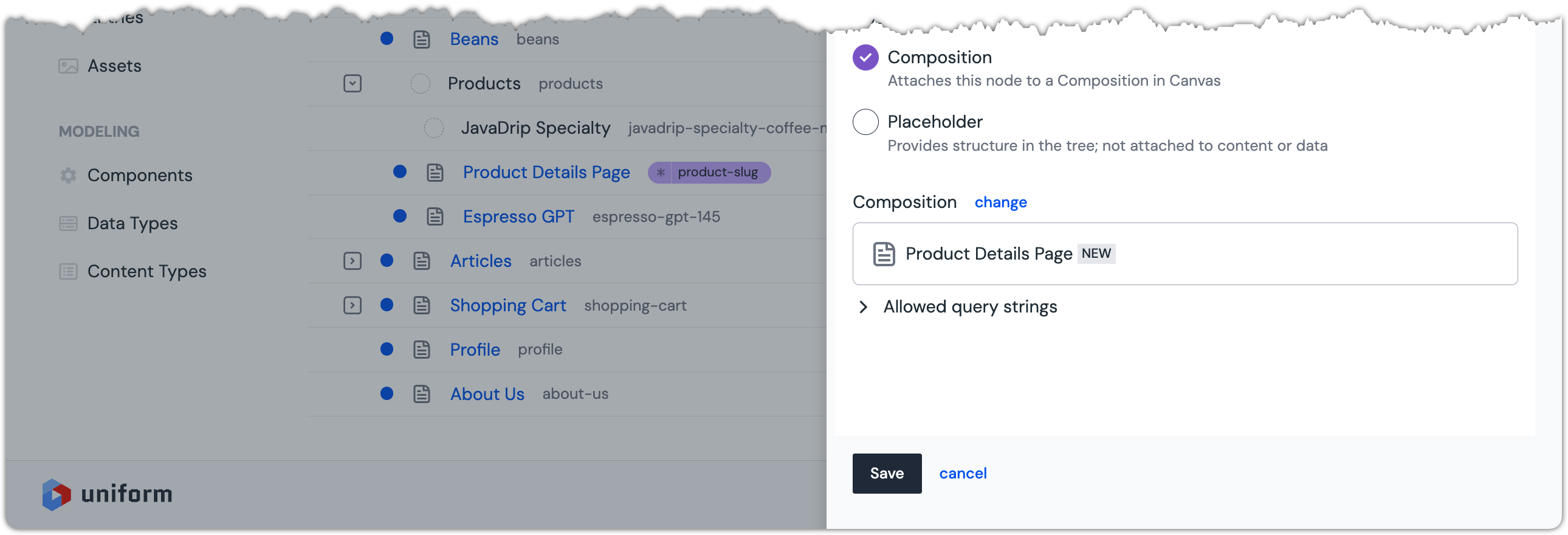 The Product Details Page option is selected.
Click Save.
 The Project Map node has a composition assigned.
About this step
This is how you replace a placeholder in the Project Map with a new composition.
Set the page title#
On the Project Map Node, click
JavaDrip Specialty.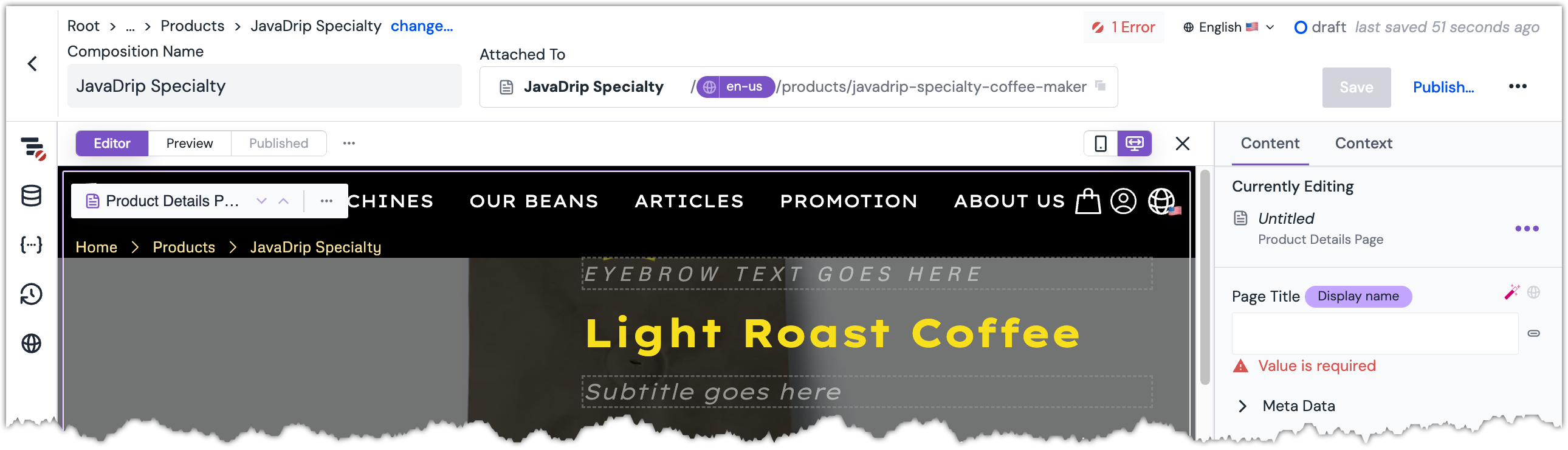 The composition open in Uniform.
About this step
This is how you open the composition assigned to a Project Map node.
On the composition, set the parameter
Page Titleto the following value:JavaDrip Specialty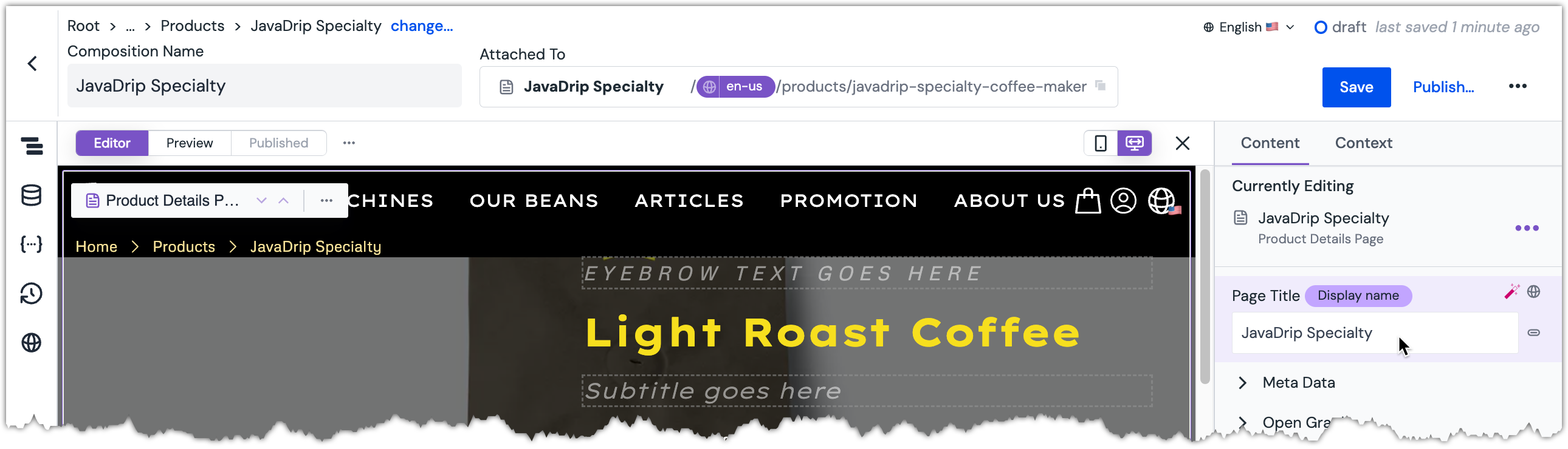 The title is set on the composition.
About this step
You do not see this value anywhere on the page, but it is used as the title in the browser tab when a visitor views the page.
Update the Product Info component#
Select the Product Info component.
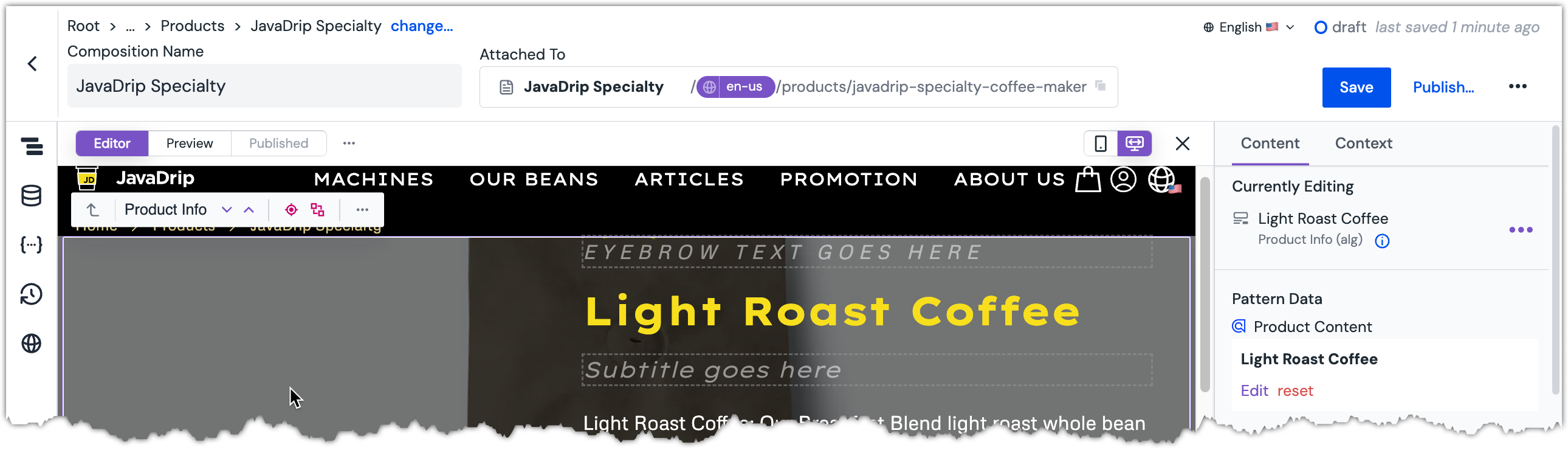 The Product Info component is selected.
Set Pattern Data to the record that matches the following product slug:
javadrip-specialty-coffee-maker-141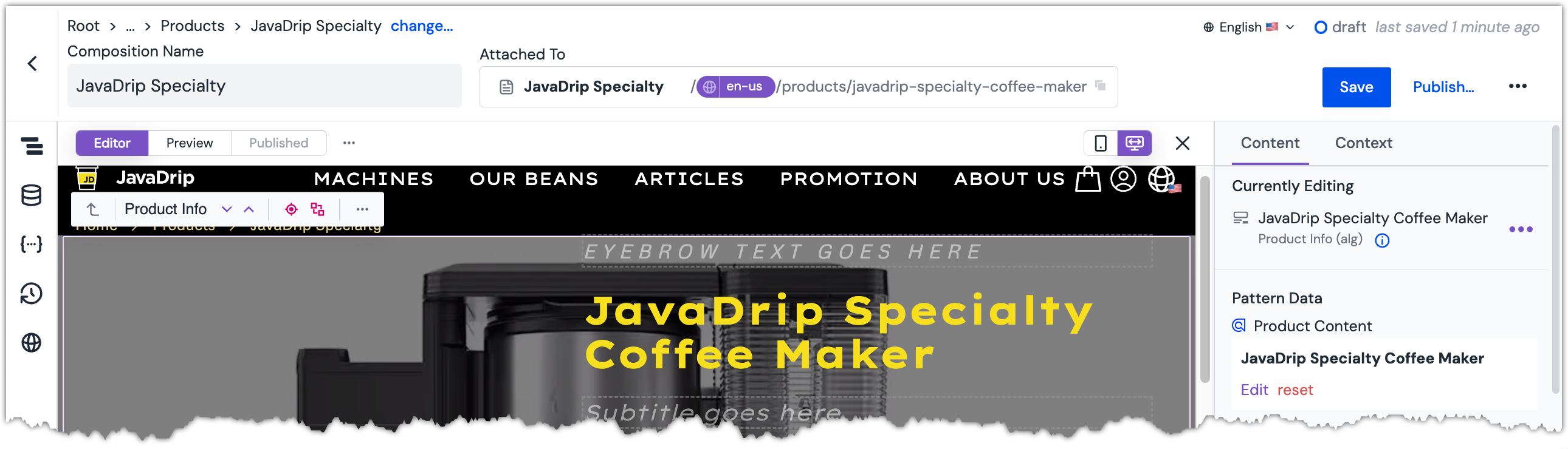 Pattern data is set on the component.
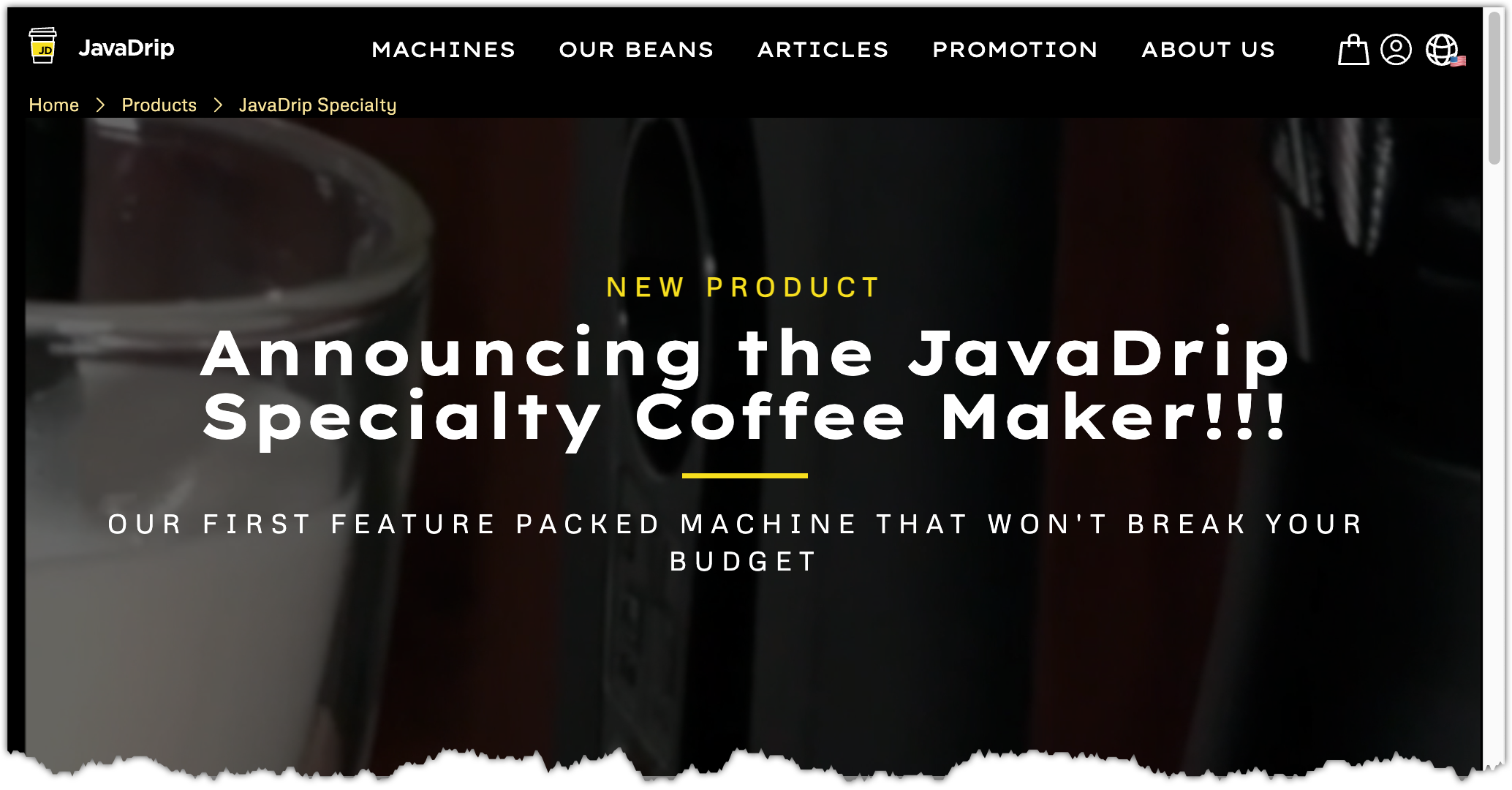
Add a Hero component#
Before the Product Info component, add a
Hero Container (uc)component.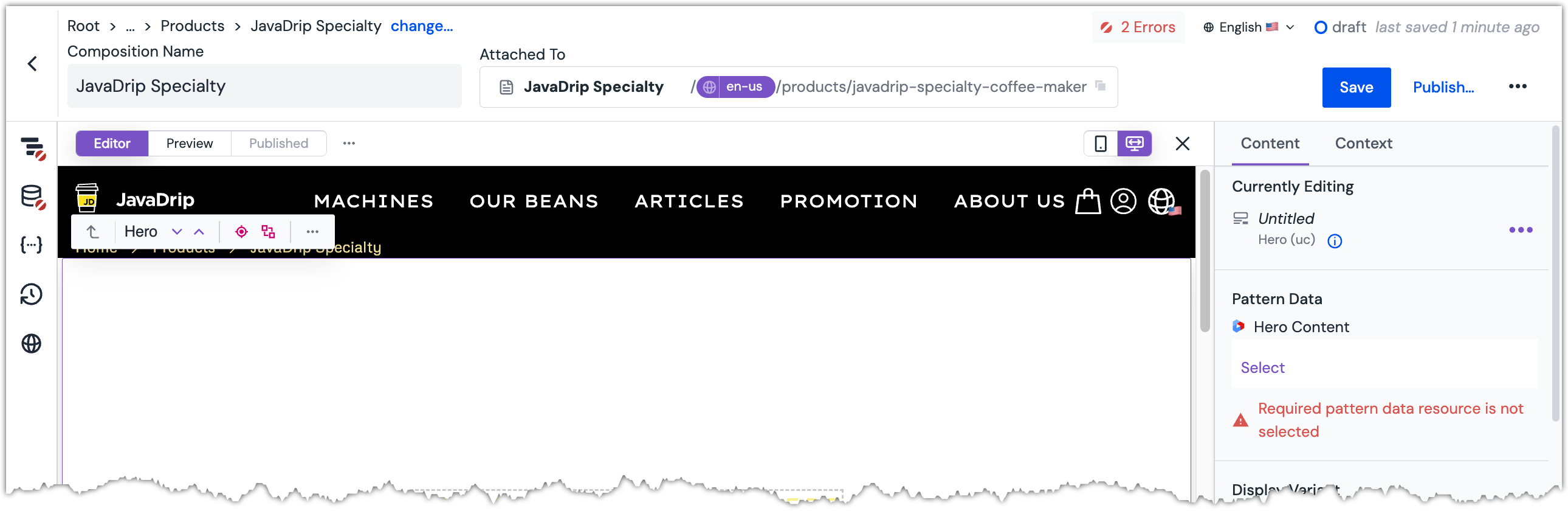 Hero component is added to the composition.
Set Pattern Data to the entry that matches the following search text:
Announcing the JavaDrip Specialty Coffee Maker!!!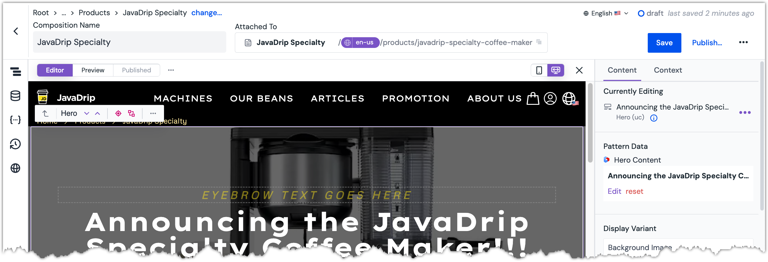 Pattern data is set on the component.
Set the parameter
Eyebrow textto the following value:New Product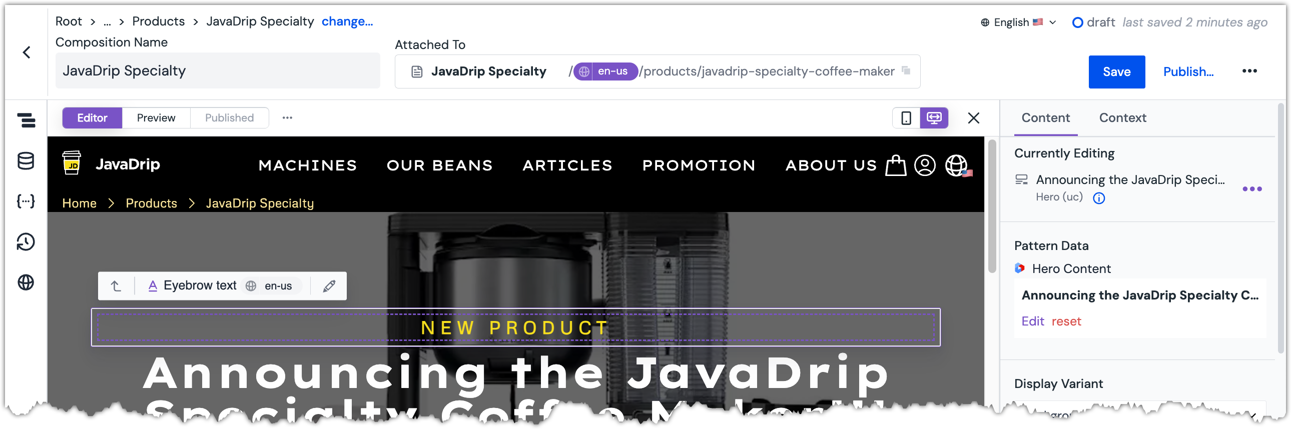 Eyebrow text is set on the component.
Set the parameter
Videoto the following Cloudinary asset:Folder Asset coffee-marketingSpecialty_Animation_co3vth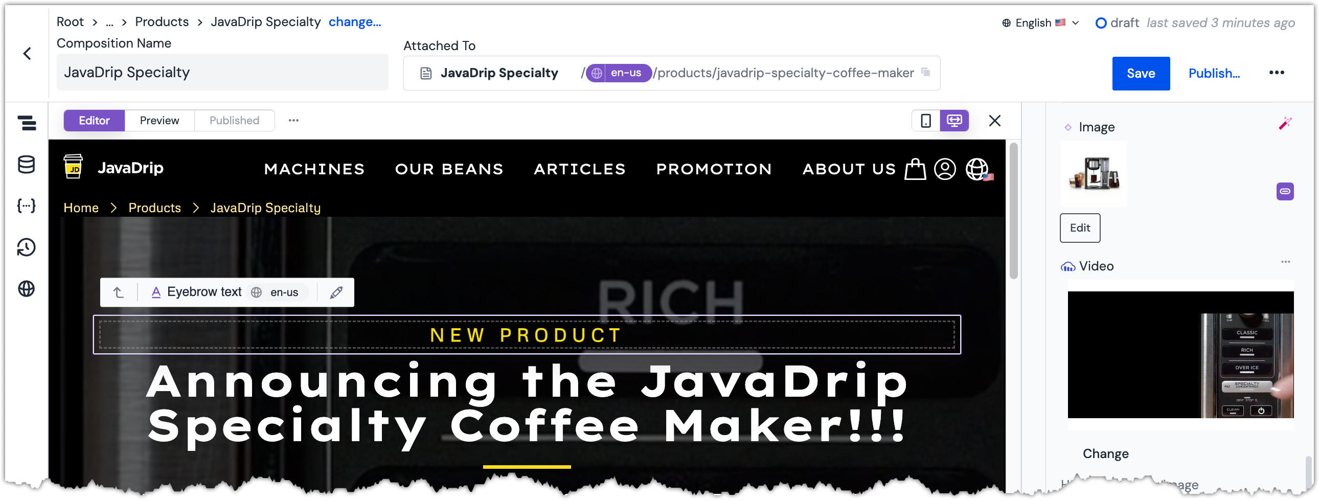 Video is set on the component.
Add a Product Feature Cards component#
After the Product Info component, add a
Product Feature Cards (uc)component.About this step
At this point you will not see the component on the page. This is an example of a component that is basically invisible if no content is set on it.
Set Pattern Data to the following entries:
Title Content type Fold-away frother feature 6 Brew Sizes feature Thermal Flavor Extractor feature 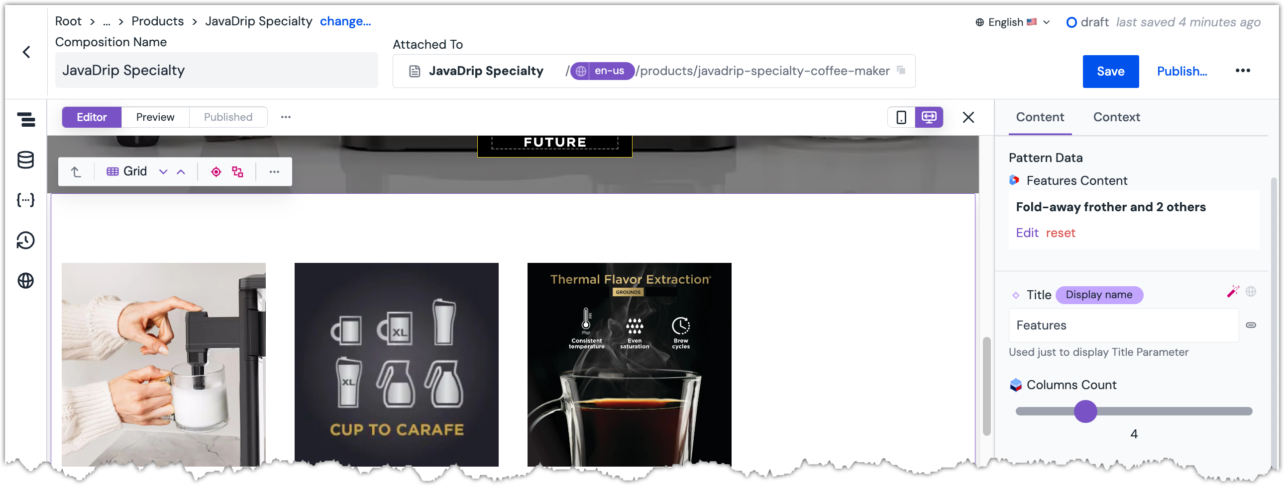 Pattern data is set on the component.
About this step
The formatting is a little off because, by default, this component expects you to select 4 features. Next you will change the component so it properly handles 3 features.
Set the parameter
Columns Countto3.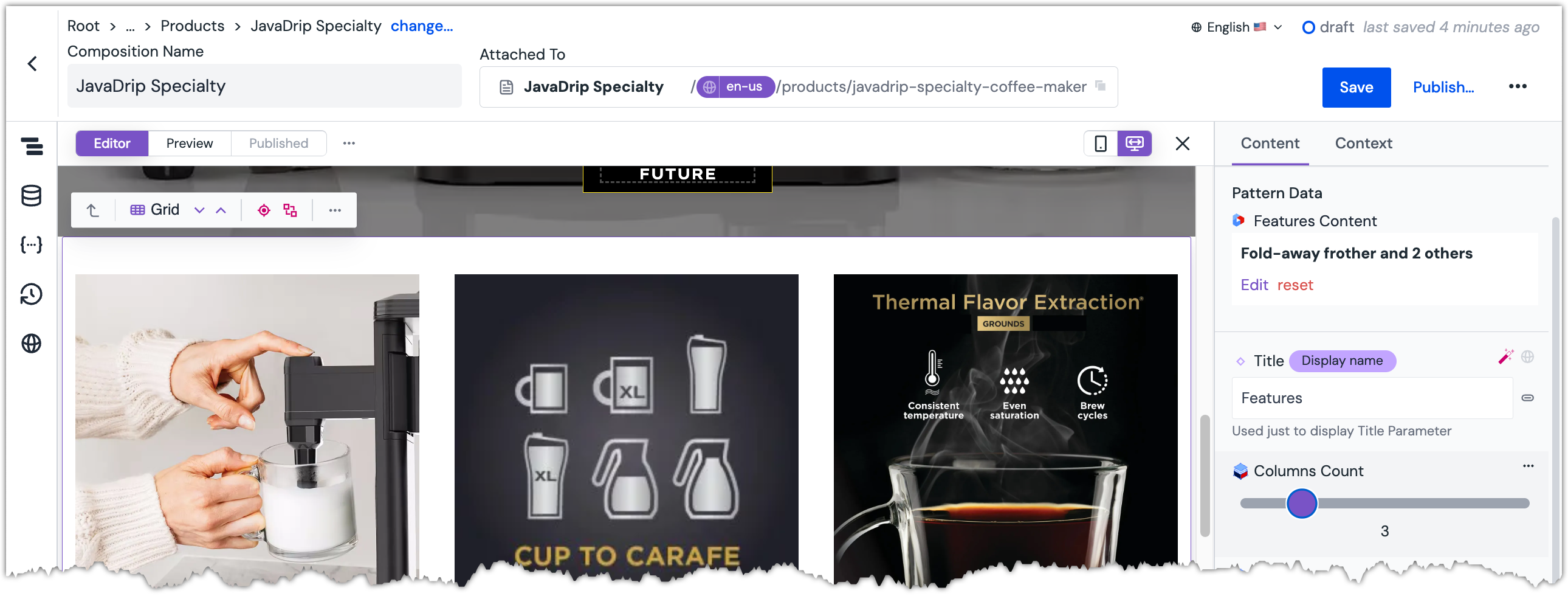 Column count is set on the component.
Add an Image Gallery component#
After the Product Feature Cards component, add a
Image Gallery (uc)component.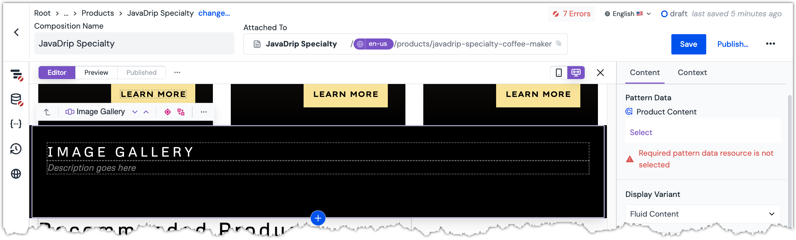 Image Gallery component is added to the composition.
Set Pattern Data to the record that matches the following product slug:
javadrip-specialty-coffee-maker-141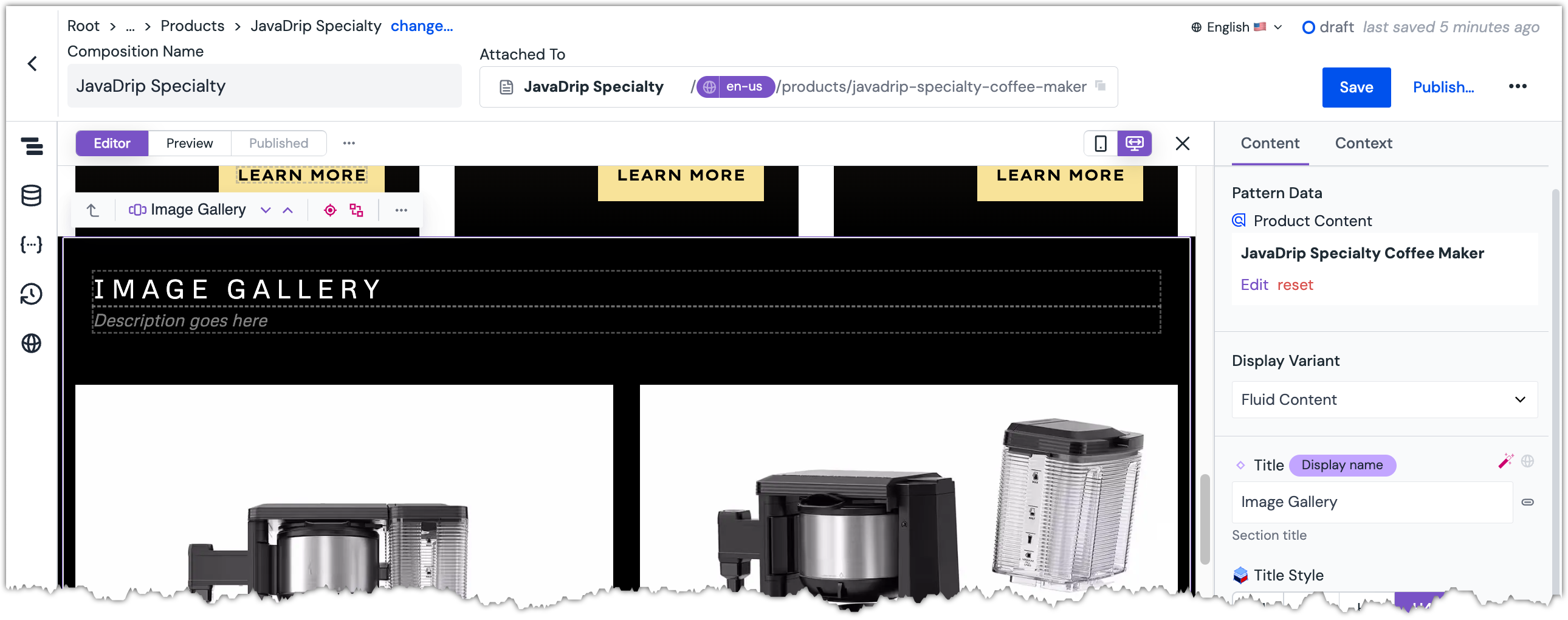 Image Gallery component is added to the composition.
Set the parameter
Titleto the following value:Specialty Gallery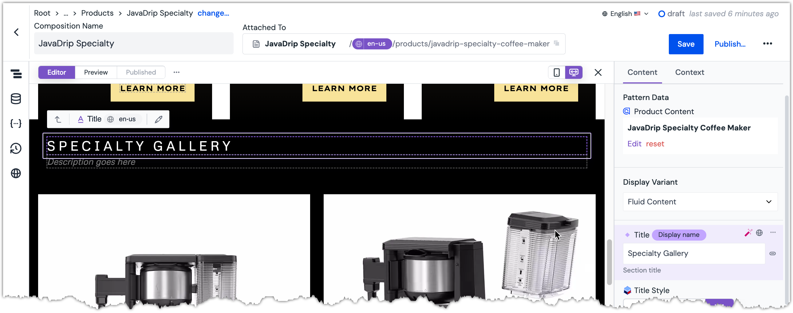 Title is set on the component.
Add a Reviews component#
After the Image Gallery component, add a
Reviews (uc)component.About this step
This is another component, like the Product Feature Cards component, that is basically invisible if no content is set on it.
Set Pattern Data by searching for Specialty which will retrieve the following entries:
Title Content type I recommend testimonial Love It! testimonial 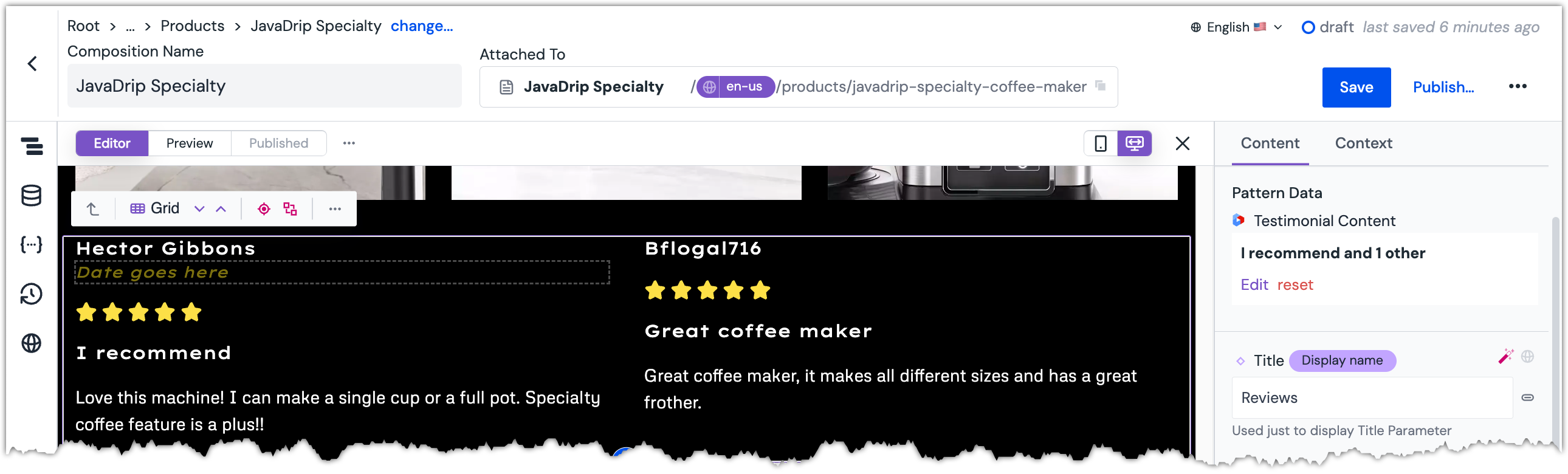 Pattern data is set on the component.
Update Recommendations component#
Add the component called
Card Block - products selector (uc).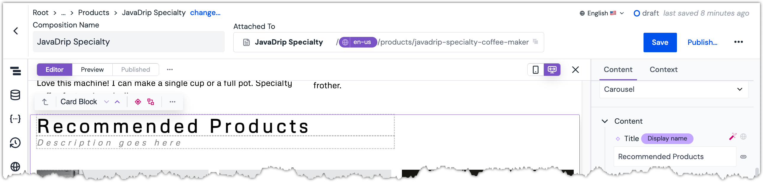 Recommendations component is selected.
Set Pattern Data search for Specialty and select the following records:
Name Frother Whisk Coffee Removable Filter Holder Coffee Permanent Filter Water Reservoir with Flip-Top Lid Glass Carafe & Brew-Through Lid 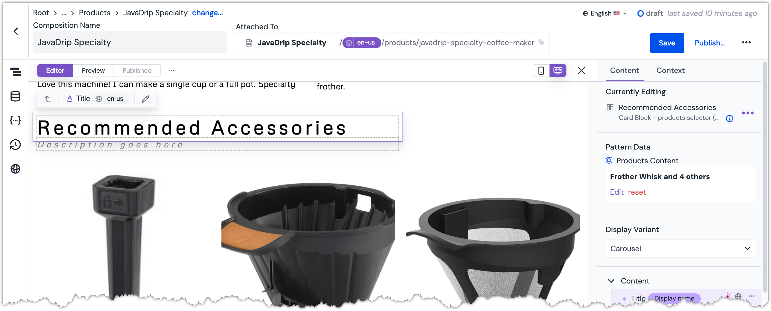 Pattern data is set on the component.
Change the parameter
Titleto the following value:Recommended Accessories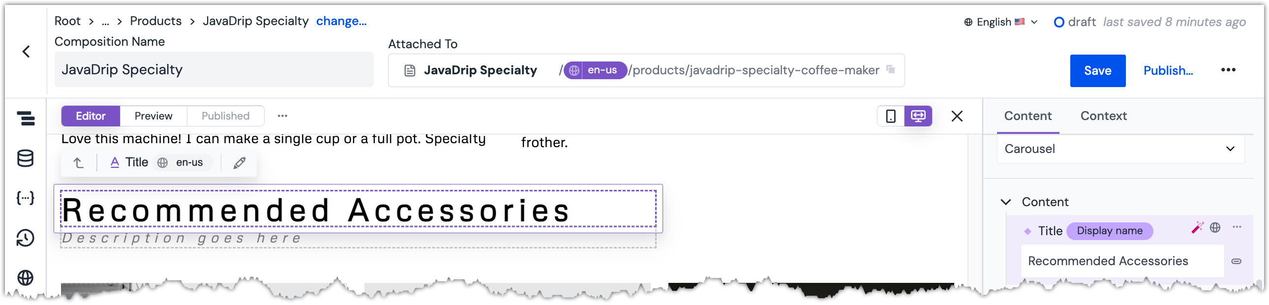 Title is set on the component.
Publish the composition.
Try it out#
Visit your PDP page at
https://[!!!YOUR HOST!!!]/products/javadrip-specialty-coffee-maker.About this step
You must replace
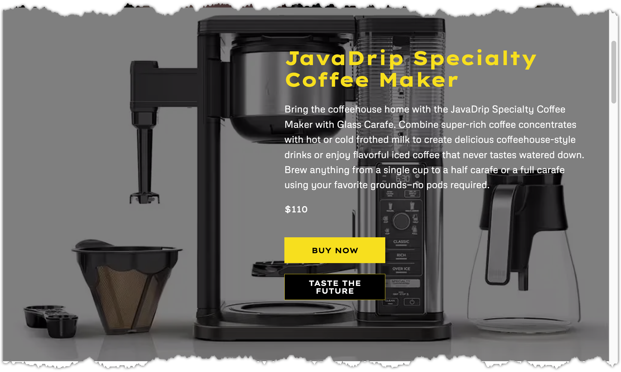
[!!! YOUR HOST !!!]with the host name of the training site you are using. This is a value that Uniform provided you when you were given access to the Uniform project. If you need help, contact us.The Hero component displays the content from the CMS entry you selected.
The Product Info component displays information about the JavaDrip Specialty Coffee Maker. You did not change this component.
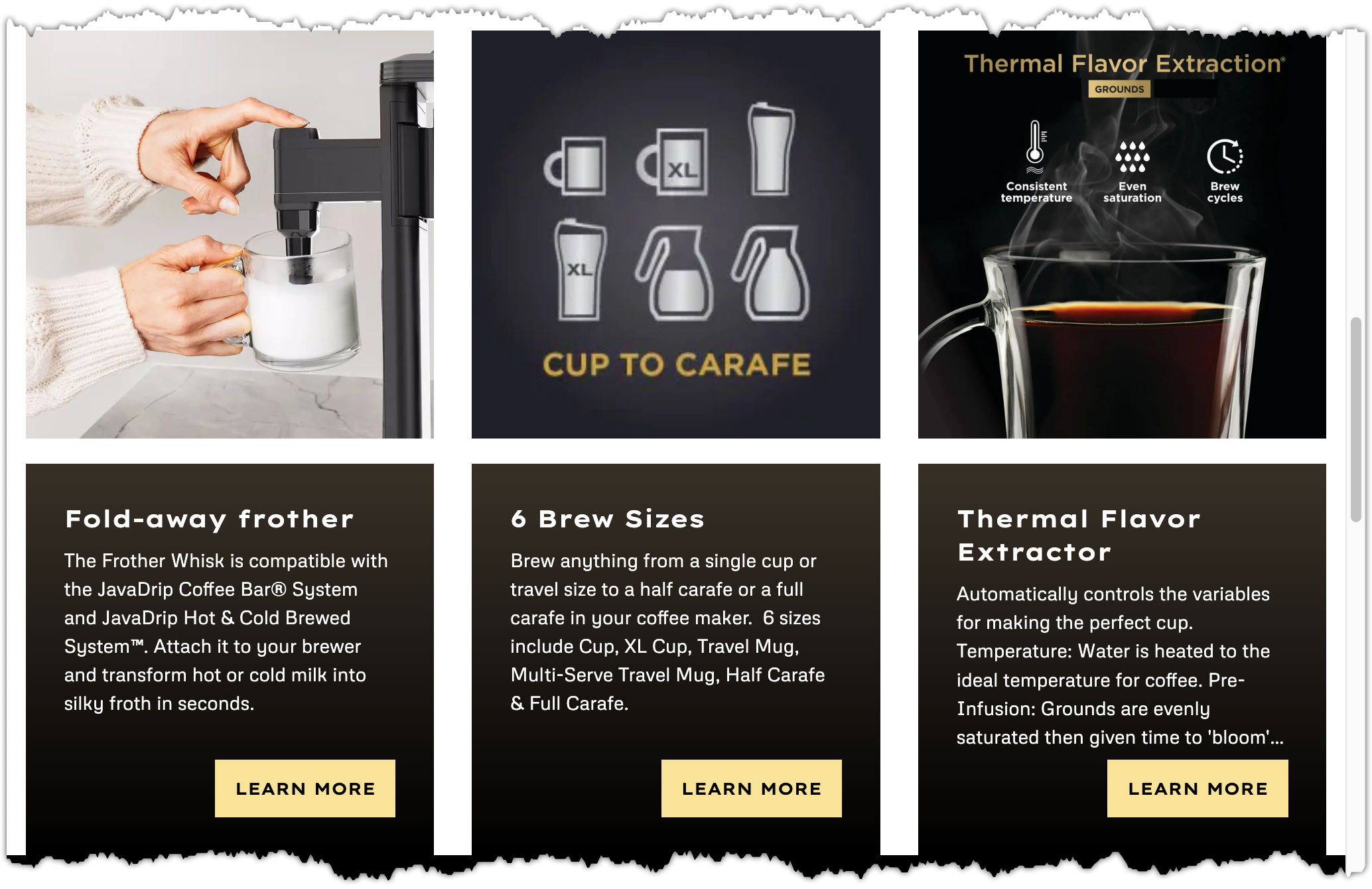
The Product Feature Cards component displays content from the 3 CMS entries you selected.
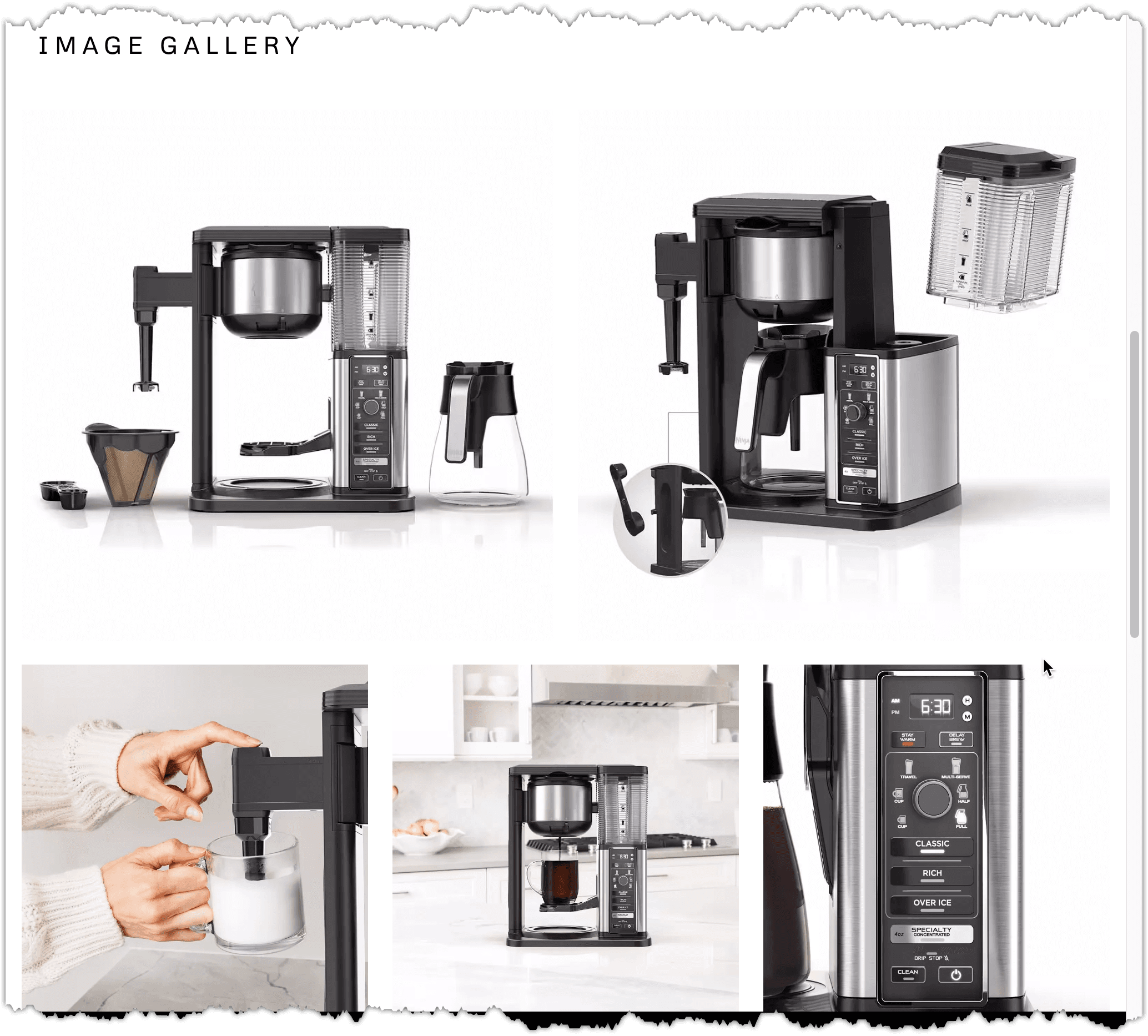
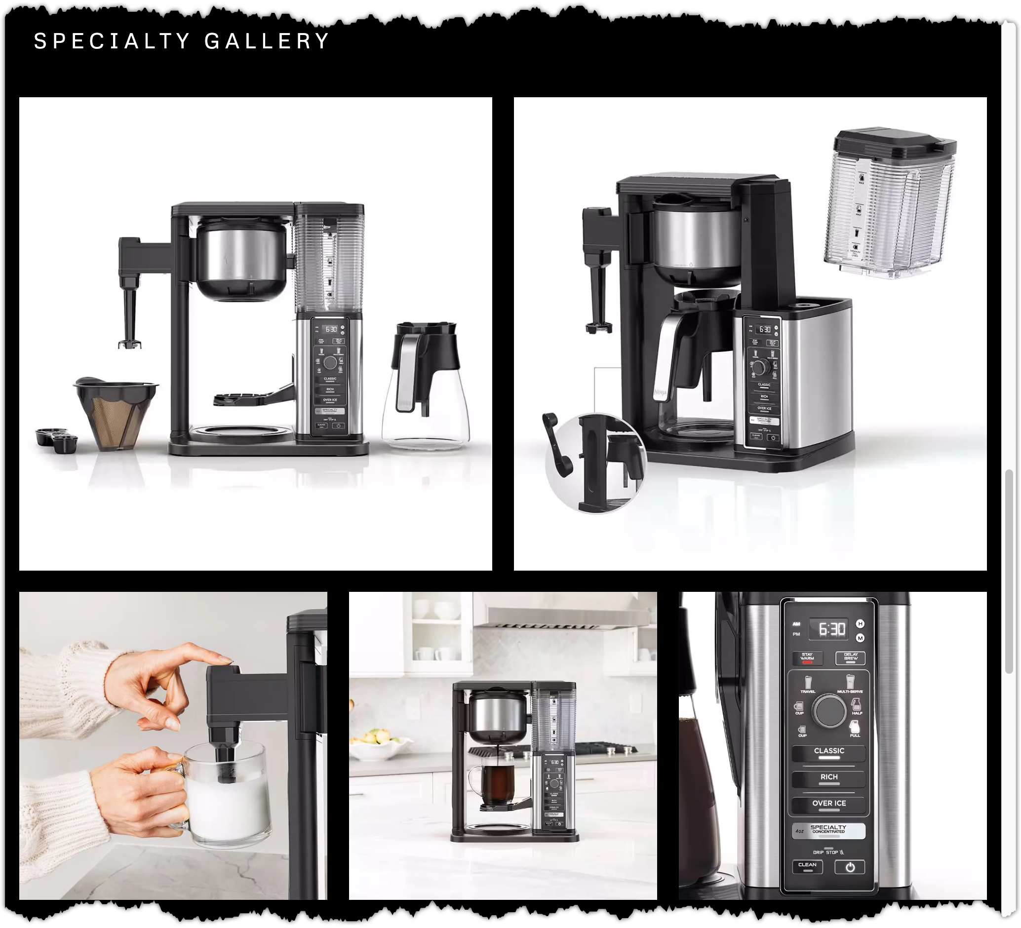
The Image Gallery component displays images that are related to the product you selected.
The Reviews component displays content from the 2 CMS entries you selected.

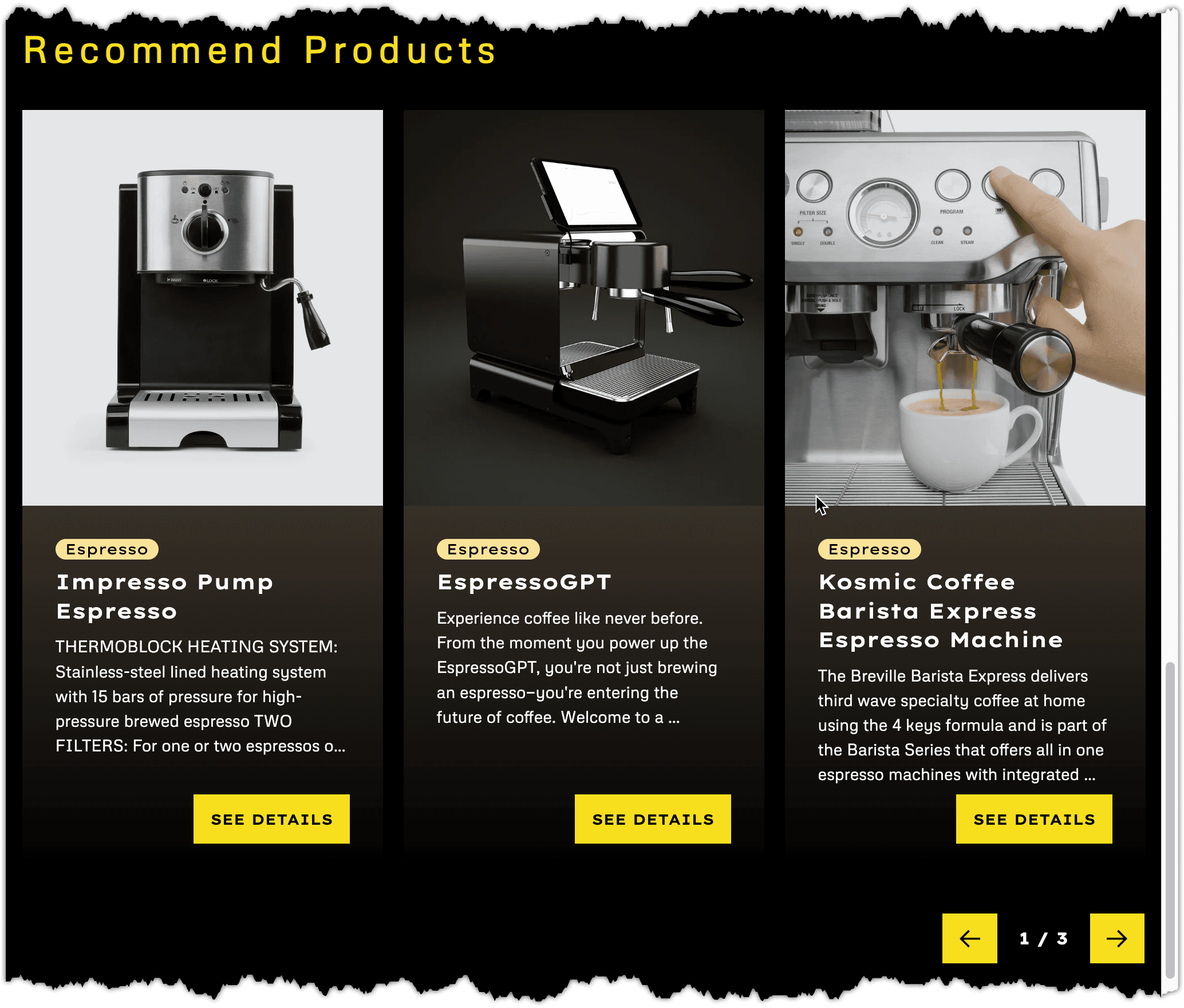
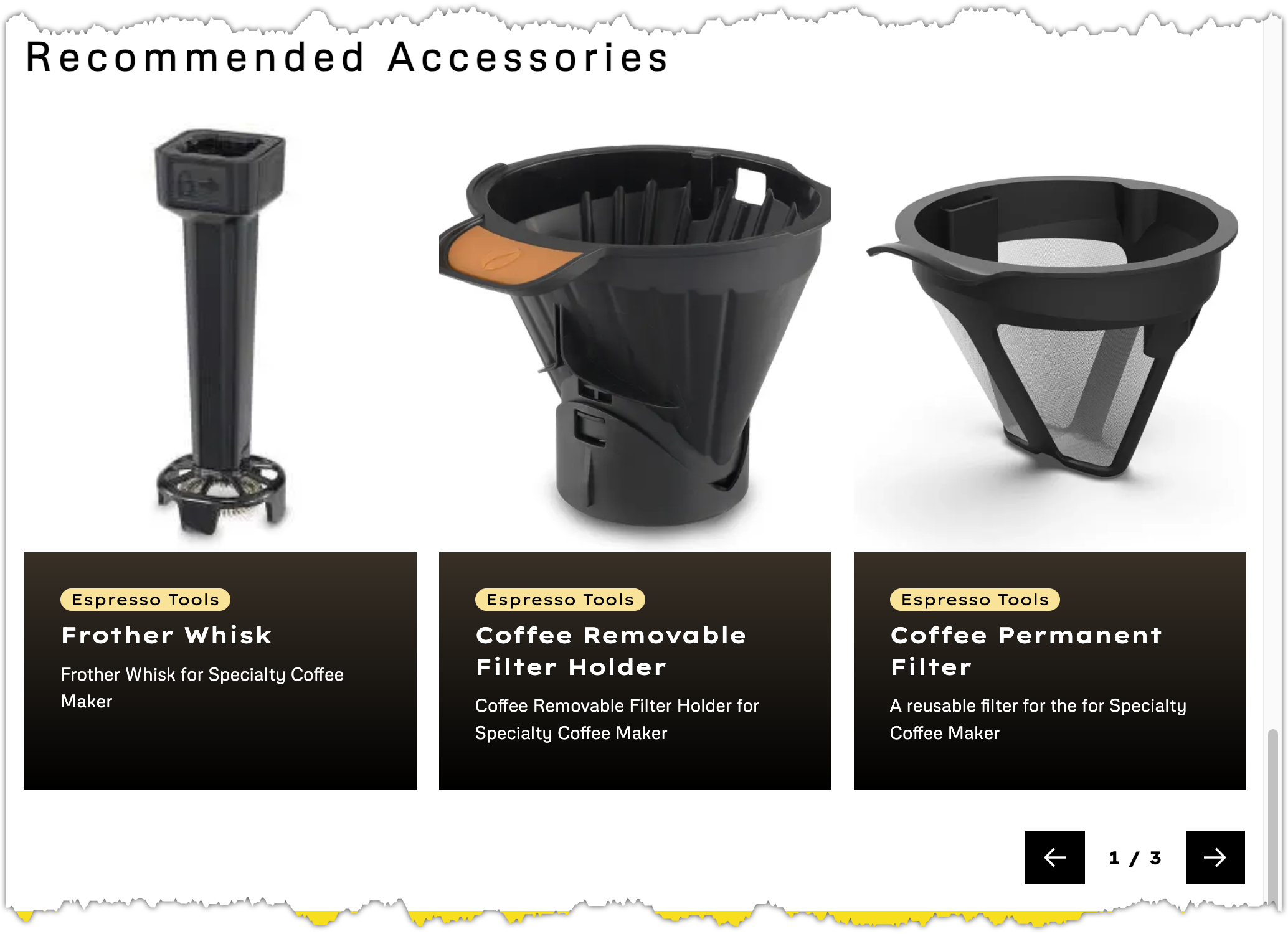
The Recommendations component displays content from the 5 records you selected.
Next steps#
In the next lesson, you will see how existing components can be reused in new ways.