Next.js application with app router
Specific SDK version notice
This tutorial is updated for the latest version of the Next.js SDK for app router, and we recommend installing the latest version of the @uniformdev/canvas-next-rsc package (19.132.0 or later).
If you are using earlier preview versions of the SDK, please contact us so we can help you upgrade your app.
Quick start#
This tutorial was created to help you add Uniform SDK into an existing Next.js app with App Router and help you understand key mechanics. If you'd like to get started more quickly, consider starting with any of these starters below which are pre-wired with the Uniform SDK and ready for use as a starting point or reference for learning.
Hello World starter
This is a single component / single page starter with minimal setup. It could be a good starting point for a new project if you plan to use your own component library, or you don't want to start with Uniform's Component Starter Kit.
Open sourced here. Check the README file to learn how to get started.
Component Starter Kit
If you'd like a more feature-rich starting point with 30+ components and a more opinionated structure and good defaults, the Component Starter Kit is highly recommended (demo). It's already pre-wired with the latest Uniform SDK for App Router.
Open sourced here. Check the README file to learn how to get started.
Next.js Commerce
If none of the options above is what you are looking for and your scenario could start with Next.js Commerce, then consider our adapted version of Next.js Commerce.
Open sourced here. Check the README file to learn how to get started.
Video tutorial#
If you prefer a video format, here is the recent launch live stream the team did to walk through the process of adding Next.js SDK into Next.js Commerce app:
Detailed tutorial#
This tutorial describes setting up a Uniform-powered composable website using Next.js 14 App Router, React Server Components, and Typescript. At the end of this tutorial, you'll know how to:
- Develop a Next.js-powered website and connect your Uniform project.
- Set up a preview and in-line editing of your website on Uniform, and continue building your website in a no-code environment.
- Render any content (internal and external) on your website.
- Run personalization and A/B testing at the edge.
Server-side rendering by default
The Uniform SDK for Next.js App Router supports both server-side rendering (SSR) and static site generation (SSG) modes. This tutorial will use the SSR mode as the default and calls out the parts where you need to make changes if you want to use SSG.
1. Create a Next.js project#
Choose a place on your local machine and in that location run the following command to create a Next.js project:
Follow the prompts and select the following options:
| Prompt | Response |
|---|---|
| Project name? | getting-started |
| Would you like to use Typescript? | Yes |
| Would you like to use ESLint with this project? | Yes |
| Would you like to use Tailwind CSS with this project? | Up to you |
Would you like to use the src/ directory with this project? | No |
Use App Router (recommended)? | Yes |
Would you like to customize the default import alias? | No |
2. Add the Uniform SDK into your app#
This section guides you through the one-time activation of the Uniform SDK.
2.1 Install dependency package#
Navigate to your newly created app directory:
cd your-appInstall the Uniform dependencies:
npm install @uniformdev/canvas-next-rscCreate a
uniform.server.config.jsfile in the root of your app:uniform.server.config.js
/** @type {import('@uniformdev/canvas-next-rsc/config').UniformServerConfig} */ module.exports = { defaultConsent: true, };This will allow you to adjust some default settings, such as whether the user has granted consent for tracking and cache behavior. Read more about possible configuration options
Add the Uniform plugin for Next.js into your
next.config.jsfile:next.config.js
const { withUniformConfig } = require("@uniformdev/canvas-next-rsc/config"); /** @type {import('next').NextConfig} */ const nextConfig = {}; module.exports = withUniformConfig(nextConfig);
2.2 Configure the preview handler#
The preview handler is used for visual editing and live preview.
The POST handler is used for Webhooks, allowing to invalidate external CDN cache based on changes in your Uniform project.
Add a new file with the following snippet:
app/api/preview/route.ts
2.3. Add component resolver and playground#
You now need to configure Uniform SDK to resolve to React components. This is a basic boilerplate for component resolution. You can adjust this logic as you see fit.
components/index.ts
Configure a playground route, this will allow you to preview patterns:
app/playground/page.tsx
2.4. Add Uniform React SDK components#
Open your existing layout file and wrap it with
<UniformContext />component, this will activate key Uniform SDK functionality for<UniformComposition />and<UniformSlot />components.app/layout.tsx
import { UniformContext } from '@uniformdev/canvas-next-rsc'; export default function RootLayout({ children, }: { children: React.ReactNode }) { return ( <html lang="en"> <body> <UniformContext> {children} </UniformContext> </body> </html> ) }Delete the existing
page.tsxin the root of yourappfolder and create the path below. This is a catch all route which will resolve from path to project map. This example usesmode="server"which supports SSR with both nodejs and edge runtimes. If you are building for the static / SSG mode, usemode="static".app/[[...path]]/page.tsx
import { PageParameters, retrieveRoute, UniformComposition, } from "@uniformdev/canvas-next-rsc"; import { resolveComponent } from "../../components"; // Uncomment to statically render routes at build time // export { generateStaticParams } from '@uniformdev/canvas-next-rsc'; export default async function Home(props: PageParameters) { const route = await retrieveRoute(props); return ( <UniformComposition {...props} resolveComponent={resolveComponent} route={route} // this is the setting for SSR and Edge-side rendering // for the static mode (SSG) use mode="static" mode="server" /> ); }Incremental activation possible
In this particular example, the
app/[[...path]]/page.tsxwill instruct that all routes need to be handled by Uniform. If you'd like to activate Uniform only on certain routes, you can choose to do so by adding the code above inside the specificpage.tsxapp route handler instead inapp/page.tsxfor example, if you want Uniform to be activated only on the home page.
3. Connect your app to your Uniform project#
Open a browser and follow these steps to configure your Uniform project and create your first composition.
note
Prerequisites
You must have access to a Uniform team with the ability to create new projects. If you are an active customer or a partner, please get in touch with your Uniform team administrator colleague and ask for an invite.
If you are not sure or your company does not have a Uniform team, you can request a sandbox here.
Start from your team dashboard in Uniform.
Navigate to Security > API keys.
Click Add API key.
Enter the following values:
Name Project Roles Getting started key[your project's name](it may be auto populated with My first project)Viewer for read-only API key (recommended for production) and Developer (if you would like to write to your project from Uniform CLI) Click Create API key.
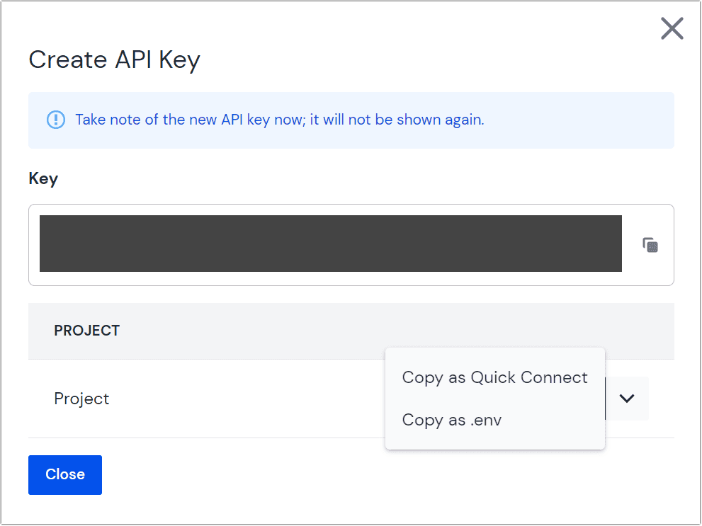 Create API key
Copy the generated API key and project ID using Copy as .env under the to place the values on your clipboard.
 How to access the 'Copy as .env' control
In the root of your Next.js project, create a
.envfile to hold all environment variables and secrets. Paste the Uniform API Key and Project ID from clipboard:
Add the
.envfile to the.gitignorefile, excluding it from version control.
3.1 Configure Preview URL#
In order for Uniform SDK to know where to go to render preview, you must configure the preview URL in your project settings:
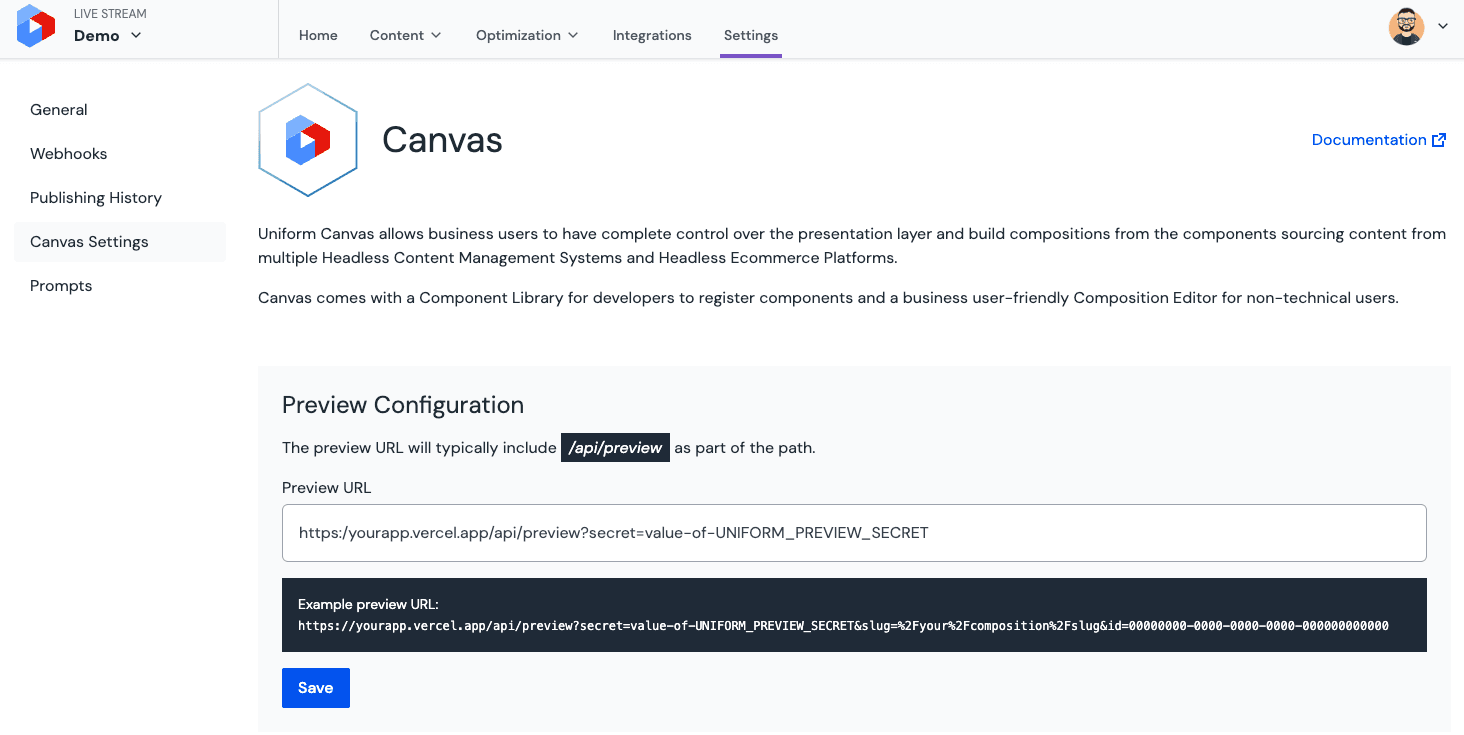
This can be either your localhost:3000 endpoint, or a deployed or hosted app. The value of the secret query string must match the value of your UNIFORM_PREVIEW_SECRET setting set in your app's .env file earlier.
3.2 Configure webhooks#
You may be wondering why you need webhooks if you setup a server-side rendered application. When composition data is fetched during server-side rendering, it's cached at the CDN level that renders the page for best performance. This cache needs to be updated when compositions change and published. Other use cases include changes to the manifest that contains personalization and A/B testing configuration and redirect management. When these entities change, the associated cache has to be invalidated.
This is where webhooks apply.
To set this up, from within your project go to Settings > Webhooks and create a new endpoint with the same URL as you used for your preview URL earlier:
Make sure all 12 events are selected and click Create to complete webhook setup:
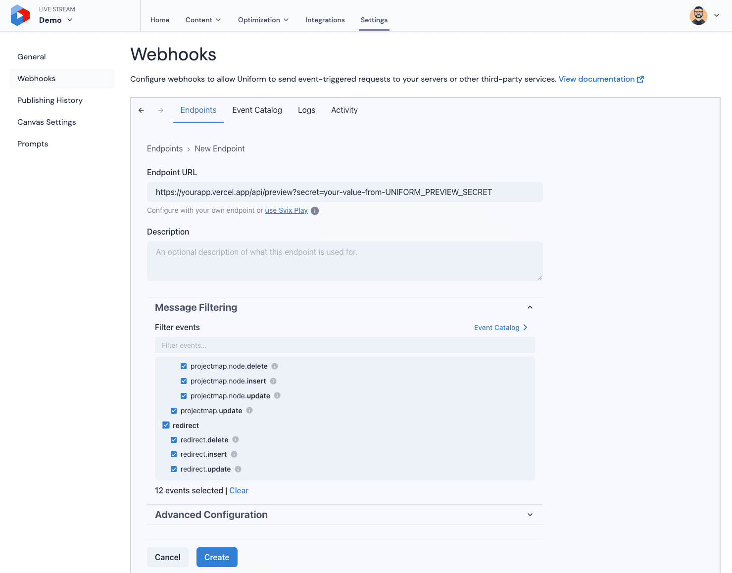
Cache clear timing
Typically it takes approximately 5 seconds for the CDN cache to be cleared after a composition is published.
4. Create and register components#
Uniform introduces the concepts of components and compositions. Components are building blocks of content on your website. They match your design system and are similar to components in React.js.
Compositions are a structured collection of components representing a portion of your website, in this case, a page. After creating a component, you'll use it in a composition and then render the composition on the front end.
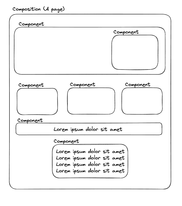
4.1 Create your first page composition#
In the Uniform application, you'll create components to match those in your front-end application, except for the layout component. This is a reversible consideration and assumes you don't want users to modify the layout in Uniform.
From your team dashboard, select a project and go to Experience > Components.
Click either Create a component (if this is your first component) or Add component.
Enter the following values:
Field Value Component name PagePublic ID page(this is auto generated based on the value in "component name")Allow creating new Compositions from this componentcheckboxChecked Add a
textparameter called Title. Keep thepublic idof the parameters lowercase as suggested.Composition parameters are typically used to contain page meta data (page title and other SEO settings).
Create a new slot in
Slotstab namedContentand keeppublic idascontent, lower cased as suggested. Keep the default slot settings as default (All components and patternsenabled).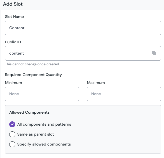 Content slot.
Save and close.
4.2 Model Uniform components#
Now you'll create a component that will be placed inside the Page composition. Since most websites have some sort of "Hero" component as the first one on the page, you'll create that.
From your team dashboard, select a project and go to Experience > Components.
Click either Create a Component (if this is your first component) or Add component.
Enter the following values:
Field Value Component name HeroPublic ID hero(this is auto generated based on the value in "component name")Allow creating new Compositions from this componentcheckboxUnchecked Add a
textparameter called Title. Keep thepublic idof the parameters lowercase as suggested.Add a
textparameter with multi-line option called Description. Keep thepublic idof the parameters lowercase as suggested.In Uniform, component parameters are containers for content attributes. These map directly to your React component props.
Save and close the component.
4.3. Create a Home node in your project map#
The project map will connect the route to the Page composition you just created.
- Navigate to project maps in the Uniform app.
- Create a project map if there isn't yet one for your project.
- Click on the root node and select edit.
- Select Composition under Node type and save the configuration. You will see an error that you have to connect a composition.
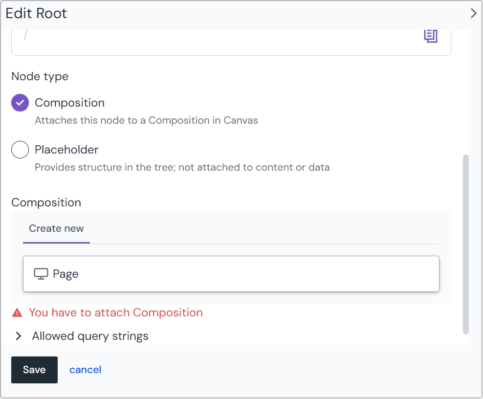
4.4. Implement your first components#
You created two components earlier in Uniform. Now you'll add representative implementation for those components in your Next.js codebase, starting with the Hero component.
Create a new
hero.tsxcomponent:components/hero.tsx
import { ComponentProps, UniformText } from "@uniformdev/canvas-next-rsc/component"; type HeroProps = ComponentProps<{ title: string; description: string; }>; export function Hero({ context, component }: HeroProps) { return ( <> <UniformText context={context} component={component} parameterId="title" as="h1" /> <UniformText context={context} component={component} parameterId="description" as="h1" /> </> ); }In-line editing of parameters
There are two ways to render parameter value with Uniform. The approach above is using a
UniformTextcomponent helper from Uniform SDK, allowing text parameters to be inline editable by authors within Uniform. If that's not desired, you can render the parameter value raw by simply rendering it as a value:<div>Parameter value: {title}</div>Now do the same for the
Pagecomposition component. Create a newpage.tsxcomponent that will serve as the implementation of the Page composition. Since thePagecomposition contains aSlotwith public idcontent, you need to add it to the implementation, as well as render the page title. The code below will render theHerocomponent dynamically based on the placement rules in Uniform compositions, as well as any other future components you add to Uniform.Compositions typically contain one more slots. For the sake of simplicity, continue with a single slot setup.
components/container.tsx
import { ComponentProps, UniformSlot, } from "@uniformdev/canvas-next-rsc/component"; type SlotNames = "content"; type ContainerProps = ComponentProps< { title: string; }, SlotNames >; export function Container({ context, component, slots, title }: ContainerProps) { return ( <> <div>Page title: {title}</div> <div> <h2>Components:</h2> <UniformSlot context={context} data={component} // this must correspond to the `public id` of the slot created earlier slot={slots.content} /> </div> </> ); }Now, you will map this component by adding the following code to your
components/index.tsfile.components/index.ts
import { type ResolveComponentFunction, type ComponentProps, DefaultNotImplementedComponent, } from "@uniformdev/canvas-next-rsc/component"; // add two component imports import { Container } from "../components/container"; import { Hero } from "../components/hero"; export const resolveComponent: ResolveComponentFunction = ({ component }) => { let componentType: React.ComponentType<ComponentProps<any>> | null = DefaultNotImplementedComponent; // add page component resolution if (component.type === "page") { componentType = Container; } // add hero component resolution if (component.type === "hero") { componentType = Hero; } return { component: componentType, }; };
4.5 Implement more components (optional)#
Follow steps 4.2 and 4.4 to create new components that aren't composition type and repeat this for any new component you need to bring into Uniform.
5. Enable edge runtime (optional)#
By default, Next.js will use the nodejs runtime, and the app will render with a serverless function.
If you'd like to take advantage of the edge runtime and render the pages from the CDN nodes closer to visitors and rely on global scale of this process, it's easy to enable this mode on your app route handler level by exporting a specific constant, like it's shown below:
app/[[...path]]/page.tsx
On some CDNs, edge runtime delivery typically renders a page within 100ms or faster from most global locations, which is nearing the performance of static site delivery. Your mileage can vary and there are many factors contributing to performance in this area. Uniform Mesh layer ensures all the internal and external content is cached as aggressively as possible, which is the key to reaching such performance characteristics.
Learn more about runtimes
It's important to understand the pros and cons of different runtimes. Please consult the official Next.js docs for edge and Node.js runtimes.
Working with Uniform Slots#
Slots allow rendering components dynamically based on composition content in Uniform, which allows building new pages and changing the layout of existing pages without developer involvement without code changes.
Depending on a specific scenario, there are multiple ways to work with slots in Uniform.
Simplest way to render a slot#
Place a <UniformSlot /> React component imported from @uniformdev/canvas-next-rsc and add context, data (which component to render) and slot (specific slot to render) props into it from the parent component.
Wrap a slot with additional markup#
This approach may be needed in case of using React components that require special container markup for inner components, or special hierarchy of DOM nodes. Typically, this is needed for Carousel components.
Known issues#
The following message will be displayed in the console during development or build. The fix for the issue is in progress.
./node_modules/@uniformdev/canvas-next-rsc-shared/dist/index.js Module not found: Can't resolve 'uniform.server.config.js' in '/Users/rsc/node_modules/@uniformdev/canvas-next-rsc-shared/dist'Preview functionality
The Preview mode isn't supported in the static mode yet. Workaround: deploy a preview environment in server mode.
Empty slot placeholders are not displaying.