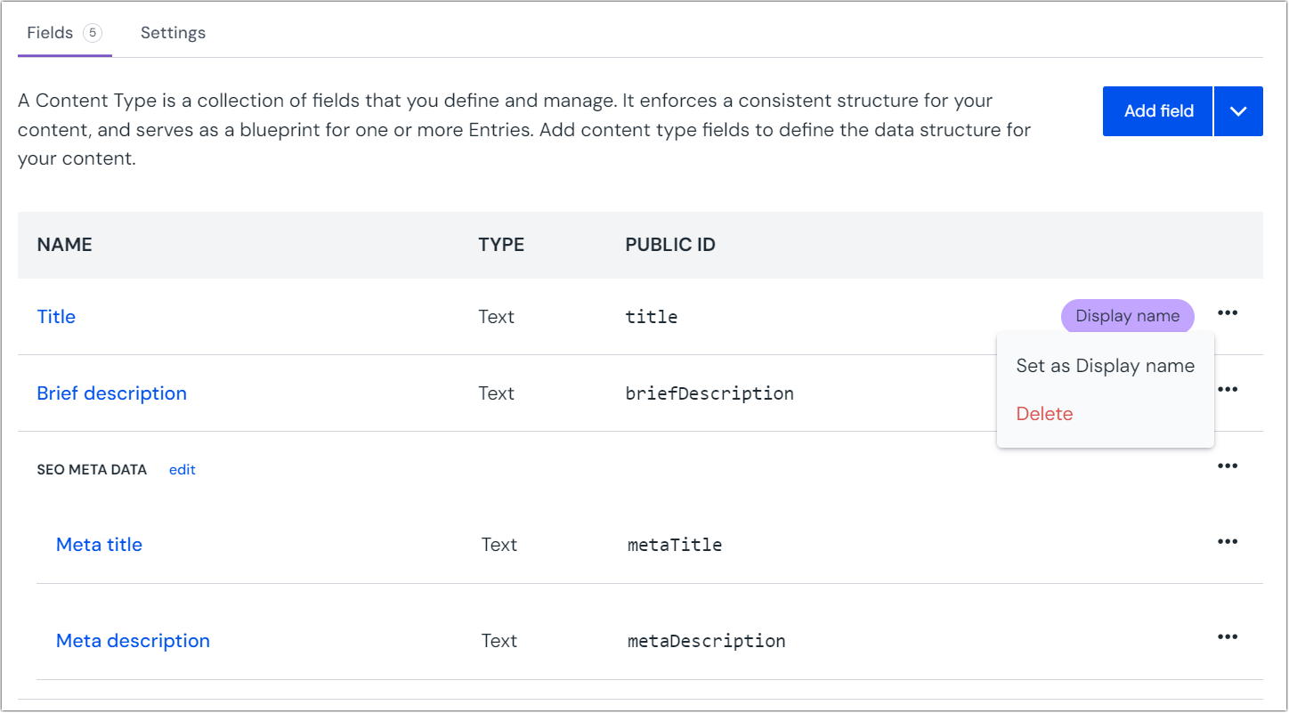
Fields for content types
Fields are the structural building blocks that make up content types. Authors fill in fields as they create a content entry, which is based on a content type.
Add a field#
In your project, navigate to Experience > Content Types and select your content type.
Click the tab Fields.
Click the Add field button.
Select a base type for your field.
Configure the options for your field type. See field types below for reference.
- Most field types can be made localizable so they store a different value for each locale
- Most field types can enable conditional values which lets them store different values based on conditions such as dynamic inputs or quirks. Conditional values are only available to enterprise projects.
Click Save on the bottom of the dialog to update the content type configuration. To add a new field you can also select Save and add another option in the button dropdown.
After all content type updates are complete, make sure to save the content type to apply your changes.
Field types#
The available field types that can be used for content types are the same as parameter types for components:
- Text
- Rich text
- Single select
- Multi select
- Number
- Date
- Date/Time
- Boolean
- Link
- Asset
- JSON data
- Reference
- Blocks
- Enrichment
- Image URL
info
Reference fields are the only field type that is not available as a parameter for components and only can be used on content types.
Reference field#
Lets a user create references to other entries. Used when you want to reuse content of one or more other entries without duplicating it.
This field type has the following configuration settings:
When adding a Reference field, enter the following values:
Name Description Name A text field to enter a descriptive name for the parameter or its purpose.
Public ID Name that uniquely identifies the parameter. This value is available to developers, and is auto generated from the Name given. It can't be changed once it's created.
Help text A user is responsible for setting a value on the parameter. This text appears below the user-interface available for setting the parameter value.
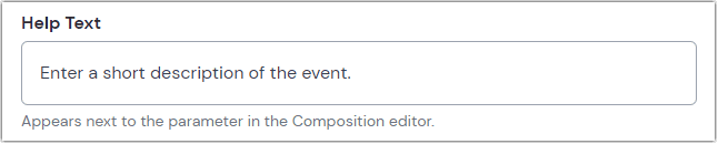 The user interface for setting the value on a text parameter with help text set to 'Enter a short description of the event.'
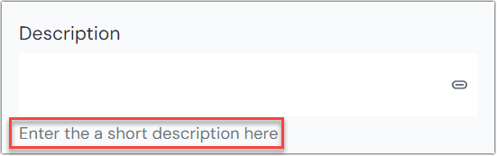 The help text in context of a composition.
Type Choose between Single reference or Multi-reference. Determines whether editors will always be limited to one reference, or can potentially select more than one. Allowed content types Lets you limit selectable entries by one or more content types. Leave blank to allow any entries to be selected, regardless of content type. Required Only applicable to Single reference. Indicates whether adding a referenced item is required. Defaults to false. Minimum/maximum references Only applicable to Multi-reference. Setting minimum to 1 makes the field Required. Leaving maximum blank will allow the editor to select an unlimited number of referenced items. Localizable Allows the parameter to be localizable.
If enabled, the default localization behavior can be set:
- Localized: One value can be set per locale
- Not localized: Single value is used across all locales
Editors can change the localization behavior on a per-instance basis.
Allow conditional values Set up multiple potential values and conditions for use.
Learn more about conditional values.
Use as display name Selecting this checkbox will show the name of the first referenced item as the display name of the content entry in lists. Click Accept on the bottom of the drawer to update the content type configuration. To add another field right away, you can also select Accept & add another from the button dropdown.
After all content type updates are complete, make sure to save the content type to apply your changes.
Group fields#
Component fields may be grouped to help cluster related ideas together in the entry editor.
They are set up in the same way as parameter groups for components. For more information, see Group parameters.
Delete a field#
In your project, navigate to Experience > Content Types and select your content type.
Click the tab Fields.
Click > Delete.
 Delete fields from your content type.
Click Save to save the changes to the content type.
About this step
If the deleted field is used in any entry, when you
select the field in an entry you will see a warning
about "orphan field data." This tells you that Uniform is storing a value for a field that's not defined in the content type. You must remove this value before you are able to save any changes to the entry.
Click Remove to remove this value from the entry.