Next.js tutorial (Page Router)
Newer version available
This tutorial is based on Next.js Page Router. If you are starting a new project now, you may want to start with App Router tutorial here, as it is now a default new way to build Next.js apps.
This tutorial describes setting up a Uniform-powered composable website in Next.js and Typescript. At the end of this tutorial, you'll learn to:
- Develop a Next.js-powered website and connect your Uniform project.
- Render content created in Uniform on your website.
- Set up a preview of your website on Uniform, and continue building your website in a no-code environment.
Goals
- Familiarize yourself with Uniform and its elements.
- Model your content and add it to Uniform.
- Connect a Uniform composition to your local project using the Composition's slug.
- Activate preview for no-code editing in your project.
In this tutorial, you'll follow the following steps to build a Uniform-powered project.
Prerequisites
You'll need knowledge of:
- HTML
- CSS
- JavaScript
- React
The knowledge of Next.js and Typescript is optional but beneficial. On your machine, you require access to a terminal with Node.js and its package manager, npm, installed. Alternatively, you can use Yarn.
1. Create a Next.js project#
Choose a place on your local machine and in that location run the following command to create a Next.js project:
Follow the prompts and select the following options:
| Prompt | Response |
|---|---|
| Project name? | getting-started |
| Would you like to use Typescript? | Yes |
| Would you like to use ESLint with this project? | Yes |
| Would you like to use Tailwind CSS with this project? | Yes |
Would you like to use the src/ directory with this project? Y/N | Yes |
Use App Router (recommended)? | No |
Would you like to customize the default import alias? | No |
The command proceeds to install dependencies in your project. Navigate to your project once done. TailwindCSS will style the components in this project.
info
Be sure you installed the latest create-next-app version to get the Tailwind installation instructions.
In your local project, navigate to the src/pages/index.tsx file. Replace the contents of the file with this:
src/pages/index.tsx
Creating the project included installing Tailwind and creating the src/styles/global.css file:
Now you can start your local development server by running the following terminal command:
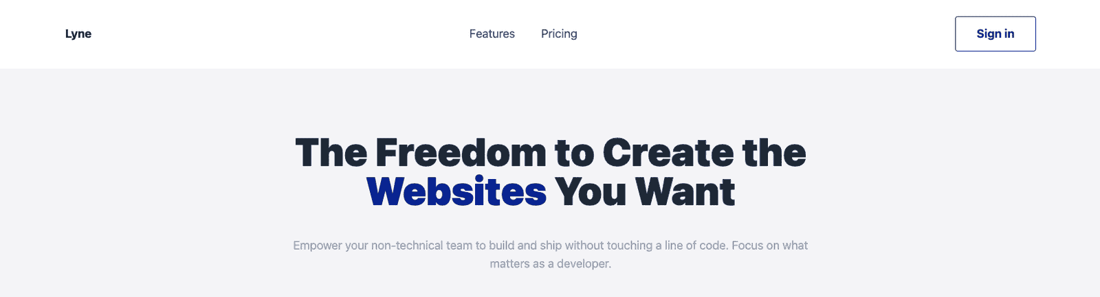
This creates a local server on localhost:3000. Opening it on the browser looks like this:

2. Project components#
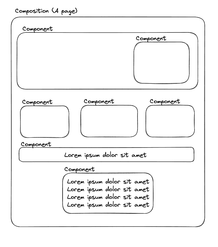
Like in most Next.js projects, you will build your website's components using JSX markup. In this case, you'll create components for different portions of your application matching your design system. Here's the final project, so you understand the design.
The more granular the components, the better control you afford your non-technical team in Uniform.
Start with building an essential layout component containing a header, footer, and hero component.
Create a folder called components in the /src directory, then add the following component files within src/components.
The components are inspired by TailwindUI Kit.
Header.tsx - A responsive navigation bar.
Footer.tsx - A responsive footer component.
Layout.tsx - Import and render the Header and Footer components.
Hero.tsx - A basic Hero component with a title, highlighted text, and subtitle.
The components you create pass data using props. Uniform utilizes the same props to pass data into the components.
3. Uniform projects#
Prerequisites
You must have access to a Uniform team with the ability to create new projects. If you are an active customer or a partner, please get in touch with your Uniform team administrator colleague and ask for an invite.
If you are not sure or your company does not have a Uniform team, you can request a sandbox here.
You'll start from your team dashboard.
Navigate to Security > API keys.
Click Add API key.
Enter the following values:
Name Project Roles Getting started key[your project's name](it may be auto populated with My first project)Developer (select from the dropdown) Click Create API key.
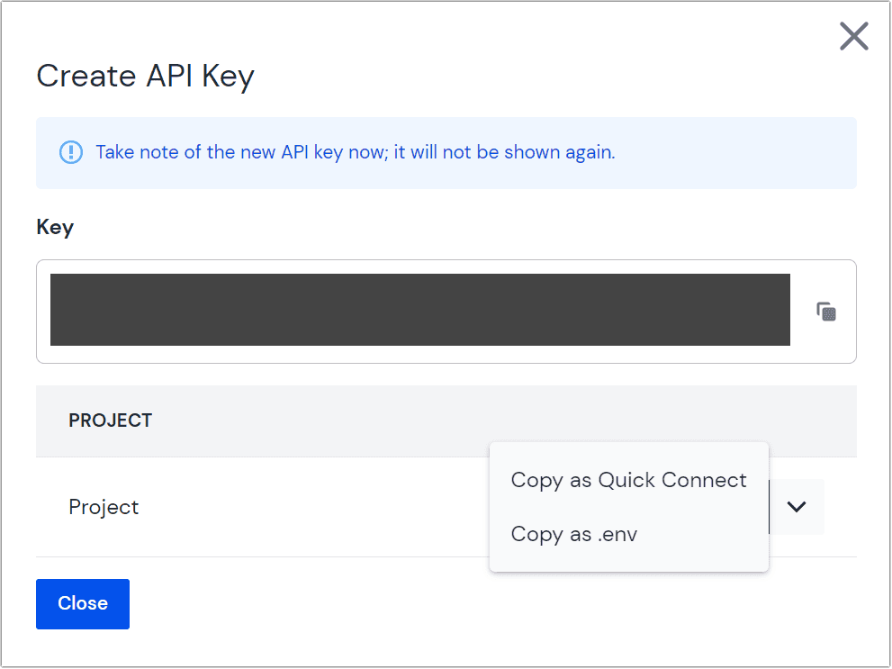 Create API key
Copy the generated API key and project ID using Copy as .env and store them somewhere safe. You'll add these to your front-end application soon.
4. Components in Uniform#
Uniform introduces the concepts of components and compositions. Components are building blocks of content on your website. They match your design system and are similar to components in React.js.
Compositions are a structured collection of components representing a portion of your website, in this case, a page. After creating a component, you'll use it in a composition and then render the composition on the front end.
In the Uniform application, you'll create components to match those in your front-end application, except for the layout component. This is a reversible consideration and assumes you don't want users to modify the layout in Uniform.
4a. Create a hero component#
- From your team dashboard, select a project and go to Experience > Components.
- Click either Create a Component (if this is your first component) or Add component.
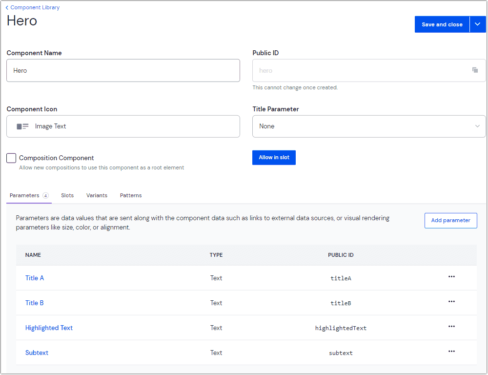
- Enter the following values:
Field Value Component name HeroPublic ID hero(this is auto generated based on the value in "component name")Component icon Image text Title Parameter None Composition Component Unchecked - Save the component by clicking the arrow in the button and selecting Save.
4b. Configure parameters#
In Uniform, component parameters are fields for data. These map directly to component props in React.
In the Parameters tab click Add parameter.
Enter the following values:
Field Value Parameter Name Title A Public ID titleA(this is auto generated based on the value in "Parameter Name")Help Text (Optional. This appears next to the parameter in the Composition editor.) Type Text Required (Optional. True/False) Allow multi-line text (Optional. True/False) Validation Regex (Optional) Click OK.
info
In Uniform, the data in parameters can be of primitive types like Text or Number. However, they can also be data from external sources introduced through Uniform integrations. You'll learn more about this in subsequent tutorials.
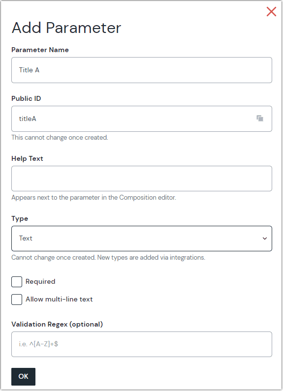 The fields for adding a parameter
Continue entering parameters until you have completed the following:
Name Type Public ID Title A Text titleA Title B Text titleB Highlighted Text Text highlightedTextSubtext Text subtext Check that each parameter's public ID matches the corresponding prop in the
<Hero/>component.Click Save and close.
5. Create a page component#
To create a page, go back to the list of components and repeat the steps to create a component. Compositions must be configured as "Composition Components," which form the basis of compositions. The default project comes with a composition component called "Page.” If you deleted this component or started the project from scratch, create a new component called "Page” and check the "Composition Component" box on the setup page.
Add a text parameter called "Meta Title," make it required, and ignore all other options. This adds meta data to the page.
The page composition component uses slots to specify a list of components allowed as children on the page. This is similar to how React uses the children prop.
Click on the Slots tab in the Page composition component
Click Add slot
Enter the following values:
Field Value Slot Name Content Public ID content (this is auto generated based on the value in "Slot Name") Required Component Quantity: Minimum Required Component Quantity: Maximum Allowed Components Allow components and patters "Allowed components" allow you use all components in the Page composition component. The Required Component Quantity option specifies the minimum or maximum number of child components allowed in the slot.
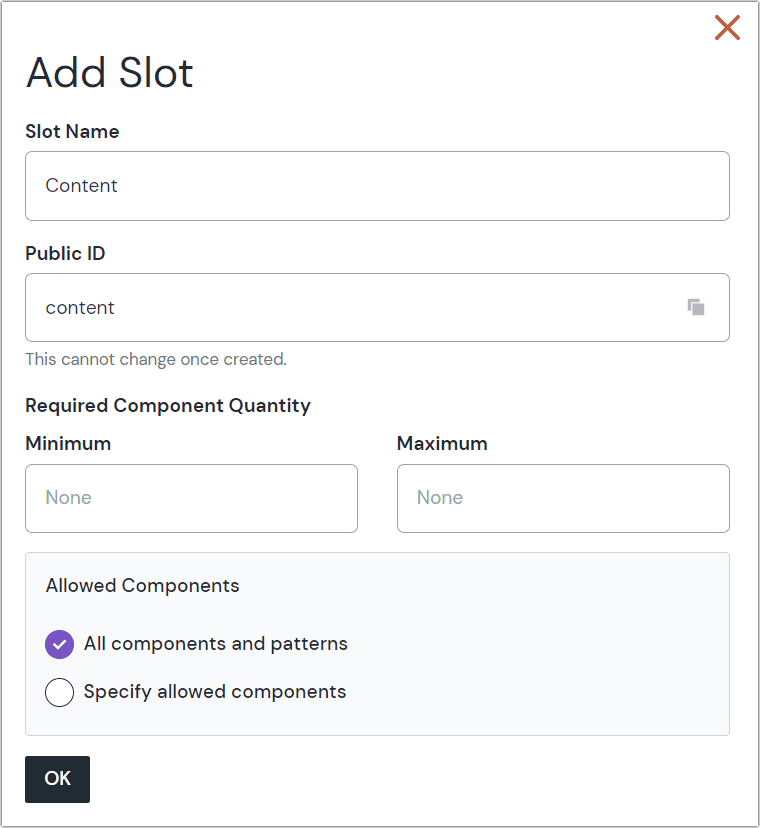 The configured slot
Click OK.
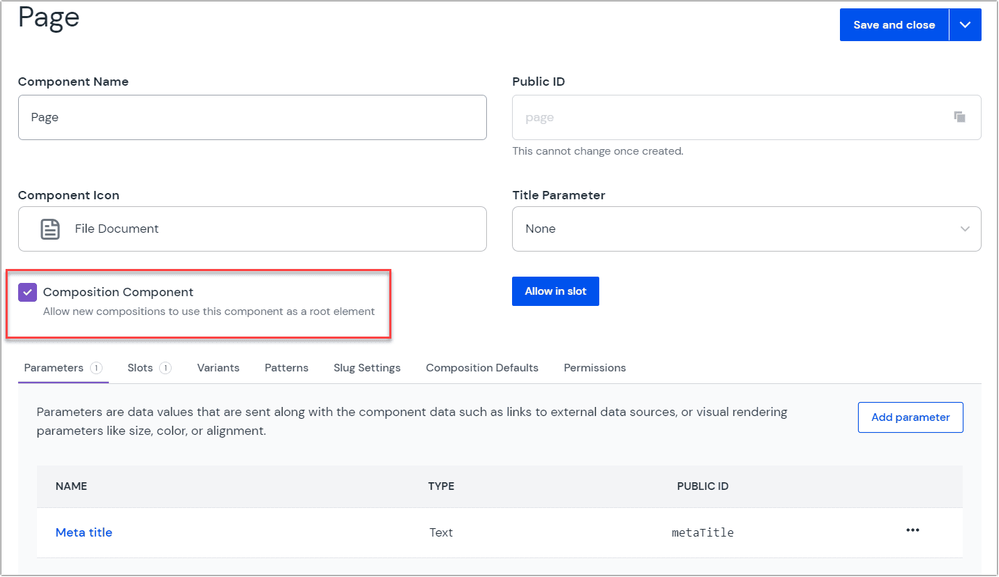 Creating a composition component
Save and close the component.
6. Create a composition#
Now that you have configured your components you can use them to create a composition.
Navigate to Experience > Compositions.
Click Create a composition (if this is your first composition) or Add composition.
Add the following values:
Field Value Select a composition type Page Name Home Slug / The default project created comes with a Home composition with a route of
/. If you deleted the Home composition shipped with the default project, create a new composition called Home with a slug of/. Select Page as the composition type.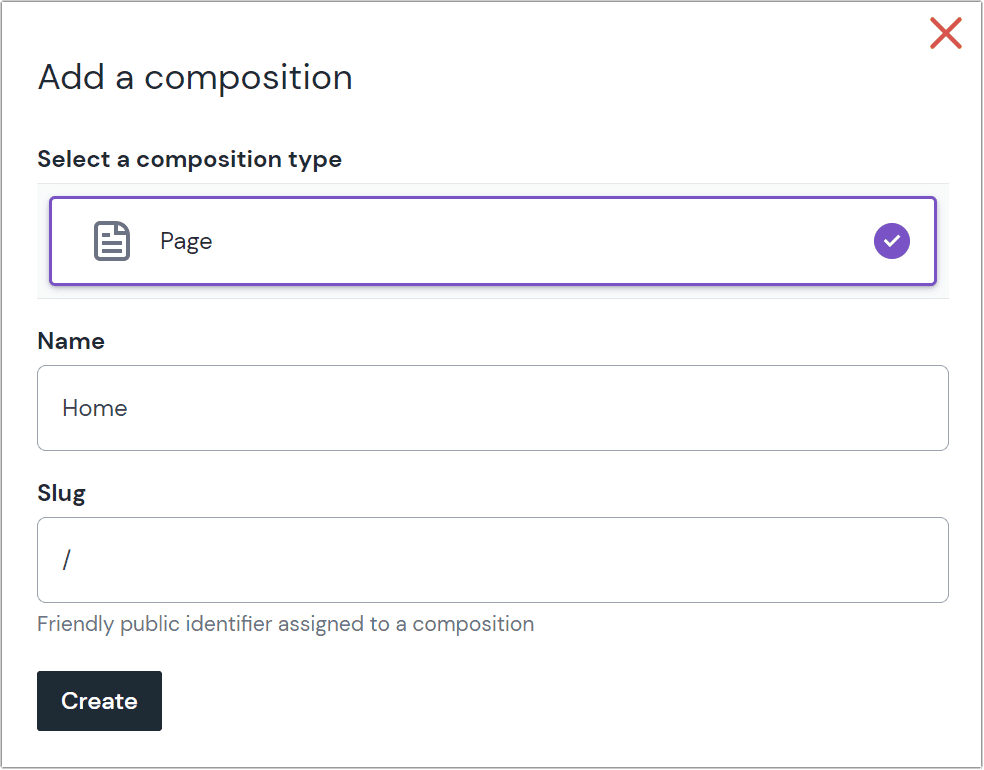 A sample Canvas editor
Click Create.
Once you create a composition you're taken to the Canvas visual editor.
The editor comprises the structure panel on the left, the preview panel in the middle, and the property panel on the right. If you aren't working with the default project, the preview won't be available yet.
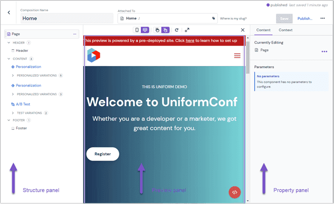
Within the structure panel, delete any existing components including personalization on the parent "Page" component.
Click the under the Content slot to add the Hero component you created earlier as the first item on the page.
In the property panel, enter the following sample content for each parameter:
Parameter Value Title A The Freedom to Create the Highlighted Text Websites Title B You Want Subtext Empower your non-technical team to build and ship without touching a line of code. Focus on what matters as a developer. Save and publish the composition.
info
Always publish compositions after an update to surface the changes in the frontend.
7. Connect Uniform to your Next.js project#
There are multiple ways to pull data from a Uniform composition into your website. This tutorial fetches the composition by its slug.
- In your Next.js project, create a
.envfile in the root of your project to hold all environment variables and secrets. Add the Uniform API Key and Project ID using the variables:
Add the .env file to the .gitignore file, excluding it from version control.
Install Uniform Canvas packages with the following command:
npm install @uniformdev/canvas @uniformdev/canvas-react @uniformdev/canvas-nextinfo
Learn more about the @uniformdev/canvas, @uniformdev/canvas-react, and @uniformdev/canvas-next packages.
In the
src/pages/index.tsxfile, enable fetching the Uniform composition with a slug matching the current Next.js route and providing it as props to the route component. This should be the first line:src/pages/index.tsx
export { getServerSideProps } from '@uniformdev/canvas-next/slug'About this step
In the block above, you configured Next.js to use the default slug-based composition route resolver and server-side rendering. It's also possible to:
Use static rendering (
getStaticProps/getStaticPathsexports)Customize the settings or extend the props function, such as fetching only draft compositions:
export const getServerSideProps = withUniformGetServerSideProps({ requestOptions: { state: CANVAS_DRAFT_STATE } })Use alternative route resolution algorithms such as project map (use
@uniformdev/canvas-next/project-mapinstead of@uniformdev/canvas-next/slugin your import)
Next, in the
index.tsxfile, you'll update the imports with the required modules and render the Composition using the code below:/index.tsx
export { getServerSideProps } from '@uniformdev/canvas-next/slug' import { Layout } from '@/components/Layout' import Head from 'next/head' import { UniformComposition, UniformSlot } from '@uniformdev/canvas-react' import { RootComponentInstance } from '@uniformdev/canvas' export default function Home(props: { data: RootComponentInstance }) { return ( <> <Head> <title>Lyne | Home</title> <meta name="viewport" content="width=device-width, initial-scale=1" /> </Head> <Layout> {/* Renders the components of your Uniform Composition resolved by getServerSideProps */} <UniformComposition data={props.data}> <UniformSlot name="content" /> </UniformComposition> </Layout> </> ) }About this step
The
UniformCompositioncomponent wraps the composition components and receives the composition data as a prop.<UniformSlot/>renders all components added to the slot namedcontentin Uniform. This is the Page composition'scontentslot's public id.The last step to visualize the composition is to register your React component with the Uniform SDK so that it knows what to render when it receives a named component.
In
components/Hero.tsx, register it with the Uniform SDK by adding this at the bottom:Hero.tsx
import { registerUniformComponent } from "@uniformdev/canvas-react"; // rest of the component as-is registerUniformComponent({ type: "hero", component: Hero });Then import your
Herocomponent file intoindex.tsxso that the registration becomes visible to the<UniformComposition>component:pages/index.tsx
import '@/components/Hero';You have now mapped the
Herocomponent to any Uniform component with the public ID ofhero.
You should now have a page with a Layout, Hero section, and content coming from Uniform.
With this, you've covered the basics of setting up a Uniform project and connecting it to your Next.js project.
8. Activate preview in Next.js#
To activate the preview panel in Uniform, you'll create a Next.js API route containing the preview logic. Uniform ships a module to set this up.
In your project, install the Uniform Canvas Next.js package using the command:
npm install @uniformdev/canvas-nextinfo
Learn more about the @uniformdev/canvas-next package.
In
src/pages/apicreate a new file called "preview.ts" with the following:preview.ts
import { createPreviewHandler } from '@uniformdev/canvas-next' const handler = createPreviewHandler({ secret: () => process.env.UNIFORM_PREVIEW_SECRET, }) export default handlerThe code above uses the
createPreviewHandlermethod to set up a preview with contextual editing supported.Add the secret as an environment variable in your .env file with the following:
UNIFORM_PREVIEW_SECRET=uniformRestart your development server, and your preview URL will become: http://localhost:3000/api/preview?secret=uniform.
warning
Visiting this link in the browser will result in JSON error "{"message":"Couldn't resolve the full path of the preview page"}"
Copy this URL, and in Uniform, navigate to your project and go to: Settings > Canvas Settings and update the URL under Preview Configuration with your new preview URL.
Save the preview URL.
Navigate to your Home Composition in Uniform, and you should have the preview active, similar to the image below.
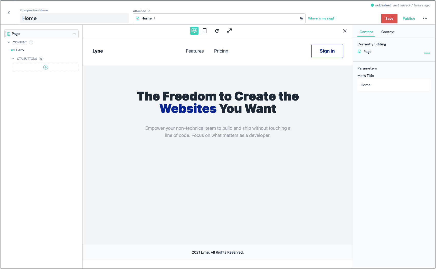 The Uniform contextual editor showing your application content
Summary
Continue building the page by:
- Adding more front-end components. Here are sample Features, FeatureCard, CTA, and CTA button components.
- Registering the components in the
resolveRenderer()function. - Modeling the components on Uniform.
- Adding components and content to the composition in Uniform.
- Repeat the process above for new pages. Import and reuse functions wherever possible.
Here's the project repository and a deployed version.