Insights dashboard
The Insights dashboard is the project-wide view of your analytics data. Open your project and select Insights in the left rail of the project dashboard. The tab appears once you have the View insights permission and Insights is enabled for the project.
If the tab is there but shows a "Not configured" message, no tracking token has been generated yet. See activate Insights.
Date range#
Everything on the dashboard is scoped by a single date range control in the header, offering the last 7 days, 14 days, 30 days, or 3 months. It defaults to the last 7 days, and your choice is remembered. Predefined ranges always end at the end of the previous full day; today is not included.
Widgets that show a trend compare the selected range against the immediately preceding period of the same length. Selecting the last 7 days compares against the 7 days before that.
The refresh button next to the date range refetches every widget at once.
Widgets#
Widgets are hidden rather than shown empty when the Context entities they depend on do not exist. A project with no enrichments will not show the audience profile widget at all, and one with no A/B tests will not show the active tests table. This keeps the dashboard proportional to what you have configured.
Sessions#
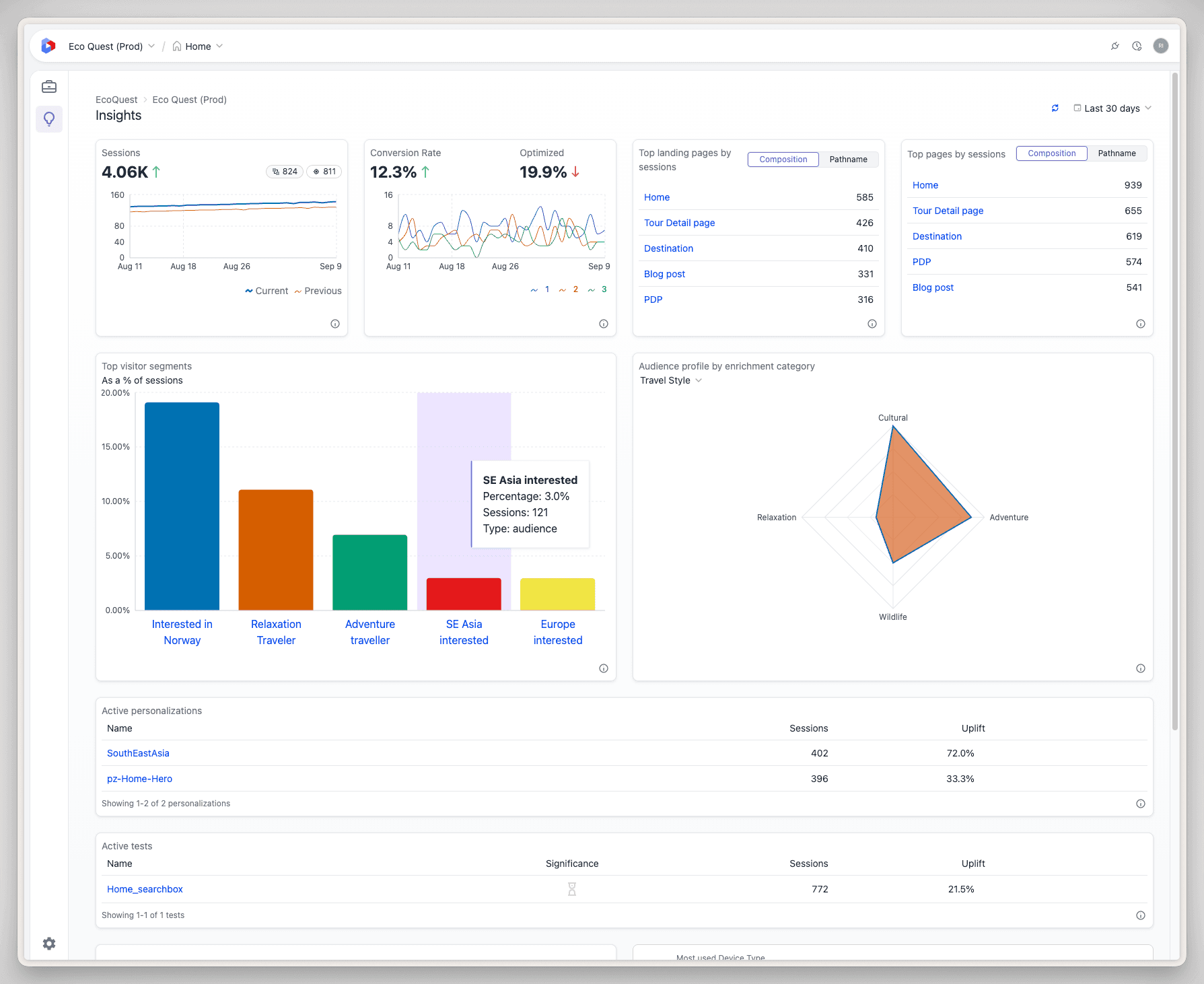
Total sessions for the period, with a trend against the previous period and a time series comparing the two. Two counters alongside the total break out how many of those sessions included an A/B test and how many included a personalization.
A session is a single continuous visit, grouping all of a visitor's activity until 30 minutes of inactivity. Sessions are the denominator for most other rates on the dashboard, so an unexpected swing here is worth understanding before reading anything else.
Conversion rate#
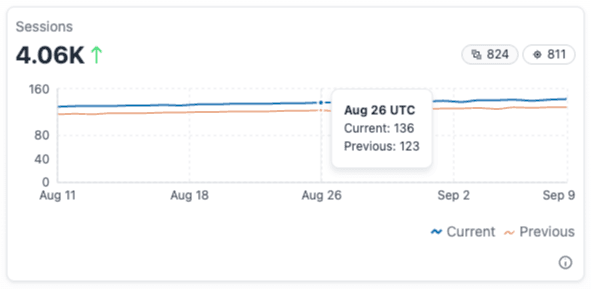
Overall conversion rate for the period with its trend, alongside an Optimized conversion rate, which counts conversions from sessions where the visitor saw a non-control A/B test or personalization variation. The chart plots the top five conversion goals for the period.
This widget only appears once you have at least one conversion goal configured.
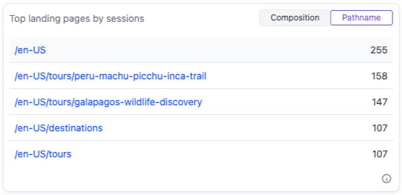
Top landing pages by sessions#
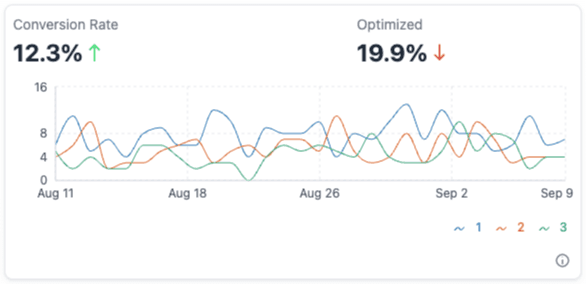
The pages where visitors most often begin a session. A toggle switches between grouping by composition and grouping by pathname.
Grouping by composition is usually what you want: a dynamic composition serving many URLs aggregates into one row rather than scattering across a long tail of paths. Group by pathname when you need the literal URLs.
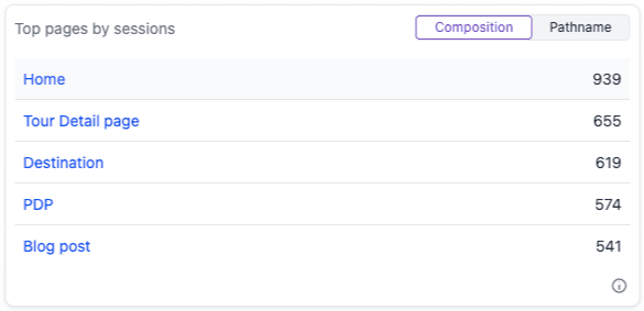
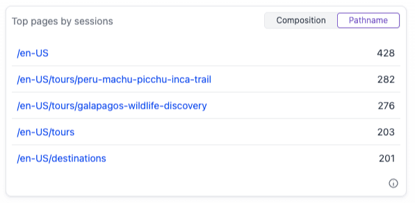
Top pages by sessions#
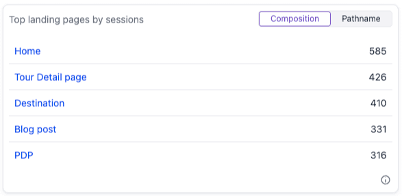
The same table and the same composition/pathname toggle, but counting every session that reached the page rather than only sessions that started there.
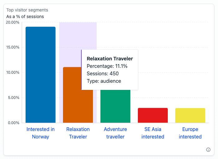
Top visitor segments#
The five audiences, intents, and signals most commonly assigned to visitors, as a percentage of sessions. Insights treats all three as segments because they share a public ID namespace.
Use it to find which segments are large enough to be worth personalizing for. The widget only appears if the project has signals or aggregate dimensions configured.
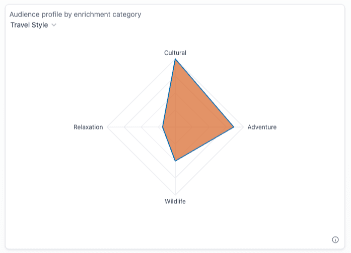
Audience profile by enrichment category#
The distribution of enrichment strength across all sessions, rendered as a radar or bar chart. Values are normalized to a 0-100 scale against the highest-scoring tag, so the chart shows relative interest rather than absolute totals.
The widget only appears if the project has enrichments configured.
Active personalizations#
A table of the personalizations that ran during the period, with sessions and uplift for each.

Uplift is the percentage change in conversion rate between the personalized variation and the control. A 0% uplift means either that the personalization is not outperforming the control, or that there is no control conversion data to compare against.
Active tests#
A table of the A/B tests that ran during the period, with a significance indicator, sessions, and uplift.
The significance column shows a checkmark when the test is both statistically and practically significant, and an hourglass when more data is needed. Hovering the indicator shows the p-value, z-score, observed effect, and sample sizes behind the verdict. See how significance works for what the dashboard requires before it will call a result.

Marketing optimization#
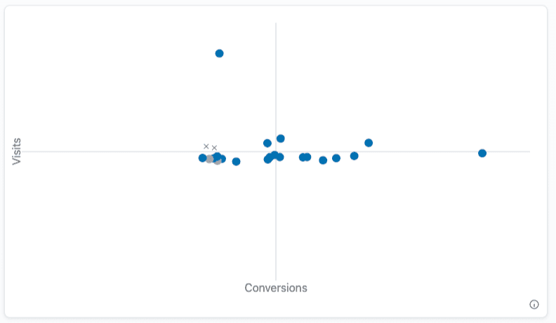
A quadrant chart plotting your compositions by visit volume against conversions. Where a composition lands suggests what to do with it:
- High visits, low conversions is the clearest opportunity to run an A/B test.
- High visits, high conversions are your top performers, worth protecting.
- Low visits, low conversions either need traffic or should be retired.
- Low visits, high conversions would raise overall conversions if you sent more traffic their way.
Device type and bounce rate#
Two stat cards close out the dashboard.
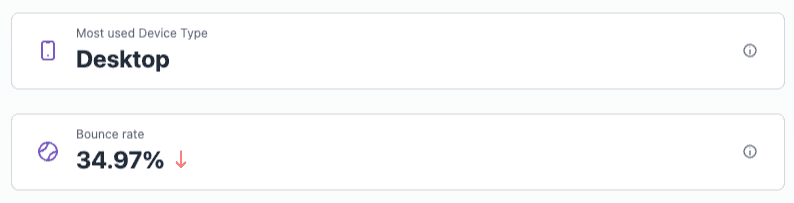
Most used device type classifies sessions as desktop, mobile, iPad, or other from HTTP headers. Tablets other than iPad may report as desktop or mobile depending on the operating system and browser.
Bounce rate is the share of sessions that ended without further interaction: no additional page views and no goal conversions. Enrichment and signal updates do not count as interaction, since those can fire automatically without the visitor doing anything.
Going beyond the widgets#
The dashboard covers the questions most teams ask most often. For anything else, like a specific composition, a comparison between two locales, or traffic sources that appeared this week but not last, ask Scout, which queries the same data directly.