Visual editing
Uniform provides the layer in a composable stack where users build experiences. As part of Canvas, users can leverage data from integrated systems to create compositions. Authors create, edit, and publish compositions from the visual editor, while seeing what the user will see.
With the visual editor you can:
- Preview content at different screen sizes (for example, desktop and mobile)
- Understand the effects of changes made to the experience
- Preview variations when adding personalization, localization, or A/B testing to an experience
Note that visual editing differs from in-line editing. With the preview seen in Uniform, editors can decide which system to update. Updates to core content should be made in the system of record. Changes to variable content (personalized, localized, or test variations) should be made in a system like Uniform to prevent pollution of the content model.
The updates to content made in Uniform don't affect core content managed in different systems.
tip
Looking for developer information? This page focuses on what the visual editor is and how to use it. Technical folks may be more interested in:
Edit compositions#
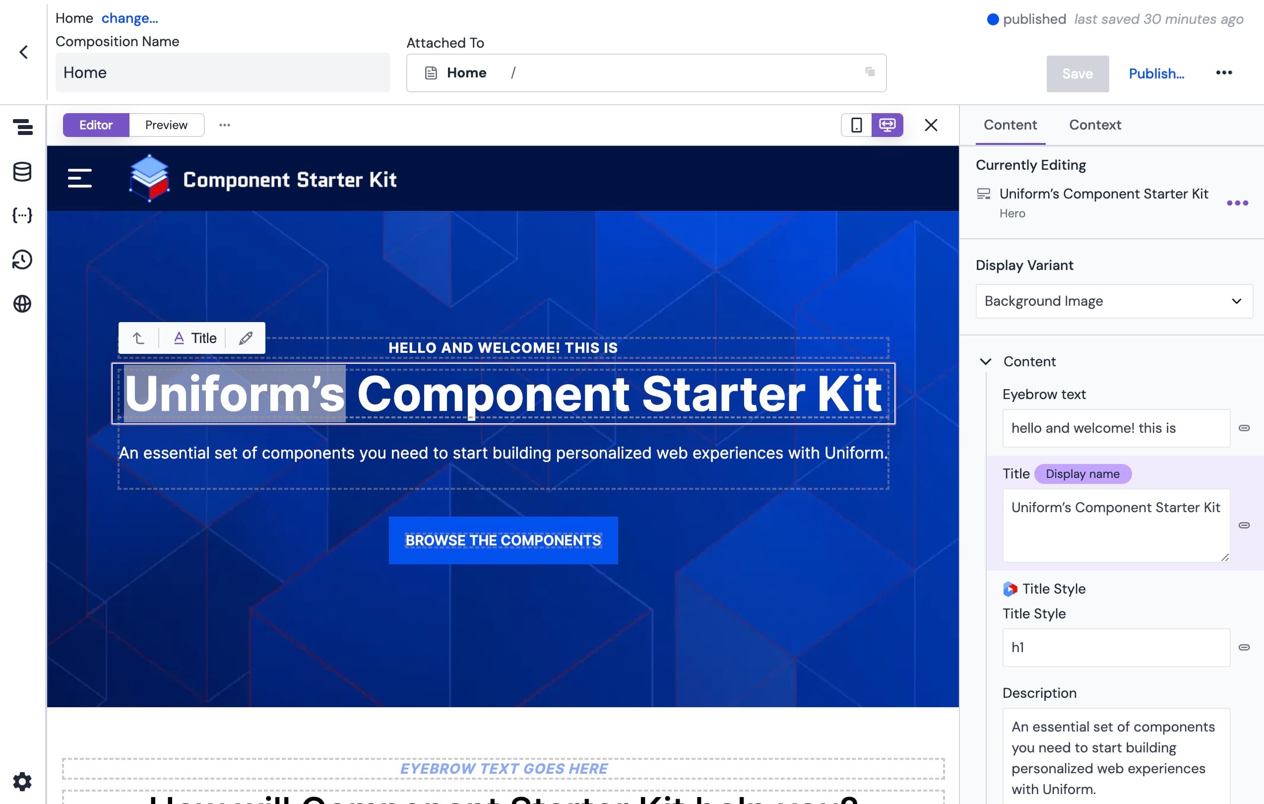
The Uniform visual editor provides the tools marketers need for creating seamless experiences, and constantly improving them through optimization and learning. It combines access to all enterprise content sources with a live preview so teams know exactly what will be published, in a navigable workspace.
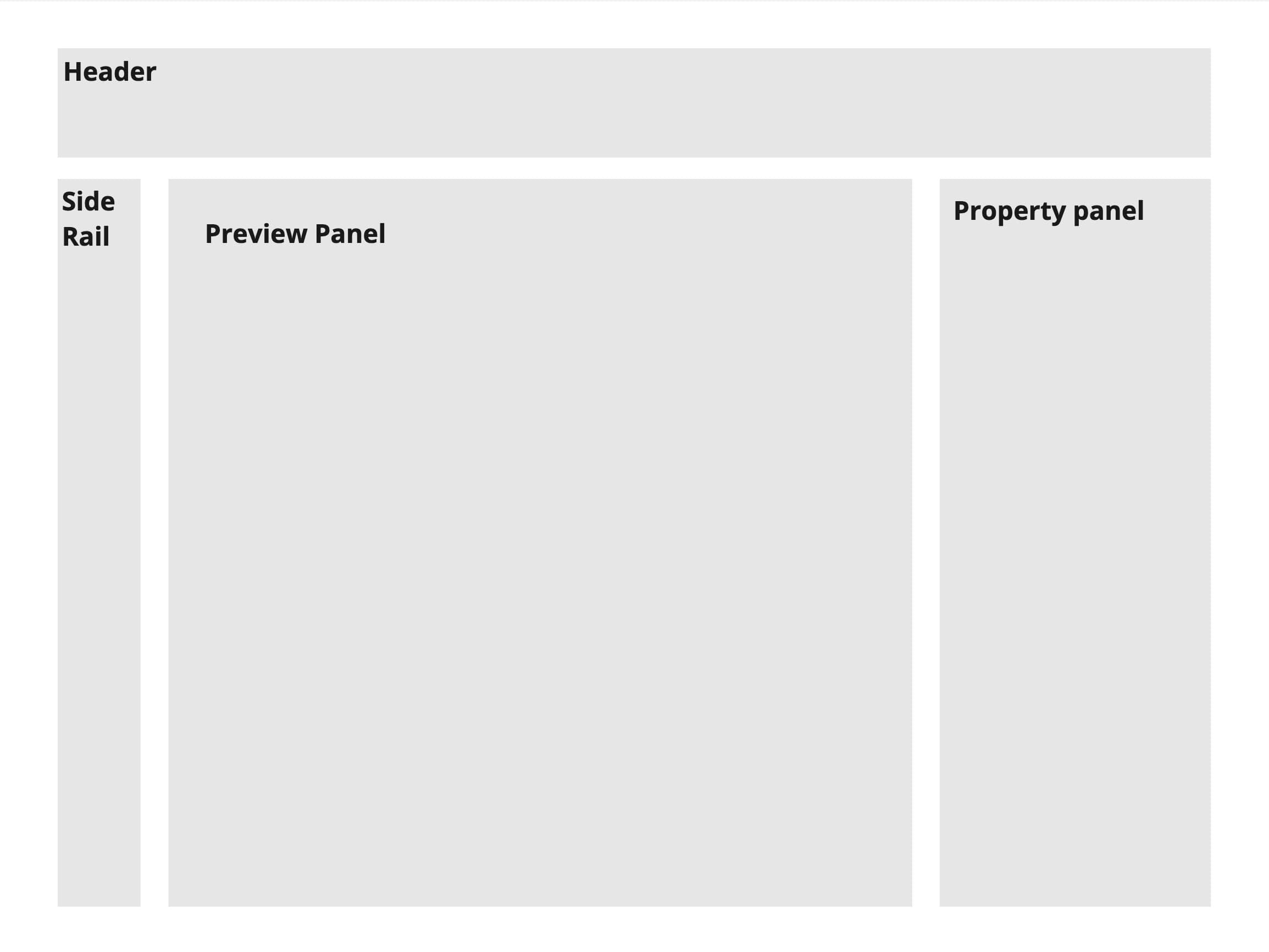
Editing compositions within Canvas is done in four main areas:
- Header: Contains the composition name, slug or node information, management controls, and status information
- Side rail: Allows you to open different panels to explore details and resources related to the currently opened composition.
- Preview panel: Holds the preview of the page and some display controls
- Property panel: Contains controls for component parameters and personalization
Header#
Main attributes of the composition are managed within the header. This includes:
- Composition name: The name of the composition. Click to edit the name inline. The sparkle icon next to the name field lets you generate a name using AI based on the composition content.
- Project map path: If the composition is attached to a project map node, the full path is displayed. Dynamic path segments are clickable, allowing you to set preview values directly. Click the tree icon to open a drawer where you can edit the project map node properties.
- Locale and edition selector: A combined menu showing the current locale and edition. The menu displays available locales on the left side and editions on the right side. If you're using editions, locales enabled on other editions appear in submenus, allowing you to switch to a specific edition and locale in one step. If only one edition exists (the default), the editions section is hidden to reduce clutter.
- Publish status: Shows whether the composition is published or in draft state.
- Save button: The button changes color when there are unsaved changes, making it easy to see at a glance whether your work needs saving.
- Menu : Opens additional management options:
- Copy full URL: Copies the full URL of the composition to your clipboard.
- View published: Opens the published version of the composition in a new browser tab.
- Dynamic preview values...: Opens the dynamic preview values popover to configure preview values for dynamic inputs and quirks.
- Edit definition: Takes you to the component definition in your component library.
- Duplicate: Creates a copy of the composition.
- Delete: Permanently removes the composition.
Side rail#
The side rail sits to the left of the screen and allows you to view details and resources connected to the current composition.
It contains following elements:
| Element | Icon |
|---|---|
| Structure | 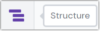 The structure icon in the side rail. |
| Data resources | 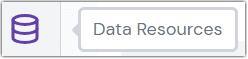 The data resources icon in the side rail. |
| Source | 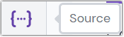 The source icon in the side rail. |
| Composition history |  The history icon in the side rail. |
| Locale management |  The locales icon in the side rail. |
| Properties |  The properties icon in the side rail. |
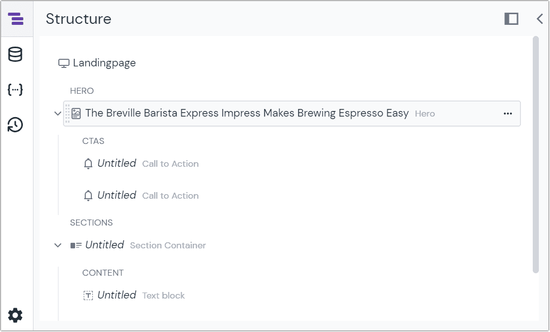
Structure#
The structure section shows the hierarchy of slots and components.
You can:
- Reorder components by dragging and dropping elements, depending on the configuration of the composition or the roles and permissions applied.
- Expand or collapse hierarchical sections, such as if you have slots within a component, making it easier to focus on specific sections.
Data resources#
The data resources section provides features to manage your data sources and data types from within your composition.
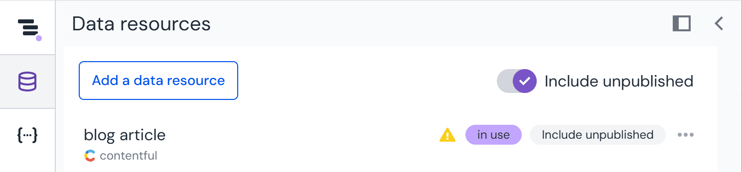
Unpublished content mode#
The data resources drawer includes an unpublished content mode toggle that allows selecting content that, depending on data source configuration, hasn't been published yet, or that hasn't passed through normal workflow stages to become live, or belongs to a different environment.
When unpublished content mode is active, the data resources icon in the side rail displays an indicator to remind you that you're viewing unpublished content.
Quick toggle
You can quickly toggle unpublished content mode without opening the drawer by holding Alt (Windows/Linux) or Option (Mac) and clicking the data resources icon in the side rail.
info
Not all data sources support unpublished content mode. Check the documentation of your specific integration to see if this feature is available.
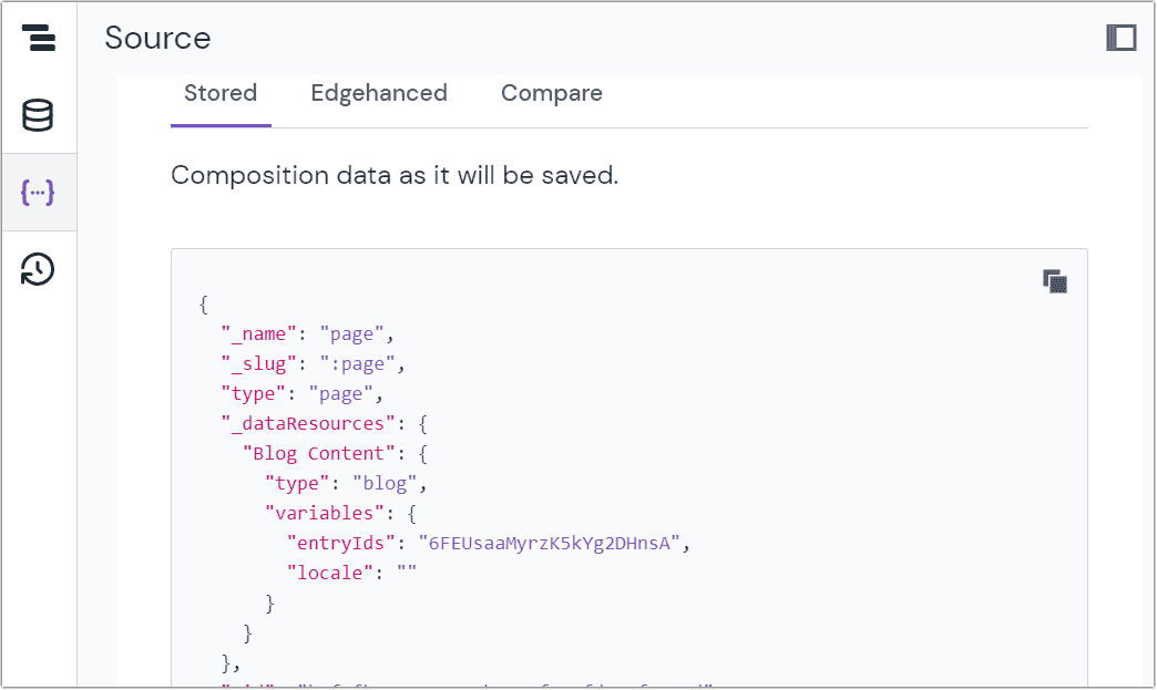
Source#
The source element shows you the references of your composition as JSON data. You can see composition data:
- As it will be saved as JSON.
- As it would be returned for use in a consuming application, with data resources, patterns, and pattern overrides applied.
- The comparison of current edits with the last published version.
Composition history#
Here you can see drafts and published versions of your composition. If you make several changes within the same day, those updates will be collected together as the number of versions created on the day. Selecting a revision will load the composition as "read only" with the references as they were at that point in time. You can:
- See what was changed, when, and by whom.
- Restore this version (which will create a new version with the associated references).
- Go back to the current version.
By default, data is saved for the last 30 days. However, for projects on the Enterprise plan, data can be accessed for up to 365 days.
This is useful when there are multiple people collaborating on a single composition, or previous version data needs to be reviewed. You should note that this isn't a full audit feature. Uniform does track the references that are saved as JSON. It doesn't save the data coming from external sources. If you're reviewing a component pattern, only the references will be saved.
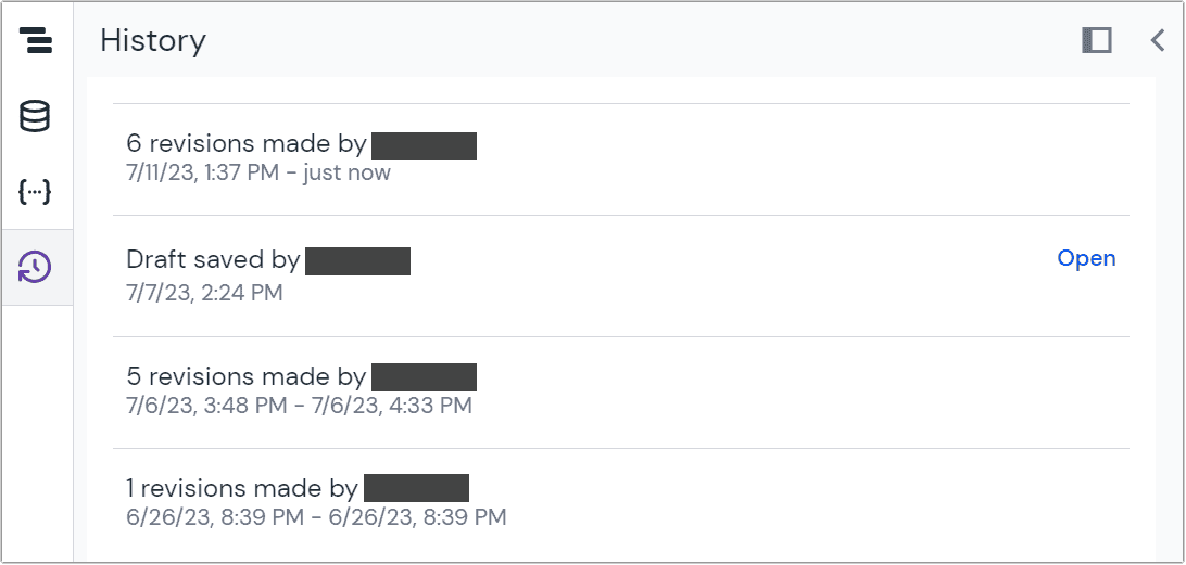
note
Only structures and component definitions are saved at a given point in time. If you restore an old composition, and its components have been updated, there could be conflicts or broken references.
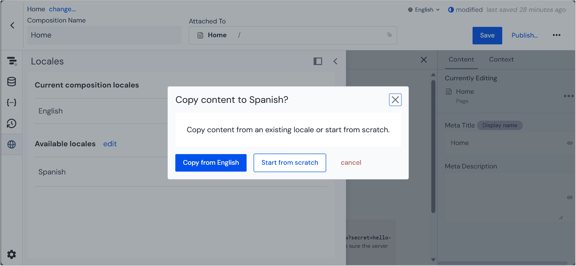
Locales#
Locales that are applied to the current composition are listed, as well as any that are available to be added. If you add a new locale, you have the option to copy content from an existing locale or start from scratch. If you choose to copy an existing locale, Uniform will copy both the content and existing localization containers.
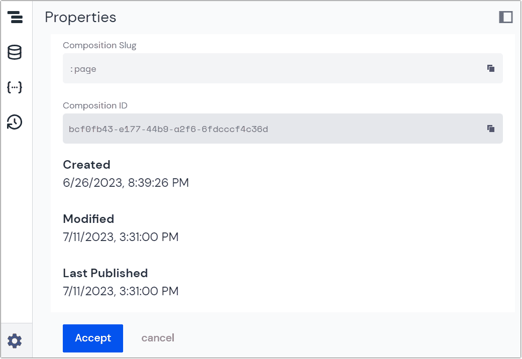
Properties#
Within the properties section of the structure panel you will see some basic information about your composition, including the:
- Composition slug
- Composition ID
- Created, modified, and last published dates
Extending the side rail#
You can add custom elements to the side rail using the "Editor tools" Mesh location in an integration.
Preview panel#
The preview panel sits in the middle of the screen (in larger view ports). Authors can:
- Toggle between editing and preview modes.
- Toggle between full-width or mobile views.
- Refresh the view to show the most recent updates from source systems.
- Open the preview in its own browser tab or window.
The preview panel can also be closed by clicking on the "X." If closed, the two side panels fill the window. Clicking the “|O|” icon will re-open the preview.
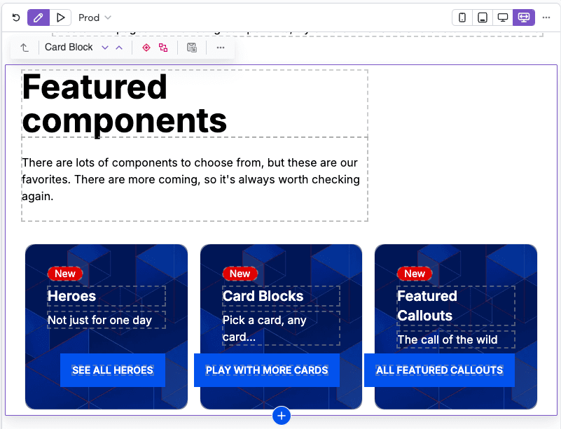
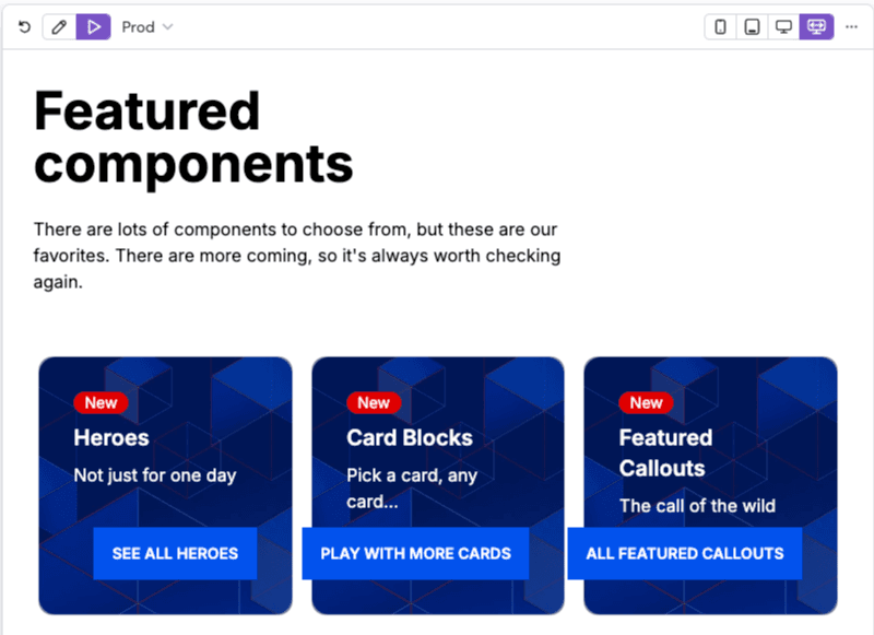
Edit & Preview mode#
At the top-left corner of the preview panel are buttons that allow users to toggle between two preview modes;
- Edit mode – enables visual editing and inline editing, helping users to quickly update content and manipulate components from within preview panel.
- Preview mode – removes the Uniform editing UI from the preview panel and enables page interactions in order to provide a clean preview experience for reviews and testing.
Preview dynamic values#
When you edit a dynamic composition that has dynamic inputs such as dynamic path segments or query strings, you can preview different values for these inputs in the preview panel. This for example allows you to preview a product detail page using any product you like.
Following dynamic inputs are supported:
- Dynamic path segments: Each dynamic path segment of the project map node path is a clickable chip.
- Query strings: A clickable chip with the count of allowed query strings is displayed next to the project map path.
- Quirks: A clickable chip with the count of quirks that are available to use is displayed next to the project map path.

Click on any chip to open a popover where you can change the preview value for that input. This lets you simulate different states and test how your composition responds to different dynamic values. Dynamic path segments and query strings are managed in the "Project map" tab and quirks are managed in the "Quirks" tab inside of the popover..

info
Preview values are temporary stored per user in your browser. Each preview value has a menu where you can access your previously used values.
Localization preview#
note
Make sure that you have localization set up in your project first.
Visual editing in Canvas allows previewing a localized version of your composition. Select a locale from the combined locale and edition menu in the toolbar. The menu displays available locales on the left and editions on the right. If you're using editions, locales enabled on other editions appear in submenus, allowing you to switch to a specific edition and locale in one step.
The value of the currently active locale is also exposed to your app in preview mode, so you can use it to better localize your data during visual editing (for example, preview localized content from a CMS).
For more information, check the localization guide or how to use custom routing in preview URLs.
Property panel#
The property panel is to the right (in larger view ports) or below the composition structure (in smaller view ports).
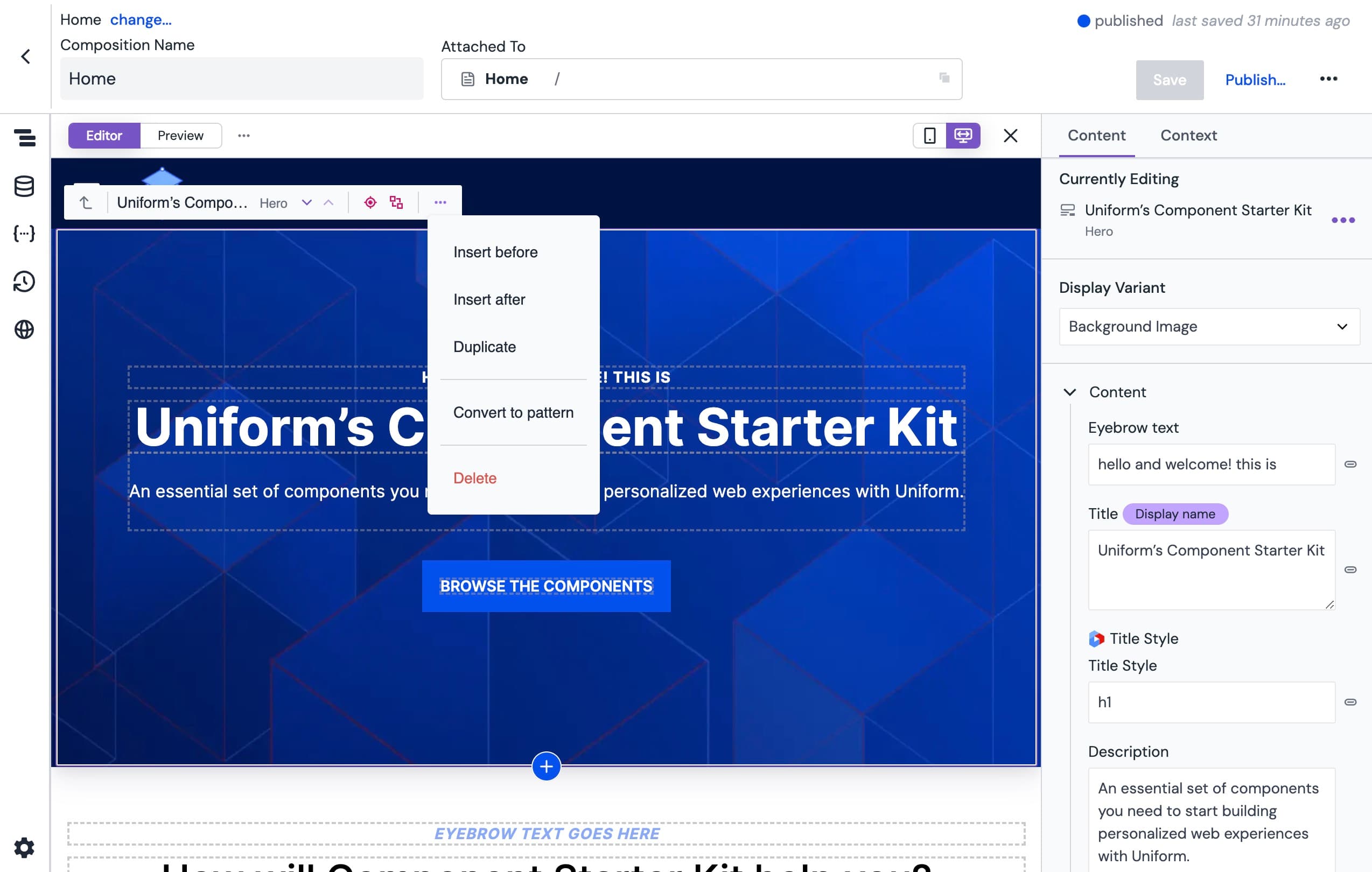
There are two tabs in the panel. The content tab orients the author showing which component is currently being edited. Clicking the on the active component opens a menu where authors can:
- Convert the component to a pattern (if it's not already)
- Edit pattern or copy pattern (if it's already)
- Duplicate the component
- Remove the component
Variations#
Variations can also be managed in the property panel. If there are multiple variations for the component, they can be selected and previewed. Clicking the to manage display variations or the to add a display variation will take authors to the component library to edit the component variations.
Parameters#
Authors can also manage parameters associated with the component from the property panel. Parameters will be specific to the integrations, data source, data type, and elements associated with the composition.
Navigate the editor#
While the visual editor is comprised of separate sections, they work together seamlessly to orient authors. As composition authors navigate through components in the preview panel, the selected item is highlighted. A tool bar also appears with which you can:
- Select the parent component
- See the icon, component title, and the type of the component
- Select the component directly above or below the selected component
- Insert a component before or after the component
- Insert a component into the slot (if the component is configured with slots)
- Convert to pattern
- Duplicate or delete the component
You can also leverage content optimization tools from the highlighter, including:
- Personalize the component.
- Test variations of the component
- Localize the component.
As you select composition elements from the structure or preview panels, the corresponding parameter is highlighted in the property panel.
Custom component display names#
You can give any component instance a custom display name to maintain a clear overview of your composition structure and document the purpose of each component. This is especially helpful when working with compositions that contain multiple instances of the same component type.
To set a custom display name:
- Select the component in the structure panel or preview panel.
- Click on the component's display name shown in the property panel header. The name becomes editable.
- Type your custom name and press Enter or click outside the field to apply the changes. The updated name will be displayed in the structure panel and property panel.
AI-generated names
Click the AI sparkle button next to the name field to automatically generate a descriptive name based on the component's content.
Custom display names are internal to Uniform and are not delivered to your frontend application.
note
Custom display names can be set on component instances and pattern instances in compositions. They cannot be set on entries.
Add components#
Click the in either the structure or the preview panel to add a component to a composition. This will open the "Insert component" dialog.
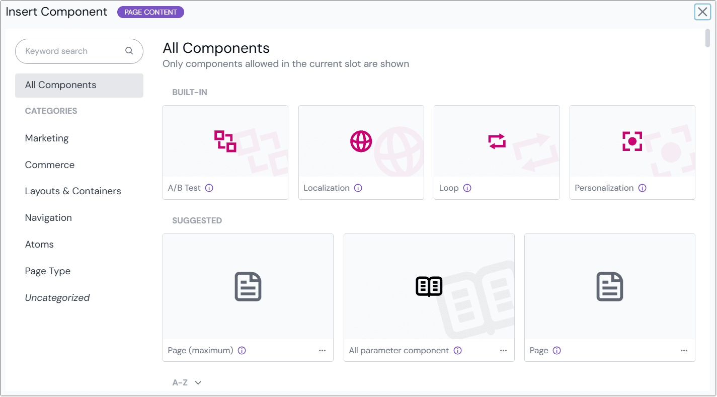
Authors can browse components allowed in the slot and permissions by:
- Searching by keyword by typing into the search box
- Choosing from the list provided, which contains:
- Built-in components: Uniform components that control visibility of the components they contain: personalization, localization, testing, and loops.
- Suggested components: A blend of components recently used (by the current user), brand new components, and recently updated components. This may not display if there are fewer than four components available.
- A-Z, which shows all components available in the current slot.
- Filter by category: Components can be categorized by editing the component. Categories are managed by editing components as well.
Content collaboration#
Presence indicator#
The presence indicator displays active users currently editing the same composition or entry. Located in the top-right corner of the composition editor, it provides real-time collaboration awareness. Hover over any avatar to view the user's name and email address.
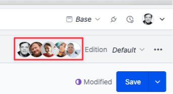
By default, the presence indicator only displays avatars of other collaborators working on the same composition or entry. Your own avatar appears only when you have the same composition or entry open in multiple tabs or devices. The indicator remains hidden when you're the sole editor.
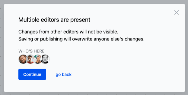
When accessing a composition or entry that another user is actively editing, you'll receive a notification in a modal window before proceeding with your edits.
Manage content version conflicts#
If another user saves changes to a composition or entry while you are editing it, you'll receive a version conflict notification when attempting to save or publish your changes. This notification displays who made the most recent changes and allows you to review those changes before deciding how to proceed.
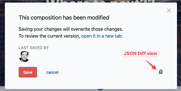
To review the changes, you have two options:
- Open the latest version of the composition in a new tab to examine the changes visually
- View a JSON diff that highlights the specific modifications made by the other user
After reviewing the changes, you can choose to:
- Overwrite the other user's changes by saving your version. Don't worry - the overwritten version remains accessible in the composition or entry history.
- Cancel your save or publish action to preserve the other user's changes and reconsider your approach.
If you cancel saving, you have two options to manage the content version conflicts:
- Keep your version:
- Open the latest version in a new tab
- Identify and copy the updated components from the latest version
- Paste these components back into your version in the original tab using copy and paste
- Save your version, which will overwrite the changes made by the other user
- Apply your changes to the latest version:
- Open the latest version in a new tab
- Identify and copy your updated components from your original version
- Paste your components into the tab with the latest version
- Save the latest version with your changes incorporated
- Discard your original version by closing the editor without saving
Copy & paste components#
Speed up your workflow by copying components and pasting them elsewhere in the composition or in another composition.
Browser permission required
To enable the copy and paste functionality for components, you need to grant Uniform "Read" access to your browser's clipboard. This permission allows Uniform to display where a component from the clipboard can be pasted and to show the currently copied component.
When the permission is not granted then you can only copy components but not paste them. You can always revise this permission in your browser settings.
Copy components#
To copy a component and its children follow these steps:
- In the composition editor, select the component you want to copy.
- Click the icon in the highlighter. Or you can choose the Copy option from the context menu of the component in the structure panel or property panel.
- Once you have a component copied in the clipboard, you will see a confirmation message on the bottom right of the screen.

Paste components#
You can then paste the component into the same or another composition.
Copy and paste across projects
This feature even works across different Uniform projects if they share the same set of components and component patterns. It can be particularly useful when you need to copy components between a staging and production project.
To paste a component from the clipboard:
- Navigate to the composition where you want to paste the component.
- Select the component or component pattern after which you want to paste the copied component.
- You have multiple ways of accessing the paste functionality:
- The highlighter will show the name of the component that is currently in the clipboard left of the icon. You can also click the menu to choose from various insertion options.
 Paste via component highlighter
- Insert the component by clicking the icon in the structure panel or preview panel. This will open the "Insert component" dialog. If there is a component in the clipboard, you will see it featured as the first item in the Suggested section. The item will have a
from clipboardbadge. Clicking this will insert the copied component at the specified position.
 Paste via Insert component dialog
 - You can repeat the paste action as many times as you need.
Known limitations of pasting components#
When pasting components, there are some limitations to be aware of:
- No paste support for Firefox and Safari: Due to browser limitations, the paste functionality is not available for Firefox and Safari browsers.
- No component schema checks: When a component is pasted, it only checks if the component type (using its public ID) is allowed, but it does not perform any further compatibility checks on the parameter schema of the component or its child components. If an incompatible or invalid component is pasted, validation errors will be shown. This can occur when the component definition is not present or incompatible with the target composition, which may happen when copying and pasting across projects.
- Component patterns require the same UUID: When pasting a component pattern across projects, the pattern must have the same UUID in both the source and target projects. Simply recreating a pattern with the same name and structure is not sufficient. To ensure consistency, use the CLI to synchronize component patterns across projects.
- No copying of dependencies: Any data dependencies that the copied component has, such as data resources that were defined on the source composition will not be copied. You will need to manually add these dependencies to the pasted component or target composition.
Dive deeper#
Learn more about how to work with the visual workspace: