Create a component
Uniform makes it easy to use your front-end and design system components with Canvas. Your front-end development works with Uniform with little change in process or code.
In the previous lesson, you used components in Canvas. Now you'll walk through creating a new component in the front end project and register it for use with Canvas.
For this exercise you'll add a new video player component to the project so users can add JavaDrip related videos to your application. During the lesson you will:
Goals
- Create a new React component that isn't from the CSK (a video player).
- Test your new component using Storybook.
- Review how the component source is registered with Uniform.
- Define the component in the Uniform component library.
- Learn about exposing component props as Canvas parameters a business user can control.
- Add the new component to a composition (page).
- Learn how to enable inline editing with your component.
Create front-end component#
In your source code, add the following directory and file:
src/canvas/VideoPlayer/VideoPlayer.tsx
/* eslint-disable */ // @ts-nocheck import { FC } from 'react'; import classNames from 'classnames'; import { getTextClass } from '@/utilities/styling'; import { VideoPlayerProps } from '.'; export const VideoPlayer: FC<VideoPlayerProps> = ({ title, description, source, id, }) => ( <div className={classNames('hero min-h-[500px] relative', 'text-secondary-content')}> <div className={classNames('hero-content text-center p-0')}> <div className={classNames('flex flex-col mx-1 md:mx-10')}> <h1 className={classNames('font-bold', getTextClass('h5'))}> {title} </h1> <div className={classNames('py-6')}> {description} </div> <div className='border-dashed border-4 border-gray-300 p-5 text-gray-300'> {source === 'YouTube' && <iframe width="560" height="315" src={`https://www.youtube.com/embed/${id}`} title="YouTube video player" frameborder="0" allow="accelerometer; autoplay; clipboard-write; encrypted-media; gyroscope; picture-in-picture; web-share" allowFullScreen></iframe> } {source === 'Loom' && <iframe width="640" height="360" src={`https://www.loom.com/embed/${id}`} frameborder="0" webkitallowfullscreen mozallowfullscreen allowFullScreen></iframe> } {!source && <div className=' text-gray-300'>Select a video source</div> } </div> </div> </div> </div> );In your source code, add the following file:
src/canvas/VideoPlayer/index.ts
import { ComponentProps, registerUniformComponent, } from '@uniformdev/canvas-react'; import { VideoPlayer } from './VideoPlayer'; export type VideoPlayerProps = ComponentProps<{ id: string; source: string; title: string; description: string; }>; registerUniformComponent({ type: 'videoPlayer', component: VideoPlayer }); export default VideoPlayer;Update the following file to make the video player available to the front-end application:
src/canvas/index.ts
import './Accordion'; import './Accordion'; import './AccordionItem'; import './AddToCart'; import './Banner'; import './Breadcrumbs'; import './Button'; import './CallToAction'; import './Card'; import './Countdown'; import './Tabs'; import './Tab'; import './_atoms/Text'; import './_atoms/RichText'; import './_atoms/Hotspot'; import './CardBlock'; import './Carousel'; import './_containers/Container'; import './_containers/Box'; import './_containers/AdvancedContainer'; import './_containers/Grid'; import './_containers/GridItem'; import './ContentBlock'; import './Divider'; import './Feature'; import './FeaturedCallout'; import './Hero'; import './HeroContainer'; import './Image'; import './Table'; import './Modal'; import './_navigation/Footer'; import './_navigation/NavigationSection'; import './_navigation/Header'; import './_navigation/IconLink'; import './_navigation/NavLink'; import './Hotspots'; import './Price'; import './ProductDetails'; import './ProductInfo'; import './ImageGallery'; import './Review'; import './Spacer'; import './Testimonial'; import './Video'; import './EnrichmentSetter'; import './Page'; import './VideoPlayer'; export { default as Accordion } from './Accordion'; export { default as AddToCart } from './AddToCart'; export type { AddToCartProps } from './AddToCart'; export { default as Banner, BannerVariant } from './Banner'; export type { BannerProps } from './Banner'; export { default as Button } from './Button'; export type { ButtonProps } from './Button'; export { default as CallToAction, CallToActionVariant } from './CallToAction'; export type { CallToActionProps } from './CallToAction'; export { default as ProductInfo } from './ProductInfo'; export type { ProductInfoProps } from './ProductInfo'; export { default as Breadcrumbs } from './Breadcrumbs'; export type { BreadcrumbsProps } from './Breadcrumbs'; export { default as Card, CardVariants } from './Card'; export type { CardProps } from './Card'; export { default as CardBlock, CardBlockVariants } from './CardBlock'; export type { CardBlockProps } from './CardBlock'; export { default as Carousel, CarouselVariants } from './Carousel'; export type { CarouselProps } from './Carousel'; export { default as Container } from './_containers/Container'; export type { ContainerProps } from './_containers/Container'; export { default as ImageGallery } from './ImageGallery'; export type { BaseImageGalleryProps } from './ImageGallery'; export { default as ContentBlock } from './ContentBlock'; export type { ContentBlockProps } from './ContentBlock'; export { default as Divider } from './Divider'; export type { DividerProps } from './Divider'; export { default as FeaturedCallout, FeaturedCalloutVariant } from './FeaturedCallout'; export type { FeaturedCalloutProps } from './FeaturedCallout'; export { default as Grid } from './_containers/Grid'; export type { GridProps } from './_containers/Grid'; export { default as Hero, HeroVariant } from './Hero'; export type { HeroProps } from './Hero'; export { default as UniformImage } from './Image'; export type { ImageProps as UniformImageProps } from './Image'; export { default as Modal } from './Modal'; export type { ModalProps } from './Modal'; export { default as Price } from './Price'; export type { PriceProps } from './Price'; export { default as Review, ReviewVariant } from './Review'; export type { ReviewProps } from './Review'; export { default as Testimonial, TestimonialVariant } from './Testimonial'; export { default as RichText } from './_atoms/RichText'; export { default as Video } from './Video'; export type { VideoProps } from './Video'; export { default as Tabs } from './Tabs'; export { TabsVariant } from './Tabs'; export type { TabsProps } from './Tabs'; export { default as Table } from './Table'; export { TableVariant } from './Table'; export type { TableProps } from './Table'; export { default as Countdown } from './Countdown'; export { CountdownVariant } from './Countdown'; export type { CountdownProps } from './Countdown'; export { default as VideoPlayer } from './VideoPlayer'; export type { VideoPlayerProps } from './VideoPlayer';
In your source code, add the following directory and file:
src/canvas/VideoPlayer/VideoPlayer.tsx
/* eslint-disable */ // @ts-nocheck 'use client'; import { FC } from 'react'; import classNames from 'classnames'; import { getTextClass } from '@/utilities/styling'; import { VideoPlayerProps } from '.'; export const VideoPlayer: FC<VideoPlayerProps> = ({ title, description, source, id }) => ( <div className={classNames('hero min-h-[500px] relative', 'text-secondary-content')}> <div className={classNames('hero-content text-center p-0')}> <div className={classNames('flex flex-col mx-1 md:mx-10')}> <h1 className={classNames('font-bold', getTextClass('h5'))}> {title} </h1> <div className={classNames('py-6')}> {description} </div> <div className="border-dashed border-4 border-gray-300 p-5 text-gray-300"> {source === 'YouTube' && ( <iframe width="560" height="315" src={`https://www.youtube.com/embed/${id}`} title="YouTube video player" frameborder="0" allow="accelerometer; autoplay; clipboard-write; encrypted-media; gyroscope; picture-in-picture; web-share" allowFullScreen ></iframe> )} {source === 'Loom' && ( <iframe width="640" height="360" src={`https://www.loom.com/embed/${id}`} frameborder="0" webkitallowfullscreen mozallowfullscreen allowFullScreen ></iframe> )} {!source && <div className=" text-gray-300">Select a video source</div>} </div> </div> </div> </div> );In your source code, add the following file:
src/canvas/VideoPlayer/index.ts
import { ComponentProps } from '@uniformdev/canvas-next-rsc/component'; import { VideoPlayer } from './VideoPlayer'; export type VideoPlayerProps = ComponentProps<{ id: string; source: string; title: string; description: string; }>; export const videoPlayerMappings = { videoPlayer: VideoPlayer, }; export default VideoPlayer;Update the following file to make the video player available to the front-end application:
src/canvas/index.ts
import { richTextMappings } from './_atoms/RichText'; import { textMappings } from './_atoms/Text'; import { accordionMappings } from './Accordion'; import { accordionItemMappings } from './AccordionItem'; import { addToCartMappings } from './AddToCart'; import { bannerMappings } from './Banner'; import { breadcrumbsMappings } from './Breadcrumbs'; import { buttonMappings } from './Button'; import { callToActionMappings } from './CallToAction'; import { cardMappings } from './Card'; import { countdownMappings } from './Countdown'; import { tabsMappings } from './Tabs'; import { tabMappings } from './Tab'; import { cardBlockMappings } from './CardBlock'; import { carouselMappings } from './Carousel'; import { containerMappings } from './_containers/Container'; import { advancedContainerMappings } from './_containers/AdvancedContainer'; import { boxMappings } from './_containers/Box'; import { gridMappings } from './_containers/Grid'; import { gridItemMappings } from './_containers/GridItem'; import { contentBlockMappings } from './ContentBlock'; import { dividerMappings } from './Divider'; import { featureMappings } from './Feature'; import { featuredCalloutMappings } from './FeaturedCallout'; import { heroMappings } from './Hero'; import { imageMappings } from './Image'; import { tableMappings } from './Table'; import { modalMappings } from './Modal'; import { footerMappings } from './_navigation/Footer'; import { navigationSectionMappings } from './_navigation/NavigationSection'; import { headerMappings } from './_navigation/Header'; import { iconLinkMappings } from './_navigation/IconLink'; import { navigationLinkMappings } from './_navigation/NavLink'; import { priceMappings } from './Price'; import { productDetailsMappings } from './ProductDetails'; import { productInfoMappings } from './ProductInfo'; import { imageGalleryMappings } from './ImageGallery'; import { reviewMappings } from './Review'; import { spacerMappings } from './Spacer'; import { testimonialMappings } from './Testimonial'; import { videoMappings } from './Video'; import { enrichmentSetterMappings } from './EnrichmentSetter'; import { pageMapping } from './Page/Page'; import { videoPlayerMappings} from './VideoPlayer'; export const baseComponentMappings = { ...accordionItemMappings, ...accordionMappings, ...addToCartMappings, ...bannerMappings, ...breadcrumbsMappings, ...buttonMappings, ...callToActionMappings, ...cardMappings, ...countdownMappings, ...enrichmentSetterMappings, ...tabsMappings, ...tabMappings, ...cardBlockMappings, ...carouselMappings, ...containerMappings, ...advancedContainerMappings, ...gridMappings, ...gridItemMappings, ...contentBlockMappings, ...boxMappings, ...dividerMappings, ...featureMappings, ...featuredCalloutMappings, ...heroMappings, ...imageMappings, ...tableMappings, ...modalMappings, ...footerMappings, ...navigationSectionMappings, ...headerMappings, ...iconLinkMappings, ...navigationLinkMappings, ...priceMappings, ...productDetailsMappings, ...productInfoMappings, ...imageGalleryMappings, ...reviewMappings, ...richTextMappings, ...textMappings, ...spacerMappings, ...testimonialMappings, ...videoMappings, ...pageMapping, ...videoPlayerMappings, }; import { createComponentResolver } from '@/utilities/canvas/componentResolver'; export const componentResolver = createComponentResolver({ ...baseComponentMappings, });
Optional: Add Storybook support for component#
- In your source code, add the following file:
src/stories/canvas/VideoPlayer.stories.tsx
/* eslint-disable */ import type { Meta, StoryObj } from '@storybook/react'; import { UniformComposition } from '@uniformdev/canvas-react'; import VideoPlayer, { VideoPlayerProps } from '@/canvas/VideoPlayer'; import { createFakeCompositionData } from '../utils'; const meta: Meta<typeof VideoPlayer> = { title: 'VideoPlayer', component: VideoPlayer, }; export default meta; type Story = StoryObj<typeof VideoPlayer>; const renderStory = (args: VideoPlayerProps) => { const fakeComposition = createFakeCompositionData('videoPlayer', args, {}); return ( <UniformComposition data={fakeComposition}> <VideoPlayer {...args} /> </UniformComposition> ); }; export const YouTube: Story = { name: 'YouTube', args: { title: 'YouTube video', description: 'This is a sample video from YouTube', id: 'a2KL5o-_xuk', source: 'YouTube', }, render: renderStory, }; export const Loom: Story = { args: { title: 'Loom video', description: 'This is a sample video from Loom', id: '9edb010ba5344833b48ef281380cedaa', source: 'Loom', }, render: renderStory, }; - Open a new terminal in the root folder of your web application.
- Enter the following command:npm run storybook
- A new browser tab opens with Storybook loaded. Navigate to the story VideoPlayer to interact with the rendered component.
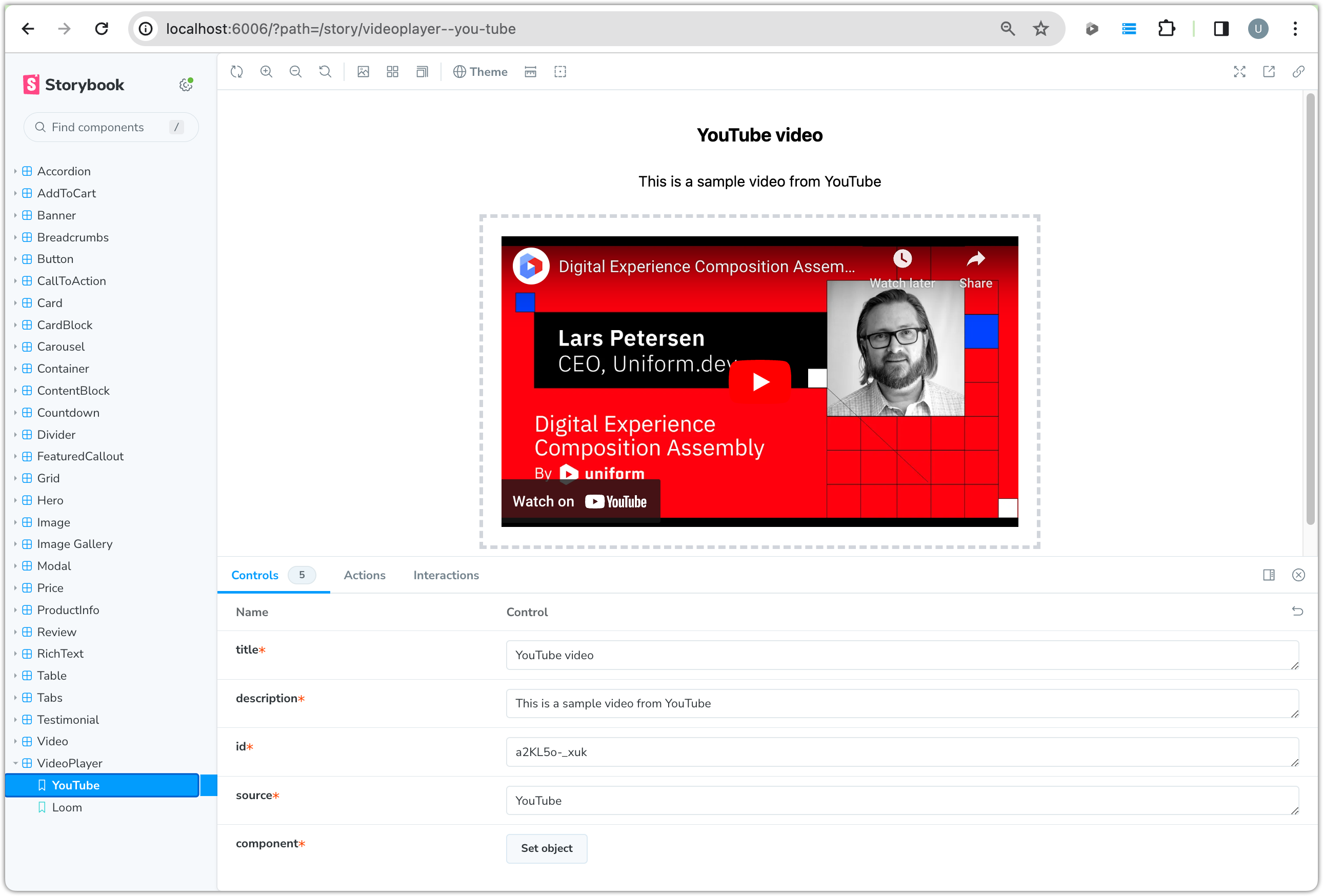 The Storybook webpage after selecting Video Player
Coming soon
Add component to Uniform component library#
Before you can use the component in Uniform, you must add a component to the Uniform component library to represent the front-end component.
- In Uniform, navigate to Experience > Components.
- Click Add component.
- Enter the following values:
Field Value Component Name Video PlayerPublic ID videoPlayerComponent Icon FilmAbout this step
The public ID must match the value that was used in the call to
registerUniformComponentin the front-end component logic. - Add the following parameters:
Type Name Public ID Options Text TitletitleText DescriptiondescriptionText IdidSingle select Sourcesource[Text: YouTube, Value: Youtube], [Text: Loom, Value: Loom] - Save the component.
Allow component in slot#
Only certain components are allowed to be added to the slot on your composition. Now you will add your new component to the list of allowed components.
- In Uniform, open the component Video Player.
- In the General tab, click Allow in slot.
- From the Component dropdown, select Page.
- From the Slot dropdown, select Page Content.
- Click Save.
Add component to composition#
Now you will add the new component to your composition.
- In Uniform, open the project map.
- Navigate to Home > Articles > The Golden Ratio of Coffee.
- Under the Breadcrumbs component, add the component Video Player.
About this step
Once the component is added, you'll notice that the preview window shows a message saying that Uniform is unable to find a component that is registered under the name
videoPlayer. You can still set parameter values on the Uniform component. After you do that, you will register the video player component so it is properly displayed. - Enter the following values:
Parameter Value Title A Magical Cup of CoffeeDescription How do you create magic in a cup? This is how!Id lpHAIp60mXsSource YouTube
Enable inline editing#
Uniform supports inline editing for text-type component parameters. Now you will enable inline editing for the title and description parameters on the video player component.
In the component code, make the following changes:
src/canvas/VideoPlayer/VideoPlayer.tsx
/* eslint-disable */ // @ts-nocheck import { FC } from 'react'; import classNames from 'classnames'; import { UniformText } from '@uniformdev/canvas-react'; import { getTextClass } from '@/utilities/styling'; import { VideoPlayerProps } from '.'; export const VideoPlayer: FC<VideoPlayerProps> = ({ title, description, source, id, }) => ( <div className={classNames('hero min-h-[500px] relative', 'text-secondary-content')}> <div className={classNames('hero-content text-center p-0')}> <div className={classNames('flex flex-col mx-1 md:mx-10')}> <UniformText parameterId="title" as="h1" className={classNames('font-bold', getTextClass('h5'))} placeholder="Title goes here" /> <UniformText parameterId="description" as="div" className={classNames('py-6')} placeholder="Description goes here" /> <div className='border-dashed border-4 border-gray-300 p-5 text-gray-300'> {source === 'YouTube' && <iframe width="560" height="315" src={`https://www.youtube.com/embed/${id}`} title="YouTube video player" frameborder="0" allow="accelerometer; autoplay; clipboard-write; encrypted-media; gyroscope; picture-in-picture; web-share" allowFullScreen></iframe> } {source === 'Loom' && <iframe width="640" height="360" src={`https://www.loom.com/embed/${id}`} frameborder="0" webkitallowfullscreen mozallowfullscreen allowFullScreen></iframe> } {!source && <div className=' text-gray-300'>Select a video source</div> } </div> </div> </div> </div> );src/canvas/VideoPlayer/VideoPlayer.tsx
/* eslint-disable */ // @ts-nocheck 'use client'; import { FC } from 'react'; import classNames from 'classnames'; import { UniformText } from '@uniformdev/canvas-next-rsc/component'; import { getTextClass } from '@/utilities/styling'; import { VideoPlayerProps } from '.'; export const VideoPlayer: FC<VideoPlayerProps> = ({ source, id, component, context }) => ( <div className={classNames('hero min-h-[500px] relative', 'text-secondary-content')}> <div className={classNames('hero-content text-center p-0')}> <div className={classNames('flex flex-col mx-1 md:mx-10')}> <h1 className={classNames('font-bold', getTextClass('h5'))}> <UniformText parameterId="title" component={component} context={context} /> </h1> <div className={classNames('py-6')}> <UniformText parameterId="description" component={component} context={context} /> </div> <div className="border-dashed border-4 border-gray-300 p-5 text-gray-300"> {source === 'YouTube' && ( <iframe width="560" height="315" src={`https://www.youtube.com/embed/${id}`} title="YouTube video player" frameBorder="0" allow="accelerometer; autoplay; clipboard-write; encrypted-media; gyroscope; picture-in-picture; web-share" allowFullScreen ></iframe> )} {source === 'Loom' && ( <iframe width="640" height="360" src={`https://www.loom.com/embed/${id}`} frameborder="0" webkitallowfullscreen mozallowfullscreen allowFullScreen ></iframe> )} {!source && <div className=" text-gray-300">Select a video source</div>} </div> </div> </div> </div> );In Canvas, the title and description parameters can be edited inline.
 The borders around the title and description indicate these values can be edited inline.