Search, filter, and sort
When browsing isn't enough, Uniform's content listings let you narrow down to the items you need. Keyword search, filter conditions, sorting, and list views are shared across compositions, entries, assets, and pattern listings.
These controls live on one search and filter bar above the list. Conditions sit on the bar as pills you add, edit, or remove in place.
This page describes the shared behavior. Some listings add capabilities specific to their content, which are covered on the corresponding entity pages and linked from entity-specific behavior below.
note
The search and filtering experience relies on a search index for your project. In projects where it isn't yet available, listings provide a simpler keyword search and a set of basic filters instead.
Where the bar is available#
The search and filter bar is available on:
- Entries
- Compositions
- Entry patterns
- Component patterns
- Composition patterns
- Assets (Uniform Asset Library), including when you pick an asset from an asset parameter
- Reference pickers, when you select an existing entry
It is not available on content type listings, component definition listings, or redirects.
The search and filter bar#
From left to right the bar has:
- A keyword search button. It expands into a search field that overlays the middle of the bar.
- Show locale, on listings that hold localized content (entries, compositions, and their patterns). Assets do not have this control.
- Filter condition pills (criteria, operator, and value).
- Add (or Add filter when the bar has no conditions).
- A More menu () when at least one condition is on the bar.
- Sort, showing the current sort field and direction.
- A list / large list / grid view selector, on listings that support more than one view. Reference pickers do not include a view selector.
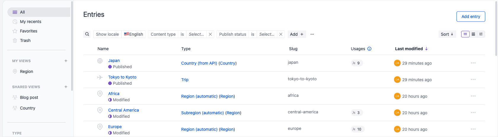
Search, filter, sort, and locale state is reflected in the URL, so you can bookmark or share a filtered listing. If it's a query you come back to, save it as a named custom view instead.
Keyword search#
Select the search button on the far left of the bar. Its tooltip reads Keyword search followed by the keyboard shortcut for your platform, as in Keyword search (⌘⇧F). The field expands over the filter pills, up to — but not over — sort and the view selector. Its placeholder is Enter keywords to search... The field takes focus as it opens, so you can start typing right away.
You can also open search with Command-Shift-F (macOS) or Ctrl-Shift-F (Windows). Press Escape, select the chevron on the left of the field, or click outside the field to collapse it.
Type to run a full-text search across your content. Search matches an item's name and slug as well as the values of its text-based fields, such as text, rich text, and select values.
While a search term is active:
- Results are ordered by relevance, so the best matches appear first.
- The sort control is unavailable until you clear the search.
- Clearing the search restores your previous sort.
When the field has a query, the trailing icon becomes a close control. Select it to clear the search.
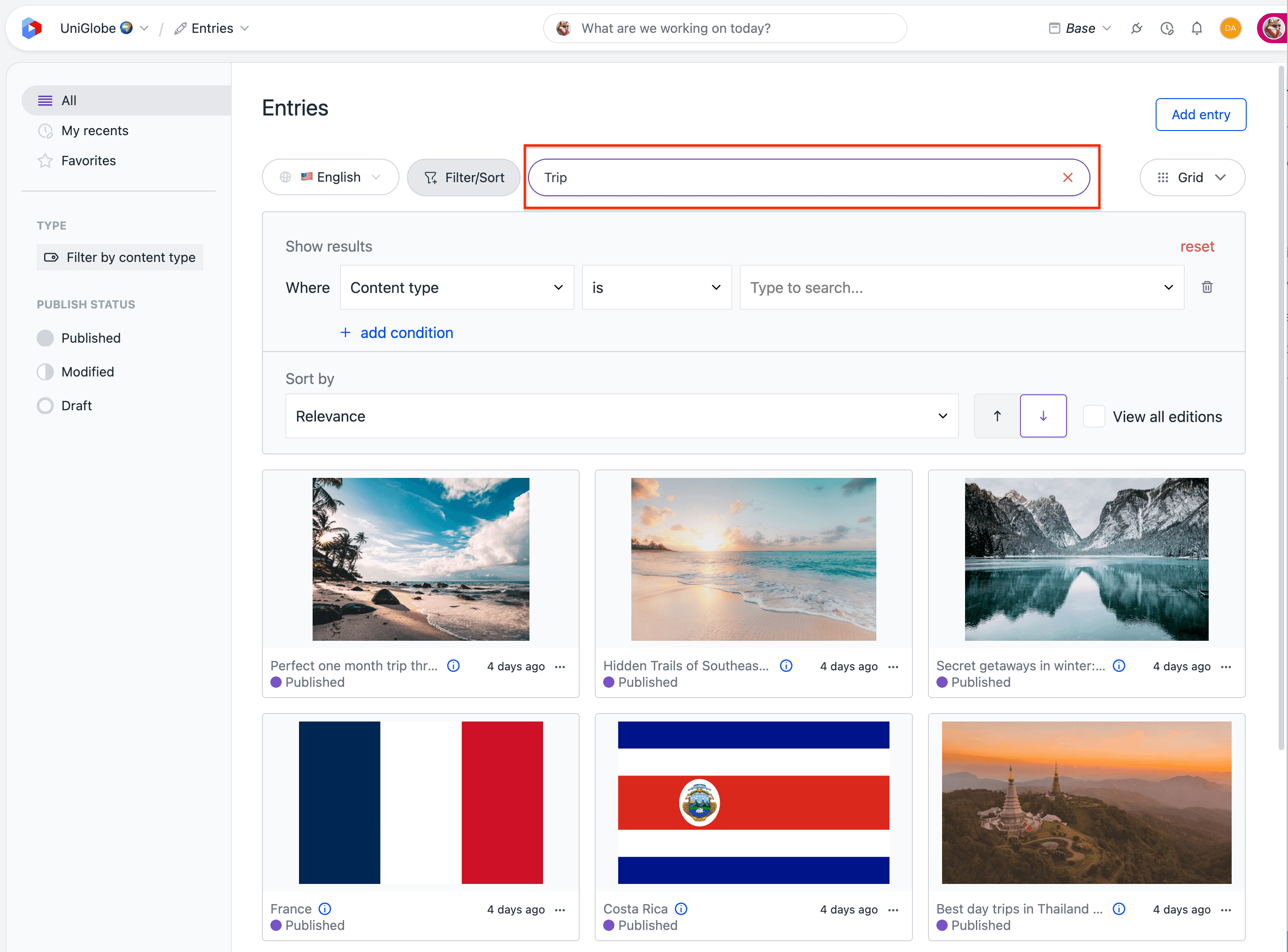
The expanded field stays open until you collapse it. After you collapse it, the search button shows the start of the query (truncated if it is long), and its tooltip becomes Current search: "<full query>" with the same shortcut appended. Select the button again to keep editing.
Locale#
Listings that hold localized content — entries, compositions, and their patterns — include a Show locale control immediately to the right of search.
- The left segment is the label Show locale.
- The right segment is the current locale. Any means results can be in any locale.
Select the right segment to choose a locale. The list is searchable (Search locales...). Any locale is first. Locale groups appear as headings when your project uses them.
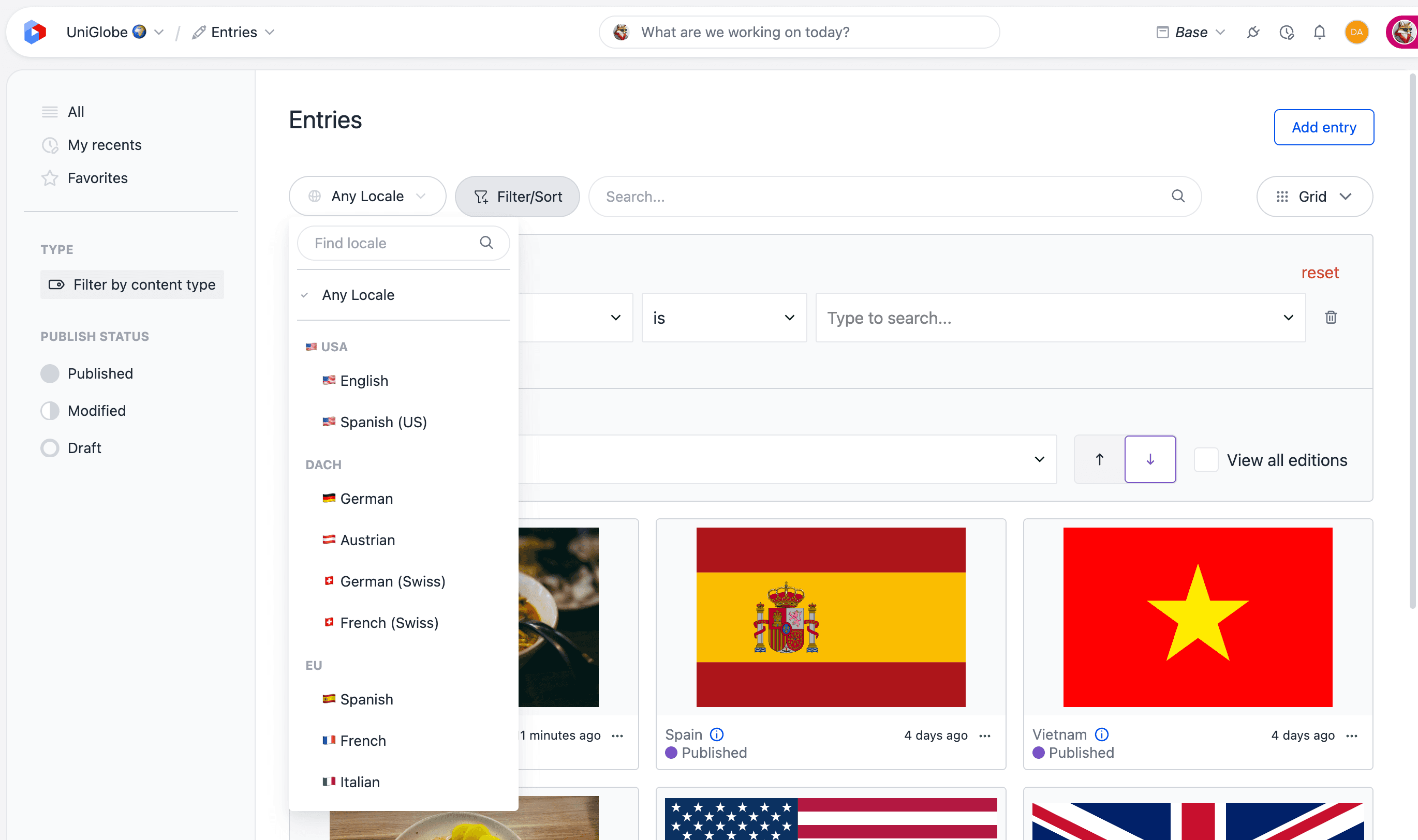
Selecting a locale shows that locale's display name. Long names truncate.
Show locale is the locale that results and filter conditions are resolved against. It is not a filter on which locales are enabled on an item.
To match items that have specific locales enabled, add an Enabled locale filter condition. While that filter is active, Show locale shows Delegated and cannot be changed — the Enabled locale filter takes precedence. Remove that filter to choose a display locale again.
In a reference picker, locale is shown as a read-only chip for the locale you are inserting into. You do not get the Show locale selector there.
Filtering#
Each condition is a pill with three parts: the field (criteria), the operator, and (for most operators) a value. Conditions are combined with and, so an item must match every condition to appear.
Select a segment to change it. Select the close control on a pill to remove that condition. Operators that take no value — for example is empty — have no value segment.
The operator segment on the pill is abbreviated where it helps scan the bar (for example any of instead of is any of, not instead of is not). The operator menu still shows the full label.
Default conditions#
Listings start with empty conditions already on the bar so the most common filters are one click away. An empty condition does not narrow the list until you pick a value.
| Listing | Default conditions |
|---|---|
| Entries, entry patterns | Content type is, Publish status is |
| Compositions | Composition type is, Publish status is |
| Composition patterns | Composition type is, Category is, Publish status is |
| Component patterns | Component type is, Category is, Publish status is |
| Assets (Uniform Asset Library) | Type is |
A default only appears when its criteria exists on that listing. Category is dropped in projects that have no categories, and Publish status is dropped on listings that don't offer publish options. A condition you've given a value to is always kept, even if its criteria becomes unavailable.
You can remove any default condition with its close control. If you leave the listing to open an item and come back, the bar keeps what you removed. Navigating elsewhere in the project restores the defaults for that listing.
The listing sidebar still lets you jump to a type (or, for assets, a media type). That is a separate quick path into the same list.
Add a condition#
Select Add (or Add filter when the bar has no conditions). A menu lists every available filter, grouped under System, Metadata, and — once the list is narrowed to a single type — that type's own fields.
If the list is long, it scrolls and a Search filters... field appears at the top. Some criteria can be used only once on the bar — for example type or workflow. Those options are disabled while they are already present.
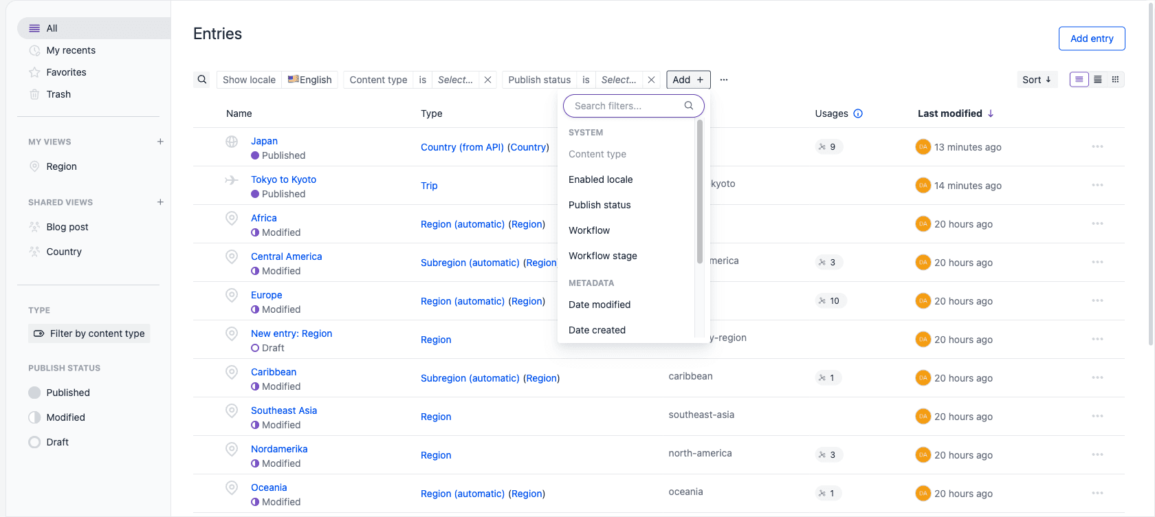
Selecting a filter adds a pill with that field and its default operator, and opens the value control so you can set it immediately.
Filter operators#
The operators available for a condition depend on the kind of field or property you're filtering on.
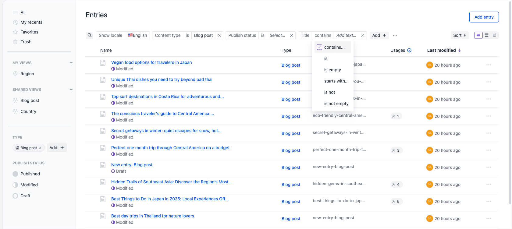
The most common operators are:
| Applies to | Operators |
|---|---|
| System properties, such as content type and publish status | is, is not, is any of, is none of |
| Single-select | is, is not, is any of, is none of, contains, starts with, is empty, is not empty |
| Multi-select | is, is not, is any of, is none of, is all of, is empty, is not empty |
| Text | contains, starts with, is, is not, is empty, is not empty |
| Rich text | contains, starts with, is empty, is not empty |
| Numbers | equals, does not equal, greater than, greater than or equal to, less than, less than or equal to, is between, is empty, is not empty |
| Date fields | is, is not, is before, is after, is on or before, is on or after, is between, is empty, is not empty |
| Date system properties, such as date created and date modified | is, is before, is after, is on or before, is on or after, is between |
| Checkboxes | is checked, is not checked |
is all of is specific to multi-select: it matches items carrying every value you pick, where is any of matches items carrying at least one. Rich text has no is or is not, because matching an entire formatted document exactly isn't useful. System properties that are optional also offer is empty and is not empty on top of the four operators listed above.
Filtering by field value needs a single type
To filter or sort by a custom field or parameter, first add a condition that limits the list to a single content type, composition type, or component type. Field-level filters aren't available across multiple types at once.
When conditions overflow#
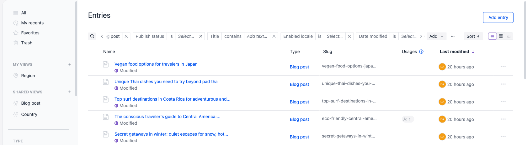
You can add as many conditions as you need. If they no longer fit, the bar scrolls horizontally:
- A chevron with a fade appears at the overflowing edge (right, left, or both).
- Select the chevron, use the left and right arrow keys, or scroll with the pointer over the bar.
- Search, Add, and More stay visible. Conditions scroll underneath those controls, not over them.
- Adding a condition scrolls the new pill into view.
More menu#
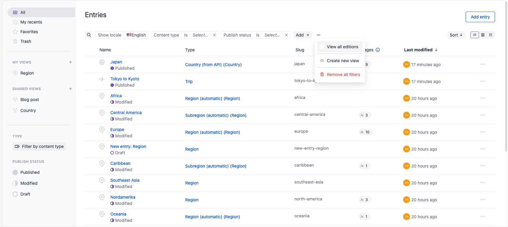
When at least one condition is on the bar, a More control (; tooltip: More filter actions) sits to the right of Add.
- View all editions — on listings that support editions. A checkmark means it is on. See search and filter editions.
- Create new view — saves the current search, conditions, and sort as a named custom view.
- Reset view — only while a custom view is open. Restores that view's saved query, discarding any changes you've made since opening it.
- Remove all filters — clears the conditions you added and restores that listing's empty defaults (for example Content type and Publish status with no value). It does not clear keyword search, locale, sort, or list view, and it does not return you to a saved view.
You can remove every condition, including the defaults. Show locale stays. With no conditions, Add becomes Add filter.
Sorting#
Sort is a button on the right of the bar. The label is the current sort field; the icon is the direction (up for ascending, down for descending).
Select it to open Sort by: a field dropdown and an ascending / descending control.
- Ascending — A–Z, oldest to newest. Tooltip: Ascending (e.g. A-Z, oldest to newest).
- Descending — Z–A, newest to oldest. Tooltip: Descending (e.g. Z-A, newest to oldest).
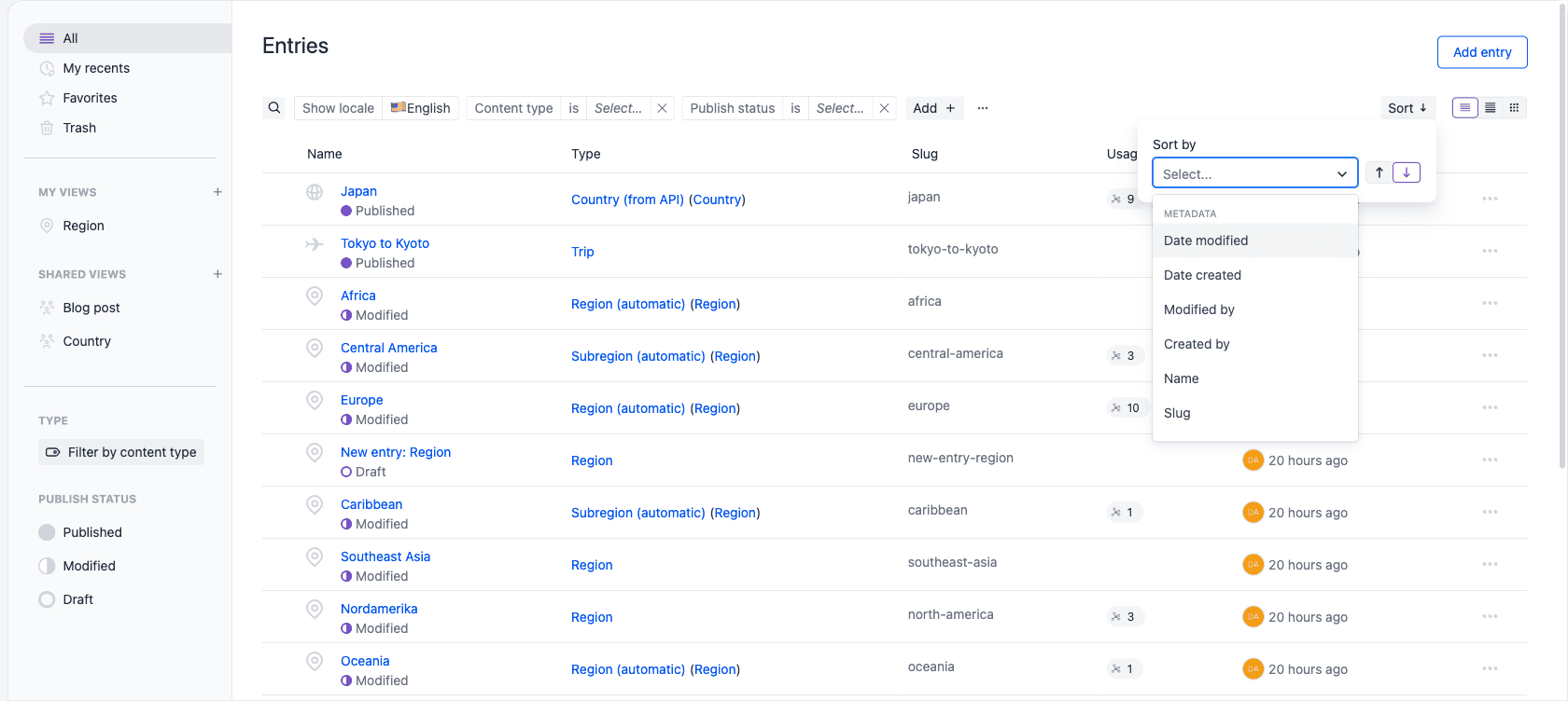
You can sort by shared properties such as date modified, date created, name, slug, and the users who created or modified an item. When a listing is filtered to a single type, you can also sort by that type's fields.
By default, listings are sorted by date modified, newest first. While a keyword search is active, results are sorted by relevance and the sort button is unavailable until you clear the search.
List views#
Where supported, listings offer up to three views. Use the segmented control on the far right of the bar to switch between them; your choice is remembered per project and listing, in the browser you're using. Hover a segment for its name.
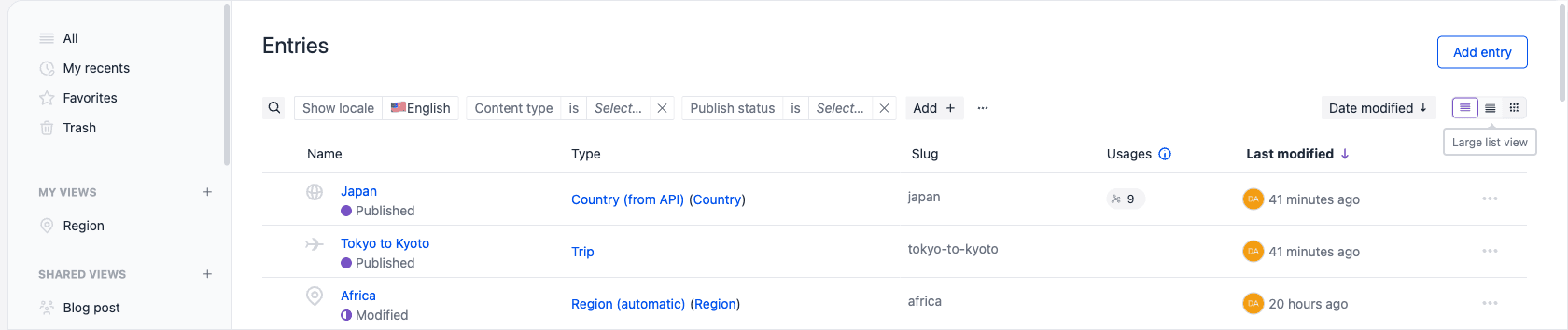
- List view — a compact, text-focused view that shows each item's key metadata as columns. Best for scanning large listings.
- Large list view — an enhanced list view with a thumbnail alongside each item's metadata.
- Grid view — a visually rich view that presents items as large cards with prominent thumbnails. Where grid is available, it's the default view.
Not every listing offers every view:
| Listing | Available views |
|---|---|
| Entries, entry patterns, assets | List, large list, grid |
| Compositions, composition patterns, component patterns | List, grid |
| Components, content types | List |
No matching results#
If the current search and filters match nothing, a note appears under the bar:

| Active | Message and action |
|---|---|
| Search only | No search results found, with Clear search |
| Filters only | No results match the selected filters, with Clear filters |
| Both | No matching results found, with Clear results |
Those actions clear the search and restore the listing's default empty conditions.
Entity-specific behavior#
Some listings extend these shared capabilities with behavior specific to their content:
- Entries — the supported field types for field-level search, search on connected external data, search through the API or SDK, and known limitations.
- Assets — filtering by label and filtering by media type, plus type-specific properties such as file size and dimensions. See the asset library.
- Editions — how search and filter behave across editions. View all editions is in the bar's More menu.
What the search and filter bar does not do#
- Combine conditions with or, or group them into an advanced filter. Every condition on the bar is combined with and.
- Filter or sort by custom fields across more than one type at a time.
- Bookmark a specific entry, composition, or asset. Use favorites.
- Remember items you recently opened. Use My recents.
- Change which columns appear in the list.
Related#
- Custom views — save a search, its filters, and its sort as a named view you can reopen from the sidebar.
- Favorites — bookmark the items you use most.
- My recents — return to the items you've most recently opened or edited.
- Trash — restore deleted entries, compositions, patterns, and assets.